
Identify your undertone first
Your body shape determines the silhouette, but your undertone determines the color. Before you worry about whether a hue flatters your frame, you need to know if your skin has warm, cool, or neutral undertones. This is the foundational step for selecting the right color palettes. Wearing the wrong temperature can make you look tired or washed out, even if the color itself is trendy.
The most reliable test is the vein test. Look at the veins on the inside of your wrist in natural light. If they appear green or olive, you likely have a warm undertone. If they look blue or purple, you are probably cool-toned. If you cannot tell the difference or see a mix of both, you likely have a neutral undertone. This simple visual check helps filter out colors that clash with your natural pigmentation.
Jewelry offers another quick confirmation. Hold a piece of silver jewelry and a piece of gold jewelry near your face. If silver makes your skin look brighter and your features stand out, you are a cool color type. If gold enhances your glow, you are warm. Neutral undertones tend to look good in both metals. This practical test avoids abstract design language and focuses on what actually looks good on you.
Understanding your undertone allows you to match seasonal trends to your specific coloring. For example, a cool-toned person might find that the icy blues of winter or the jewel tones of summer are more flattering than the earthy oranges of autumn. This knowledge prevents you from chasing trends that do not suit your natural palette.
cool tones and 2026 seasonal palettes
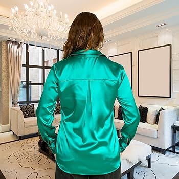
Cool undertones shine in colors that mirror the clarity of winter ice and summer skies. For 2026, the palette moves beyond basic navy and black into nuanced shades of icy blue, lavender, and emerald. These hues reflect light against the skin, creating a brightening effect that complements pink or blue undertones.
When styling these colors, consider your body shape to maximize the impact. A narrow V-neck in icy blue elongates the torso for pear shapes, while structured emerald blazers add definition to hourglass silhouettes. The goal is to let the color frame your face without overwhelming your natural contrast.
Shop these trending cool-toned pieces below. Each item is selected for its ability to harmonize with cool undertones while offering versatile styling options for various body types.

As an Amazon Associate, we may earn from qualifying purchases.
2026 warm tone palettes
Warm undertones shine in 2026’s earthy, sun-kissed palette. These shades harmonize with golden, peach, or olive skin, creating a cohesive look that emphasizes natural radiance. The trend moves away from harsh contrasts, favoring soft gradients and rich, grounded hues that flatter the body’s natural warmth.
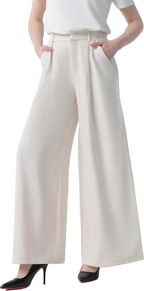
For hourglass and pear shapes, wide-leg trousers in terracotta or camel create a long, flowing line that balances the hips. Pair these with a fitted turtleneck in mustard or rust to highlight the waist. The structured silhouette of an A-line dress in burnt orange works equally well for apple shapes, drawing the eye upward while skimming the midsection.
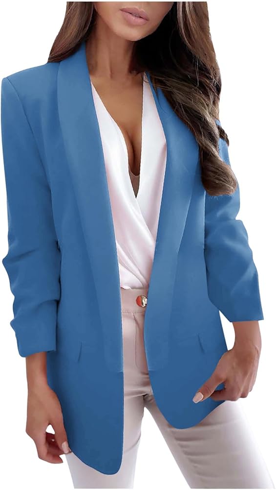
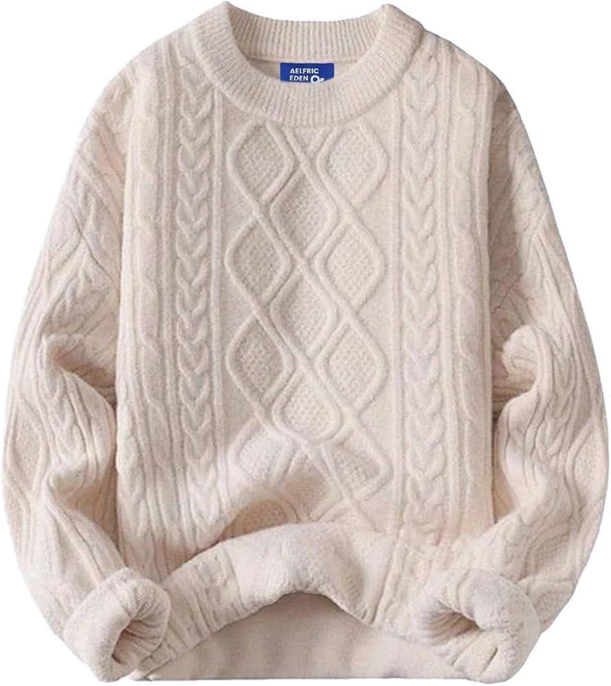
Layering is key for rectangular and athletic builds. A chunky knit cardigan in ochre over a slip dress in soft peach adds volume and curves where needed. For those with a triangle shape, a structured blazer in deep bronze over a simple tee in ivory creates a balanced upper body, while wide-leg pants in a matching warm tone elongate the legs.
As an Amazon Associate, we may earn from qualifying purchases.
These pieces are designed to be mixed and matched, allowing you to build a versatile wardrobe that celebrates your warm undertones. Focus on textures like wool, silk, and cotton to add depth to your look, ensuring that each outfit feels both current and timeless.
Balancing proportions with color
The 60/30/10 rule is a practical framework for distributing color across an outfit to create visual harmony. Think of your wardrobe as a canvas: the 60% is your dominant base, the 30% is a supporting secondary tone, and the 10% is a sharp accent. When applied to your seasonal palette, this ratio helps manage visual weight, drawing the eye where you want it and softening areas you might want to minimize.
Build your 60% base
Your largest color block should come from your most flattering shades within your identified palette. For an hourglass shape, a dominant hue in a fitted top or dress emphasizes your natural waistline without overwhelming your frame. If you have a rectangular body type, choose a base color that creates a continuous vertical line, such as a monochromatic suit or a long cardigan over a matching dress. This foundational layer sets the tone for the entire look, ensuring the colors work together rather than competing.
Add a 30% secondary layer
The secondary color introduces contrast and breaks up the monotony of the base. Use this portion for outerwear, trousers, or skirts. For pear-shaped bodies, a darker secondary color on the bottom half can help balance wider hips, while a brighter secondary top draws attention upward. Apple-shaped individuals might find that a secondary color in a structured jacket creates definition around the midsection. The goal is to use this middle ground to guide the eye smoothly from your head to your feet.
Finish with a 10% accent
The final 10% is your accent color, reserved for accessories like bags, shoes, jewelry, or a scarf. This is where you can experiment with bolder hues from your palette or introduce a metallic finish. For inverted triangle shapes, an accent color in a skirt or lower-body accessory can add necessary visual weight to the bottom half. Petite frames benefit from small, sharp accents that don’t overwhelm their stature. This small touch of color ties the outfit together and adds personality without disrupting the balanced proportions you’ve established.
Verify that your largest garment covers about 60% of your visible silhouette. Ensure this color is one of your most flattering shades from your seasonal palette.
Add a second color for your middle layer, such as a jacket or trousers. Use this to create contrast or balance, depending on your body shape.
Reserve your boldest or brightest color for accessories. This 10% should draw the eye to specific features or add a finishing touch.
Step back and look in the mirror. Does the eye flow naturally? Adjust the placement of your accent if it feels too heavy or too light.
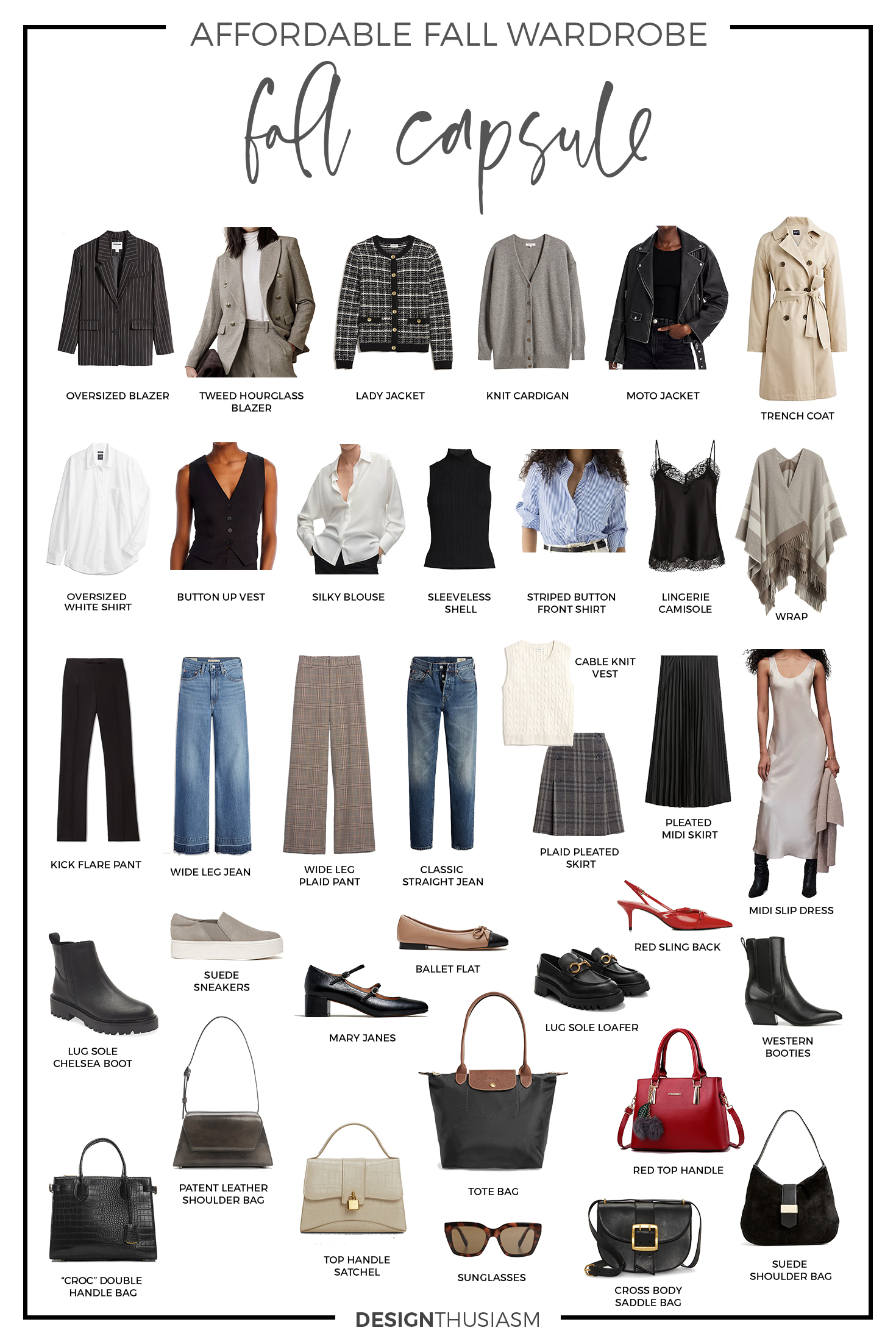
Essential pieces for the 60/30/10 rule
-
Structured Blazer
Perfect for the 30% secondary layer, adding definition to the waist. -
Silk Scarf
Ideal for the 10% accent, introducing a pop of color without bulk. -
Tailored Trousers
Serve as a strong 60% base, creating a clean vertical line.
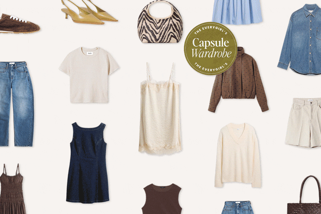
Essential tools for palette creation
Building a seasonal wardrobe starts with a digital palette. These tools let you test colors against your skin tone and save combinations for quick shopping reference. Instead of guessing, you can lock in a cohesive scheme before you buy.
Coolors is a fast generator that lets you hit the spacebar to create palettes or extract colors from photos. It helps you preview how specific shades look together, ensuring your top, bottom, and accessories harmonize. Adobe Color offers a similar library of trending themes if you need inspiration for broader seasonal shifts.
Once you have your palette, save it to your phone or print it out. This visual cheat sheet makes it easier to filter online shopping results or choose outfits from your closet. You can also use these digital tools to plan capsule wardrobes, ensuring every piece works with your seasonal color analysis.
Frequently asked questions about color palettes
How do I find out my color palette?
The most reliable way to determine your seasonal color palette is by checking your undertones. Look at the veins on your inner wrist under natural light: if they appear blue or purple, you likely have a cool undertone. If they look green, you are probably warm. When the distinction is unclear, you likely have a neutral undertone.
You can also test this with jewelry. If silver jewelry makes your skin look brighter and your features stand out, you fit a cool color type. If gold jewelry complements your complexion better, you are a warm color type. This simple visual check helps you narrow down whether you should lean toward icy blues or earthy ochres.
What is the 60/30/10 color rule for outfits?
This classic styling rule helps you balance your wardrobe without looking cluttered. It suggests dividing your outfit into three parts: 60% dominant color, 30% secondary color, and 10% accent. For example, a navy coat (60%) paired with a cream sweater (30%) and burgundy shoes (10%) creates a cohesive, professional look.
Applying this ratio to your seasonal palette ensures harmony. If you are wearing a winter palette, your dominant color might be charcoal gray, the secondary could be white, and the accent a sharp red. This structure prevents you from using too many competing shades from your palette at once.
Can I mix warm and cool colors in one outfit?
Yes, but it requires careful handling. Mixing warm and cool tones can create a dynamic look, but it often clashes if the undertones are too different. A safer approach is to use neutral colors like beige, gray, or white as a bridge between warm and cool shades.
If you want to experiment, try pairing a cool-toned blue shirt with warm-toned brown trousers. The brown acts as a neutral anchor, allowing the blue to stand out without fighting against the rest of the outfit. This technique works well for transitional seasons like spring and autumn.
How do I choose colors for my body shape?
Your body shape influences which colors draw attention and which recede. Darker colors tend to minimize areas, while lighter, brighter colors highlight them. For instance, if you want to emphasize your waist, wearing a bright top with a dark skirt can create an hourglass illusion.
Conversely, if you prefer to downplay certain areas, stick to monochromatic looks or darker shades in those zones. The goal is to use color to balance your proportions, not to hide your body. Choosing colors that contrast with your skin tone can also help define your silhouette more clearly.
No comments yet. Be the first to share your thoughts!