
Prep your lighting and workspace
The most common mistake people make when doing color analysis at home isn't using the wrong mirrors—it's standing in the wrong light. Artificial lighting, whether from overhead LEDs or warm incandescent bulbs, casts a specific color temperature that distorts your natural skin tone. To get an accurate reading, you need to strip away these variables and rely on neutral, natural daylight.
Find a spot near a large window where indirect sunlight hits your face. Avoid direct, harsh sun, which creates shadows and washes out details. If natural light isn't available, use full-spectrum daylight bulbs designed to mimic the sun's true color temperature. The goal is to see your skin as it truly is, not as it appears under the yellow tint of your living room lamp.
Clear your workspace of distractions. Remove colorful clothing, bright makeup, and patterned backgrounds that could reflect onto your face. Wear a neutral-colored top, such as white, black, or gray, to prevent color bleed. This neutral canvas ensures that any changes you see in your complexion are due to the drapes you're testing, not the shirt you're wearing.
Drape neutrals to find your undertone
Color analysis starts with your skin’s undertone, the subtle hue beneath the surface that determines which colors make you glow and which make you look tired. While surface skin tone can change with sun exposure or seasonal dryness, your undertone remains constant. The most reliable way to identify it at home is through draping—holding specific fabric colors near your face in natural light and observing how your skin reacts.
Think of draping as a visual stress test. You are looking for contrast and clarity. When a color complements your undertone, your skin looks brighter, and shadows or imperfections tend to fade. When a color clashes, your skin may appear sallow, grayish, or washed out, and dark circles or redness often become more pronounced.
Step 1: Prepare your lighting and base
Natural daylight is essential for an accurate assessment. Artificial indoor lighting, especially yellow incandescent bulbs or blue-tinted LEDs, will distort how colors interact with your skin. Stand facing a window with indirect sunlight. Remove any makeup from your face and pull your hair back so that no hair color frames your face, which could confuse the results. Wear a neutral white or gray top to avoid color reflection from your clothing affecting the test.
Step 2: Test gold versus silver
Hold a piece of gold jewelry and a piece of silver jewelry against your jawline, one at a time. Observe which metal makes your skin look healthier and more radiant.
- Gold looks better: If yellow gold blends harmoniously with your skin and makes you look warm and sunny, you likely have warm undertones.
- Silver looks better: If silver creates a crisp, clean contrast and makes your skin look clear and bright, you likely have cool undertones.
- Both look good: If both metals look equally flattering, you may have neutral undertones.
Step 3: Test warm versus cool fabrics
For a more definitive test, use fabric swatches or clothing items in distinct warm and cool shades. Avoid neutral colors like black, white, or gray, as they can be tricky to interpret. Instead, use vibrant examples:
- Warm colors: Olive green, mustard yellow, peach, or terracotta.
- Cool colors: Olive blue, magenta, emerald green, or icy pink.
Drape the warm color under your chin. Look in the mirror. Does your skin look lively or does it look dull? Then swap to the cool color. Repeat this process, noting which side of your face looks more balanced. The color that minimizes shadows and evens out your complexion is your match.
Step 4: Interpret the vein test (optional check)
While draping is the most accurate method, you can cross-reference with your wrist veins. Look at the veins on the inside of your wrist in natural light.
- Greenish veins: Typically indicate warm undertones.
- Blue or purple veins: Typically indicate cool undertones.
- Blue-green or ambiguous: Typically indicate neutral undertones.
This check is not definitive on its own but can support what you see during draping. Remember, color analysis is a stylistic tool, not a medical diagnosis. Your goal is to find colors that enhance your natural features, not to label yourself with a rigid scientific category.
Test contrast levels and value
Your contrast level is the difference between your hair, skin, and eye color. It tells you how much "pop" your features can handle. High-contrast people look striking in sharp, bright colors. Low-contrast people look best in muted, blended tones.
To find your level, look at your features without makeup in natural light. Notice the gap between your darkest hair and your lightest skin. This simple check separates high-contrast seasons like Winter from low-contrast seasons like Spring or Summer.
High contrast
High contrast means your features stand out sharply against each other. You likely have dark hair with light skin, or very dark eyes. Think of a sharp black-and-white photo. Colors that match this intensity—like pure white, black, or bright red—look powerful on you. Soft, dusty colors might wash you out or make you look tired.
Medium contrast
Medium contrast sits in the middle. Your hair, skin, and eyes are closer in tone. You might have medium brown hair and olive skin. You have more flexibility than high-contrast types. Colors with some depth, like navy, forest green, or soft black, work well. Avoid colors that are too pale or too neon.
Low contrast
Low contrast means your features blend together. Your hair, skin, and eyes are similar in lightness. Think of a watercolor painting. Soft, muted colors like sage green, dusty rose, or beige look harmonious. Sharp, bright colors can overwhelm your natural softness. You look best when your clothes blend gently with your skin tone.
| Contrast Level | Visual Cue | Best Colors | Avoid |
|---|---|---|---|
| High | Dark hair, light skin, dark eyes | Pure white, black, bright red, electric blue | Muted pastels, dusty tones, beige |
| Medium | Hair and skin are similar in tone | Navy, forest green, soft black, teal | Neon colors, pale pastels |
| Low | Hair, skin, and eyes blend together | Sage green, dusty rose, beige, soft gray | Pure white, sharp black, bright red |
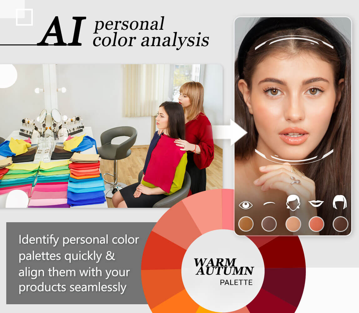
Match your results to a season
Now that you have identified your undertone and contrast level, it is time to map those findings to one of the 12 seasonal sub-types. This step translates your physical characteristics into a concrete palette. You do not need to memorize all 12 types at once; start by locating the main season that matches your primary traits, then refine the sub-type if needed.
Think of your seasonal palette as a curated wardrobe. Just as you would not wear a neon orange swimsuit to a funeral, certain colors will clash with your natural coloring while others will harmonize. The goal is to find the shades that make your skin look clear, your eyes bright, and your features defined.
Here is how your results typically break down into the four main seasons and their specific sub-types.
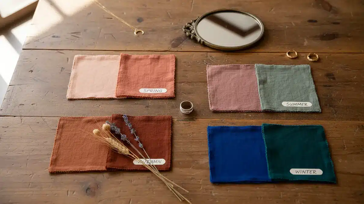
Spring: Warm and Light
Spring types have warm, yellow or golden undertones with light to medium contrast. Your coloring is generally soft and bright rather than stark.
- True Spring: Warm and clear. You look best in bright, warm colors like coral, peach, and true green. Avoid heavy blacks or cool grays.
- Light Spring: Warm and light. Soft, pastel versions of spring colors work best. Think light peach, soft yellow, and light green.
- Warm Spring: Warm and clear, but slightly deeper. You can handle richer, more saturated warm colors like tomato red, gold, and olive green.
Summer: Cool and Soft
Summer types have cool, pink or blue undertones with low to medium contrast. Your coloring is muted and soft, never harsh.
- True Summer: Cool and soft. Muted, dusty colors like dusty rose, soft blue, and lavender are your best friends. Avoid bright whites; opt for off-white or cream.
- Light Summer: Cool and light. Very pale, cool colors work well. Think baby blue, light lavender, and pale pink.
- Cool Summer: Cool and soft, but slightly deeper. You can handle slightly richer cool tones like medium blue, plum, and soft magenta.
Autumn: Warm and Deep
Autumn types have warm, yellow or golden undertones with medium to high contrast. Your coloring is rich, earthy, and deep.
- True Autumn: Warm and clear. Rich, warm earth tones like tomato red, golden yellow, and olive green look stunning. Avoid cool pastels.
- Light Autumn: Warm and light. Softer, lighter versions of autumn colors work best. Think peach, light gold, and soft olive.
- Deep Autumn: Warm and deep. You can handle very dark, rich colors like forest green, burnt orange, and deep brown. Avoid light, washed-out shades.
Winter: Cool and Bright
Winter types have cool, pink or blue undertones with high contrast. Your coloring is stark, clear, and bright.
- True Winter: Cool and clear. You look best in pure black, pure white, and bright, clear colors like fuchsia, royal blue, and emerald green.
- Light Winter: Cool and light. You can handle lighter, brighter cool colors. Think icy blue, bright pink, and crisp white.
- Deep Winter: Cool and deep. You can handle very dark, cool colors like black, navy, and deep purple. Avoid warm, earthy tones.
How to Verify Your Season
Once you have identified your potential season, test it with draping. Hold up clothes or fabric swatches in your identified colors next to your face in natural light. Look for these signs:
- Harmony: Your skin looks even, your eyes sparkle, and your features look defined.
- Clash: Your skin looks dull, sallow, or grayish, and dark circles become more noticeable.
If you feel unsure, try colors from two adjacent seasons. For example, if you are between Summer and Autumn, try a soft blue (Summer) and a soft olive (Autumn). See which one makes you look more alive.
Common draping mistakes to avoid
Even with the best lighting, small visual variables can skew your results. Color analysis is a stylistic tool, not an exact science, so you must control every variable in your frame. Here are the most common errors that lead to false readings.
Wearing makeup during the test
Foundation, concealer, and blush create a uniform layer that masks your natural skin undertone. If you are trying to determine if you are a "Cool" or "Warm" season, makeup will almost always muddy the signal.
Using the wrong fabric texture
Silk, satin, and shiny polyester reflect light in ways that matte cotton or wool do not. A shiny gold fabric might look flattering simply because it bounces light onto your face, not because the color complements you. Stick to matte fabrics for your initial draping to see the true color interaction.
Confusing hue with undertone
It is easy to mistake a bright color for a flattering one. For example, you might look good in a bright lime green because it is high-contrast, but that does not mean you are a "Spring." You might actually look better in a muted olive green that harmonizes with your skin. Focus on how the color affects your skin’s appearance (do you look tired or vibrant?), not just the color itself.
Ignoring your natural hair color
If you have dyed your hair a drastically different shade than your natural root color, it can throw off the balance. Your natural hair color provides the baseline contrast for your eyes and skin. If your hair is currently black but was naturally brown, try to drape with your natural root color visible or use a neutral headband to minimize the hair’s impact.
Build a capsule wardrobe from your palette
Now that you’ve identified your season, it’s time to put those colors to work. A capsule wardrobe relies on a cohesive color story rather than a random mix of trends. By sticking to your specific palette, you ensure that every top matches every bottom, reducing decision fatigue and eliminating the frustration of buying clothes that don’t flatter your skin tone.
The 60/30/10 rule is the easiest way to structure this. Think of your wardrobe as a visual outfit: 60% should be your dominant neutrals (the base), 30% your secondary colors (the main outfits), and 10% your accent colors (the pop of interest).
Your dominant neutrals form the foundation of your capsule. If you are a Soft Autumn, this might include warm taupe, soft camel, or olive green. For a Cool Winter, these would be crisp white, charcoal gray, or navy. These are the colors you wear most often—jeans, trousers, coats, and basic tees. They should blend seamlessly with your natural skin tone and hair, creating a harmonious backdrop.

This is where your personality shines. Secondary colors are your primary hues—think rust orange for a Soft Autumn or emerald green for a Cool Winter. These colors make up the bulk of your shirts, dresses, and sweaters. They should be vibrant enough to stand out against your neutrals but still harmonious with your overall palette. If you have to squint to see if a color works, it’s likely not a true secondary for your season.
Accents are the finishing touches. These are smaller items like scarves, jewelry, bags, or shoes. They can be bolder or more unusual shades within your palette. For example, a Soft Autumn might use a mustard yellow scarf or terracotta shoes, while a Cool Winter might opt for a bright royal blue handbag. These accents draw the eye and add visual interest without overwhelming the outfit.
Frequently asked questions about color analysis
You might have heard terms like "Winter" or "60/30/10" and wondered how they apply to your personal style. These concepts are practical tools for building a cohesive wardrobe, not rigid scientific rules. Use them to guide your choices, not restrict them.
No comments yet. Be the first to share your thoughts!