

Read the palette first
Before you build a Soft Summer outfit, you need to understand the rules of the palette itself. This color season is defined by desaturated, low-contrast, and coolish tones. Most of the colors sit in the grey-blue spectrum, with a heavy focus on muted pinks and soft blues.
These colors are not bright or primary. They are dusty, hazy, and blended with grey. If you pick a color that is too saturated or too warm, it will clash with your natural coloring rather than complement it.
Think of the palette as a filter. It softens everything it touches. Your goal is to find clothes that match this muted, cool energy. Stick to shades that feel "washed out" or "misty." Avoid anything sharp, neon, or overly warm. Once you internalize this muted quality, building a polished wardrobe becomes much easier.
Build the outfit
A Soft Summer color palette relies on desaturated, low-contrast, and coolish tones. Think dusty blues, muted mauves, and soft greys. These colors harmonize with your natural coloring rather than overpowering it. The goal is a polished look that feels effortless and refined.
Start with your base layer. A soft grey or muted blue top works well as a foundation. These neutral tones are versatile and easy to mix with other pieces in your palette. Avoid stark whites or bright blacks, which can wash you out or create too much contrast.
Next, add a mid-tone piece. A dusty rose sweater or a soft lavender cardigan adds depth without being loud. These colors have a slight cool undertone that complements your skin. They also pair beautifully with the neutral base you chose earlier.
Finish with your bottom layer. Navy blue or charcoal grey trousers or skirts are excellent choices. They provide structure and grounding to the outfit. For a softer look, try a muted teal or a pale slate blue.
Accessorize with intention
Jewelry matters. Silver, platinum, or white gold metals complement your cool undertones better than gold. Keep jewelry simple and elegant to maintain the low-contrast aesthetic.
Shoes and bags should follow the same rules. Choose soft leather in taupe, dusty pink, or navy. Avoid shiny patent leathers or bright colors that disrupt the harmony of the outfit.
Final checks
Look in natural light. Soft Summer colors can sometimes look dull in poor lighting. Ensure your outfit feels balanced and that no single piece stands out too aggressively.
Remember, the Soft Summer palette is about subtlety. If you feel like you're wearing "nothing," you're probably doing it right. The polish comes from the cohesion of the tones, not from bold statements.
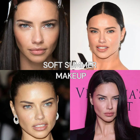
Start with a soft grey, muted blue, or dusty lavender top. These low-contrast neutrals form the foundation of your outfit and harmonize with your coolish undertones.
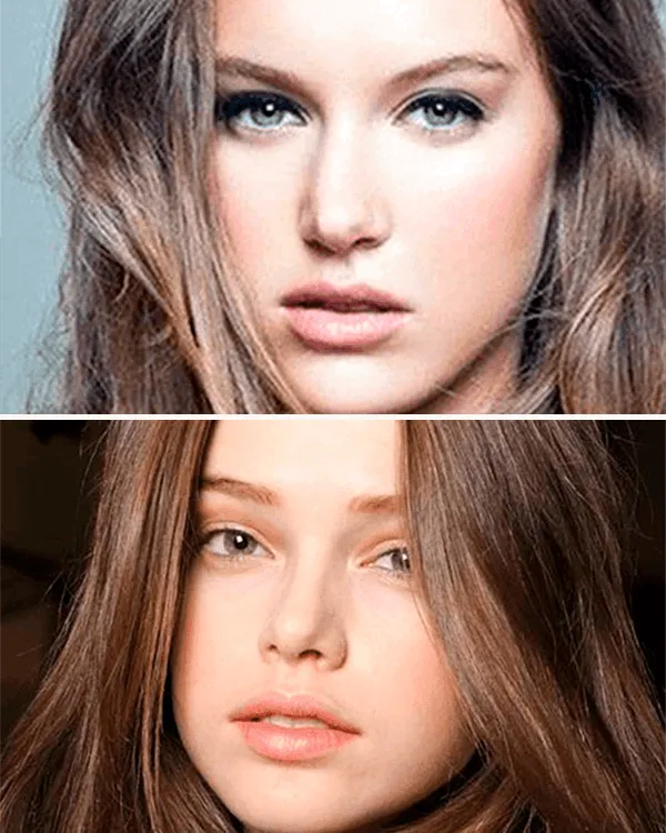
Layer a dusty rose, soft lavender, or pale teal cardigan or sweater. This adds depth and visual interest while maintaining the desaturated, cool aesthetic essential for Soft Summers.
Finish with navy, charcoal, or slate blue bottoms. These darker, cool-toned pieces provide structure and prevent the outfit from looking too washed out or floaty.
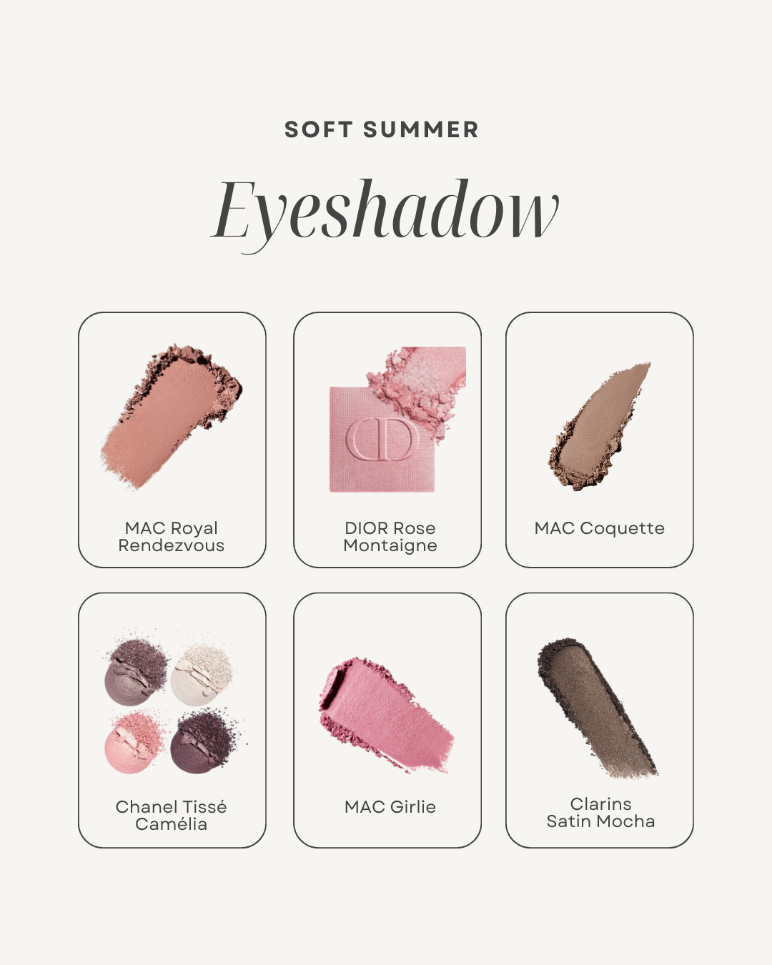
Choose silver, platinum, or white gold jewelry. Keep bags and shoes in taupe, dusty pink, or navy leather to maintain the cohesive, low-contrast look.
Mistakes that flatten the colors
Soft Summer coloring relies on low contrast and muted tones. When the outfit lacks this balance, the result is often a washed-out appearance that drains energy from the face. The goal is to support your natural coolish, grey-based hues, not compete with them.
The most common error is wearing pure white. Stark white creates a harsh contrast against Soft Summer’s muted features, making the skin look sallow or tired. Instead, opt for soft whites, oatmeal, or light heather grey. These shades provide brightness without the jarring effect of high-contrast neutrals.
Another frequent mistake is choosing overly saturated colors. Bright primaries or neon tones overwhelm the delicate balance of a Soft Summer palette. These colors can make the complexion appear dull by comparison. Stick to desaturated versions of your favorite hues—think dusty rose instead of hot pink, or slate blue instead of royal blue.
Finally, avoid warm, golden undertones in fabrics. While some warmth can be flattering in other seasons, Soft Summer coloring is fundamentally cool. Warm golds, oranges, and yellows can clash with your natural undertones, creating a disjointed look. Stick to blue-based neutrals and cool pastels to maintain a polished, cohesive appearance.
Soft Summer Color Palette Questions
Sticking to a muted, cool-leaning palette requires a few adjustments to how you shop and style. Here are the practical answers to the most common questions about building a Soft Summer wardrobe.
No comments yet. Be the first to share your thoughts!