
Why color matters for your silhouette
Color isn’t just about aesthetics; it’s a visual tool that manipulates how the eye perceives your body’s proportions. Think of your wardrobe as a canvas where light and shadow interact with your natural curves. By choosing specific color palettes that flatter your body shape, you can create optical illusions that either soften certain areas or draw attention to your favorite features.
This principle relies on the way different hues reflect or absorb light. Darker shades tend to recede, making the areas they cover appear slimmer, while lighter, brighter tones advance, adding visual volume. When you pair these effects with the right color combinations, you can balance your silhouette. For example, a high-contrast outfit might break up your frame, while a monochromatic look can elongate it, creating a smoother, taller line.
The goal isn’t to hide your body but to highlight it in a way that feels authentic and confident. Understanding how color interacts with your unique shape allows you to build a wardrobe that works for you, not against you. It’s about selecting palettes that harmonize with your complexion and structure, turning everyday dressing into a strategic exercise in visual balance.
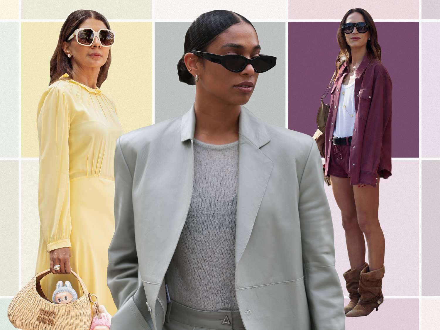
Warm tones for hourglass and pear shapes
Warm, earthy, and golden palettes act like natural lighting for hourglass and pear body types. These hues mimic sunlight, adding a soft glow that draws the eye toward the center of the body. For hourglass figures, this warmth highlights the waistline, creating a focal point that emphasizes your natural curves. For pear shapes, the upward visual pull of golden and terracotta shades balances wider hips by attracting attention to the torso and shoulders.
Think of warm colors as a spotlight. Instead of letting your eyes wander to the widest part of your frame, these tones guide them to your narrowest point. A rust-colored wrap dress or a mustard-yellow top doesn't just look good; it structurally alters how your silhouette is perceived. The key is to keep the warmth concentrated around the waist or upper body, where you want the most attention.
Start with foundational pieces in burnt orange, deep gold, or warm terracotta. These colors are versatile enough for workwear yet rich enough for evening looks. Pair them with neutral bottoms like navy or charcoal to keep the focus on the waist. Avoid letting warm tones dominate the lower half, which can visually widen the hips. Instead, let the warmth rise, creating an elegant, balanced silhouette that celebrates your shape.
Cool hues for apple and rectangle frames
Cool colors like navy, slate, and emerald naturally recede, making them ideal for minimizing the appearance of a wider midsection or creating definition for a straighter silhouette. Think of these shades as visual shapers; they draw the eye inward rather than expanding outward, offering a streamlined effect that warm, bright tones often struggle to achieve.
For apple-shaped bodies, the goal is to de-emphasize the torso while highlighting the limbs. A structured navy blazer worn over a lighter top creates a vertical line that cuts through the midsection, breaking up the visual weight. Similarly, an emerald wrap dress uses the cool, deep tone to slim the waist while the wrap detail creates a flattering V-neckline that draws attention upward to the face.
Rectangle shapes benefit from the contrast that cool, saturated colors provide. Since this body type lacks natural curves, using a solid slate or deep teal can create the illusion of definition where there is none. Pairing a cool-toned top with darker bottoms anchors the look, while a monochromatic cool palette—like varying shades of blue—creates a long, uninterrupted vertical line that elongates the entire frame.
Monochromatic palettes for tall and athletic builds
Monochromatic styling is the ultimate tool for tall and athletic frames because it creates an unbroken vertical line. When you wear one color from head to toe, you remove visual interruptions that might shorten your silhouette. This approach highlights your natural height and lean muscle definition, turning your body into a sleek, unified column.
Think of your outfit as a single architectural structure rather than separate pieces. A charcoal gray turtleneck tucked into matching charcoal trousers doesn't just look coordinated; it visually extends your torso and legs into one long, continuous shape. This effect is particularly flattering for athletic builds, as it emphasizes the V-taper of your shoulders and the length of your limbs without adding bulk.
To keep the look from feeling flat, play with texture and fabric weight instead of introducing new hues. Pair a ribbed knit sweater with smooth wool trousers, or layer a silk shirt under a matte blazer in the same shade. The interplay of light and shadow on different materials adds depth and interest, ensuring your monochromatic palette feels sophisticated and intentional rather than plain.
Cream and olive are excellent alternatives to black for daytime wear. A cream linen shirt with cream chinos offers a relaxed, airy vibe that still maintains that elongating vertical flow. Similarly, an olive green henley paired with olive cargo pants grounds the look in earth tones while keeping the focus on your frame's proportions.
Build your seasonal wardrobe guide
A cohesive wardrobe starts with a defined palette. Instead of buying items in isolation, treat your color selection like a curated gallery. When your pieces share a common chromatic language, mixing and matching becomes effortless, and every outfit feels intentional rather than assembled.
Step 1: Identify your season
Your "season" is determined by your skin’s undertone and contrast level, not the time of year. Warm undertones (yellow, peach, or golden) suit earthy hues like olive, rust, and cream. Cool undertones (pink, red, or blue) look best in jewel tones like sapphire, emerald, and true white. Neutral undertones can often wear both, though they may need to adjust saturation levels to avoid looking washed out or muddy.
Step 2: Pick three core colors
Select three shades that you can wear daily. These are your workhorses. For a warm season, this might include camel, olive, and terracotta. For a cool season, try navy, charcoal, and burgundy. These colors should appear in your most-worn items like trousers, blazers, and base-layer tops. They form the structural backbone of your closet.
Step 3: Add two accent colors
Accents provide visual interest and break up monotony. Choose two colors that complement your core palette without clashing. If your core is neutral-heavy, pick one bright and one muted accent. For example, a warm palette might pair camel and olive with mustard yellow and rust. These accents work well in shirts, dresses, or accessories like scarves and bags.
Step 4: Test with neutrals
Neutrals tie everything together. Ensure your wardrobe includes at least two neutral shades that work with both your core and accent colors. Black and white are universal, but consider softer neutrals like taupe, gray, or off-white depending on your season. These pieces—jeans, denim jackets, leather shoes—should anchor your brighter colors, ensuring your outfits remain grounded and versatile.
Tools for curation
Use digital tools to visualize your palette before shopping. Platforms like Coolors or Adobe Color allow you to generate and save palettes based on specific color wheels. Upload a photo of your skin or a favorite outfit to extract harmonious colors. This prevents impulse buys that don’t match your existing wardrobe.
Palette Resources
-
Coolors
Fast palette generator with accessibility checks. -
Adobe Color
Explore color themes and extract palettes from images. -
Canva Color Palettes
Browse thousands of pre-made combinations for inspiration.
Common color palette mistakes to avoid
Even with the right body shape in mind, a few common color mistakes can throw off your entire look. The most frequent pitfall is ignoring your skin’s undertone. If you have cool undertones, wearing warm, yellow-based colors like mustard or orange can make your skin look sallow or tired. Conversely, those with warm undertones may find that icy pastels or stark black washes them out, making them appear pale or drained.
Another frequent error is placing high-contrast colors in the wrong areas. High-contrast combinations, such as black and white, draw the eye to the specific body parts where they are worn. If you have a pear shape, wearing a bright white top with dark bottoms can emphasize the width of your hips. Instead, try using contrast strategically to balance your proportions, keeping brighter or lighter shades near the areas you want to highlight.
Finally, avoid using color palettes that clash with your natural coloring. A palette that feels vibrant on a friend might look muddy on you. Test your colors in natural light to ensure they harmonize with your skin, hair, and eyes. When your palette complements your natural features, it creates a cohesive and flattering look that enhances your overall appearance.
Frequently asked questions about color palettes
What are the best color palettes for an hourglass body shape?
Hourglass figures benefit from high-contrast palettes that define the waist. Try pairing a deep jewel tone like emerald green with a neutral cream or ivory. This combination draws the eye to the center while balancing the hips and shoulders. Avoid monochromatic looks that hide your natural curves.
Which colors should pear-shaped bodies avoid?
Pear shapes should be cautious with bright, warm colors on the lower half, as they draw attention to width. Instead, anchor your outfit with dark, cool tones like navy or charcoal on the bottom. Pair these with brighter, lighter shades on top to balance the silhouette and draw attention upward.
How do cool-toned palettes flatter a rectangular body shape?
Rectangular bodies lack defined waistlines, so use cool-toned palettes to create visual depth. Colors like slate blue, forest green, or soft lavender recede, making areas appear slimmer. Layering these shades with warmer accent pieces near the bust helps create the illusion of curves and dimension.
Can warm color palettes work for apple-shaped bodies?
Yes, but placement matters. Apple shapes carry weight in the midsection, so avoid large blocks of bright warm colors like orange or red on the torso. Instead, use warm neutrals like camel or terracotta for outer layers, and keep the inner layers in cooler, slimming tones like deep purple or teal.
No comments yet. Be the first to share your thoughts!