
Color palettes limits to account for
A seasonal palette is a curated set of hues that harmonize with your natural coloring, but it only works if you respect the boundaries of your body shape. Think of your wardrobe as a visual frame; the colors must complement the lines and proportions you are trying to highlight or soften. If the palette clashes with your silhouette, even the most scientifically accurate seasonal analysis will fall flat.
The primary constraint is contrast level. High-contrast palettes, such as crisp black and white or navy and cream, create strong visual breaks. These work exceptionally well for hourglass or athletic builds because they define the waist and emphasize structure. For softer or pear-shaped figures, low-contrast palettes like charcoal and slate, or muted pastels, create a continuous vertical line that elongates the body without drawing the eye to specific problem areas.
Saturation is the second, often overlooked constraint. Bright, saturated colors like electric blue or vibrant red advance visually, making areas they touch appear larger. Muted, dusty tones recede. If you have a broader shoulder frame, pairing a saturated top with a dark, receding bottom balances the upper body. Conversely, if you are petite, keeping saturation high across the entire palette prevents the outfit from looking washed out or swallowing your frame.
To translate these constraints into a practical wardrobe, avoid buying random items that "fit the season." Instead, build a capsule where every piece shares the same undertone and contrast level. This ensures that any top pairs with any bottom, reducing decision fatigue while maintaining a cohesive, custom look that respects both your seasonal coloring and your physical proportions.
Color palette choices that change the plan
Choosing a seasonal palette isn't just about what looks good on a hanger; it's about how those colors interact with your specific body shape and skin undertones. A palette that flatters a soft, hourglass silhouette might overwhelm a sharp, rectangular frame. To build a custom wardrobe that works, you need to weigh four concrete factors: contrast level, color weight, undertone harmony, and versatility.
Contrast and Body Shape
High-contrast palettes (like black and white) create strong visual breaks that can shorten or lengthen the appearance of the body. For taller, leaner shapes, high contrast can add necessary visual weight. For shorter or curvier frames, low-contrast palettes (like navy and charcoal) create a continuous vertical line, making the silhouette appear longer and leaner. If you have a soft, hourglass shape, moderate contrast helps define your waist without creating harsh horizontal blocks.
Color Weight and Proportion
"Color weight" refers to how heavy a color feels visually. Darker, saturated colors (burgundy, forest green) recede, while lighter, brighter colors (pastels, white) advance. Use this to your advantage: place heavier colors on areas you want to minimize and lighter colors on areas you want to highlight. For example, if you have a rectangular body shape with less defined waist, wear a light top with a dark skirt to create the illusion of curves.
Undertone Harmony
Your skin's undertone (cool, warm, or neutral) determines which colors in a palette will make you look healthy and awake, and which will make you look washed out. Cool undertones look best in jewel tones and icy pastels. Warm undertones shine in earth tones and warm pastels. Mismatching undertones can make your skin look gray or sallow, regardless of your body shape. Always test colors near your face in natural light.
Versatility and Capsule Potential
A great palette isn't just about one standout outfit; it's about how many combinations you can create. A versatile palette has a base of neutral colors (60-70% of your wardrobe) and accent colors (30-40%). The neutrals should mix and match easily, while the accents should complement each other. This ensures you can create multiple outfits from a smaller number of pieces, reducing decision fatigue and maximizing your wardrobe's utility.
Comparison Table: Palette Types by Body Shape
| Body Shape | Best Contrast Level | Recommended Color Weight Placement | Key Palette Traits |
|---|---|---|---|
| Hourglass | Moderate | Balanced, define waist | Jewel tones, soft pastels |
| Rectangle | Low to Moderate | Light top, dark bottom | Monochromatic, vertical lines |
| Pear | High | Dark bottom, light top | V-necks, structured fabrics |
| Apple | Low | Dark top, light bottom | V-necks, flowy tops |
Choosing the Right Tools
Finding the right palette can be overwhelming. Here are some trusted resources to help you generate and test color combinations:
Trusted Color Palette Resources
-
Coolors
Instantly generate beautiful palettes by hitting the spacebar. Extract colors from images and check accessibility to ensure your wardrobe colors work together. -
Color Hunt
Discover hand-picked color palettes curated by designers. Great for finding trending seasonal colors that are proven to work well together. -
Adobe Color
Browse trending color palettes and discover curated combinations. Use the color wheel tool to find harmonious shades that match your skin tone. -
Canva Color Palettes
Browse thousands of color combinations and create your own designs. Free and easy to use for planning your seasonal wardrobe colors.
By evaluating these tradeoffs, you can move beyond generic seasonal trends and build a wardrobe that truly works for your unique body shape and skin tone.
Build a custom wardrobe using your seasonal palette
Matching your seasonal color palette to your body shape isn't just about aesthetics; it's about creating a cohesive visual line that flatters your natural proportions. When colors harmonize with your skin tone and the silhouette matches your structure, your outfit works harder for you. This guide breaks down the process into five practical steps, turning abstract color theory into a concrete wardrobe strategy.
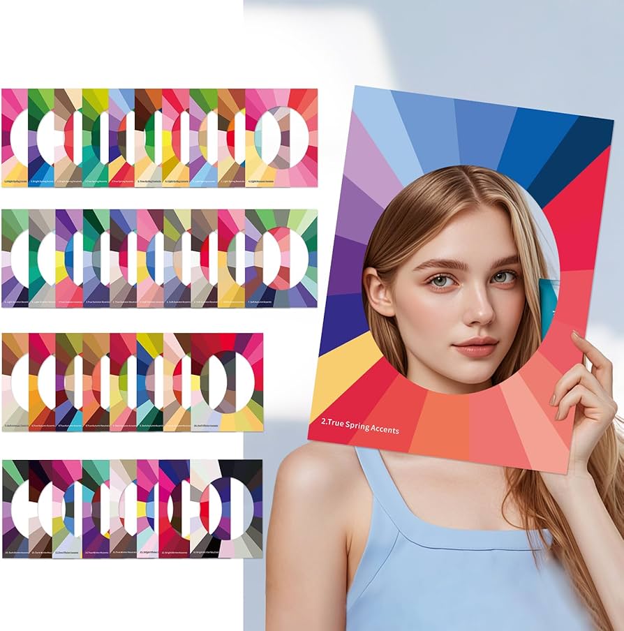
Start by identifying whether you are a Spring, Summer, Autumn, or Winter. This classification depends on your skin's undertone (warm or cool), hair color, and eye color. Use a simple draping test with white fabric versus off-white fabric to see which one brightens your complexion. Tools like Coolors can help you visualize palettes that align with your season, ensuring you stick to colors that naturally enhance your features rather than washing them out.
Next, identify your body shape—whether you are pear, apple, hourglass, rectangle, or inverted triangle. This step focuses on where you carry weight and your shoulder-to-hip ratio. Understanding your silhouette helps you determine which color placements draw attention or create balance. For example, wearing your season's brightest hue on top can balance a pear shape, while darker tones on the bottom can streamline an apple shape.
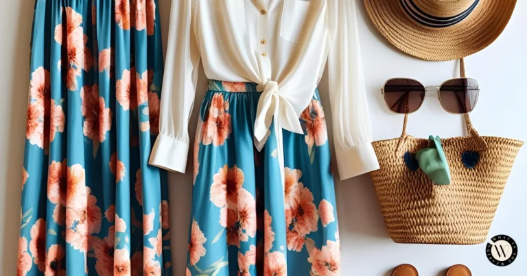
Not all colors work equally well in every garment. Reserve your most vibrant seasonal shades for tops, jackets, and accessories that sit near your face. Use neutral tones from your palette for bottoms and shoes, which are harder to match if the color is slightly off. This approach creates a "capsule" effect where every top works with every bottom, reducing decision fatigue while maximizing style impact.
Build your wardrobe foundation with high-quality staples in your core neutral colors. These include trousers, skirts, and tailored blazers. Then, introduce accent pieces like scarves, belts, or statement jewelry in your secondary seasonal colors. This layering technique allows you to refresh your look seasonally without replacing your entire closet. Focus on fabrics that drape well for your specific body shape to ensure the colors fall correctly.
Finally, try on complete outfits in natural light to see how your seasonal colors interact with your body shape. Take photos to review objectively, checking for any color clashes or proportion issues. Keep a digital or physical wardrobe log to track which combinations receive the most compliments. Over time, this data will help you refine your palette, removing items that don't serve your goals and investing in pieces that do.

As an Amazon Associate, we may earn from qualifying purchases.
Common Color Matching Mistakes to Avoid
Many seasonal palette guides rely on rigid rules that ignore individual body structure. A common error is assuming that "spring" or "autumn" tones automatically suit every skin undertone within that category. This overlooks how contrast levels between hair, skin, and eyes actually dictate which shades create harmony. Instead of forcing a generic seasonal label, look at your natural contrast. High-contrast features often look washed out by muted, low-contrast palettes, regardless of the season.
Another frequent mistake involves ignoring the visual weight of garments. Light, pastel colors can make heavier body frames appear top-heavy if not balanced with structured fabrics. Conversely, very dark, heavy colors can overwhelm petite frames, shrinking the silhouette unnaturally. The goal is balance, not just color temperature. Pairing a deep, rich hue with a tailored cut often works better than a bright, unstructured top.
Finally, avoid trusting online color swatches without physical verification. Screen calibration varies wildly, and what looks like a true "forest green" on one monitor might appear muddy on another. Always test fabrics in natural daylight. This simple check prevents costly returns and ensures the color complements your complexion rather than fighting it.
Color palettes: what to check next
Finding the right seasonal palette for your body shape often raises practical questions about fit, fabric, and versatility. These answers address the most common objections readers face when building a custom wardrobe.
These guidelines help you stick to a cohesive look while remaining flexible with your personal style preferences.
No comments yet. Be the first to share your thoughts!