
Color palettes budget
Building a cohesive wardrobe doesn’t require a luxury budget, but it does demand strategic color selection. The right palette maximizes the versatility of affordable basics, allowing you to mix and match pieces from fast-fashion retailers without looking disjointed. By anchoring your seasonal look in a few well-chosen hues, you can stretch every dollar further.
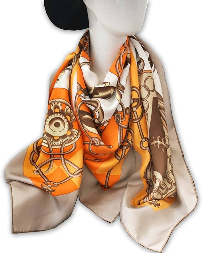
Start with a neutral base—think beige, cream, or soft gray—that works across body shapes and price points. These shades are often available in higher-quality fabrics at mid-range stores, making them worth the slight premium. Then, add one or two seasonal accent colors that complement your skin tone. This approach reduces decision fatigue and ensures that even the cheapest items integrate seamlessly into your existing wardrobe.
When shopping for these accent pieces, look for sales on trend-driven colors like pastel orange or lilac. These shades are less critical to your overall cohesion, so you can take risks with lower-cost items. If a trend fades, the loss is minimal. Conversely, investing in a durable neutral blazer or pair of trousers provides long-term value, regardless of shifting color forecasts.


As an Amazon Associate, we may earn from qualifying purchases.
Shortlist real options
Choosing a seasonal palette isn't about picking a single favorite color; it's about selecting a combination that works together. The 2026 forecast emphasizes body shape trends that favor structure and flow, meaning your color choices need to support those silhouettes. A monochromatic scheme can elongate, while a split-complementary palette adds energy without overwhelming the frame.
We compared the strongest palette types against current design tools and trend reports. The goal is to help you align your wardrobe or design project with the year's most effective visual strategies. Below is a direct comparison of the top contenders.
Palette Comparison
| Palette Type | Visual Effect | Best For | Complexity |
|---|---|---|---|
| Monochromatic | Elongates, streamlined | Structured silhouettes | Low |
| Analogous | Harmonious, natural | Flowing fabrics | Low |
| Complementary | High contrast, bold | Statement pieces | Medium |
| Split-Complementary | Balanced energy | Casual wear | Medium |
Why These Options Work
Monochromatic palettes, like the light blue examples often cited by Figma, create a continuous line that flatters the body. Analogous schemes, such as cream or sage, offer a softer transition that works well with natural textures. Complementary pairs, like maroon and green, draw the eye and add definition to tailored fits. Split-complementary options, such as pastel orange with purple, provide visual interest without the tension of direct opposites.
For those looking to implement these trends, tools like Coolors and Color Hunt offer instant generation of these specific combinations. You can extract colors from images or start with a base hue to ensure your palette remains cohesive throughout the season.
Inspect the expensive parts
Before you commit to a seasonal body shape, check the physical and digital assets that are hardest to replace. A mismatched color palette can make tailored silhouettes look ill-fitting or cheap, regardless of the cut. Use this checklist to catch failures early.
Darker tones in the 2026 forecast absorb more dye and may bleed into lighter accents. Test a hidden seam with a damp white cloth before washing. If dye transfers, the garment will ruin your entire palette on the first wear.
Digital forecasts often oversaturate hues. Compare the digital hex code against a physical swatch or paint chip in natural daylight. Screens can distort warm undertones, making a perfect complementary pairing look muddy in person.
Large-scale prints can overwhelm smaller frames, while tiny patterns may disappear on taller silhouettes. Hold the fabric up to your body to judge the visual weight. The color must support the shape, not fight it.
Ensure the primary palette works with your existing bag and shoe collection. If the new trend clashes with your gold or silver hardware, the garment becomes a lone outlier. Versatility is the true cost saver.


As an Amazon Associate, we may earn from qualifying purchases.
Plan for ownership costs
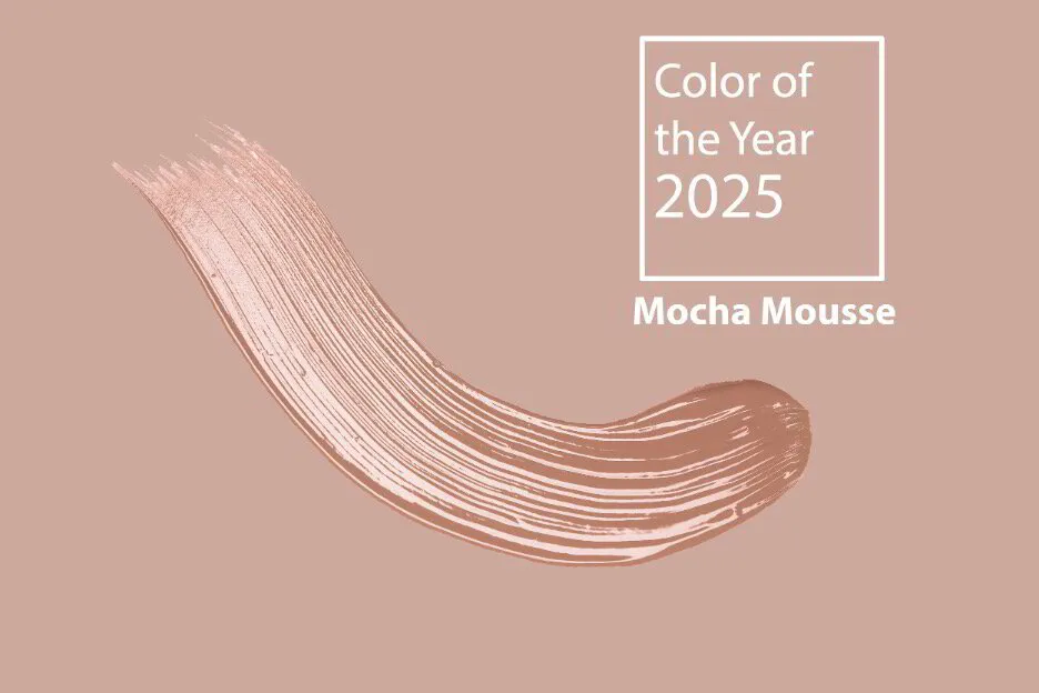
Color palettes are not just about picking shades that look good on a screen or in a magazine. They are also about the long-term commitment of maintaining them. When you commit to a seasonal palette—whether it’s the crisp monochromatic light blues or the warm analogous creams—you are committing to a specific maintenance routine. A cheap buy stops being cheap when the upkeep costs outweigh the initial savings.
Consider the difference between a high-quality, colorfast paint and a budget option. The budget paint might save you $50 upfront, but if it fades or yellows within a year, you are looking at repainting, which involves buying new supplies, time, and labor. Similarly, fashion items in trendy, saturated colors often require special washing or dry cleaning to prevent fading, adding to the annual cost of ownership.
To avoid these surprises, evaluate the total cost of care before you buy. Check the manufacturer’s care instructions for textiles or the warranty and durability ratings for home goods. If a product requires expensive professional cleaning or replacement parts every few months, it is likely a poor value, regardless of its low entry price.
- Long-lasting color retention
- Reduced need for repainting
- Easy application


As an Amazon Associate, we may earn from qualifying purchases.
Color palettes: what to check next
Finding the right seasonal palette is less about guessing and more about matching specific hues to the silhouettes trending in 2026. Whether you are refreshing a wardrobe or updating a brand identity, knowing how to apply these colors ensures your choices feel intentional rather than accidental.
What are examples of color palettes?
Color palettes fall into distinct categories based on how the hues interact. A monochromatic palette uses variations of a single hue, such as light blue shades, offering a cohesive and calming look. Analogous schemes, like cream tones, place colors side-by-side on the color wheel for a natural harmony. Complementary palettes, such as lilac and yellow, create high contrast and energy by pairing opposite colors. Split complementary options, like pastel orange with blue-green, offer contrast without the tension of direct opposites. Square palettes, seen in beige combinations, use four colors evenly spaced for balance, while triadic palettes, like pink with green, provide vibrant variety. Monochromatic greens, such as sage, remain a staple for organic, grounded aesthetics.
How do I match colors to body shape trends?
The key is to use color to either highlight or soften specific areas. Darker, monochromatic shades create a slimming vertical line, making them ideal for tailored silhouettes. Brighter, analogous colors draw the eye to the areas they cover, which works well for statement sleeves or wide-leg trousers. Stick to neutral bases like beige or cream for the main garment, then use a complementary accent color for accessories to break up the visual weight.
Can I use multiple palettes in one outfit?
Yes, but limit yourself to two primary colors from the forecast to avoid visual clutter. Use a neutral base for the majority of the look, then introduce one accent color from the seasonal trend. This approach keeps the outfit structured while still feeling current. If you want to experiment, try a split-complementary scheme where the main color is muted and the accents are slightly brighter.
Where can I find reliable color palette resources?
Tools like Coolors and Adobe Express allow you to generate and preview palettes instantly. You can extract colors from images to ensure your seasonal choices match existing items. Pinterest also offers curated collections for specific aesthetics, such as "white pink blue" combinations. For designers, Figma’s resource library provides detailed breakdowns of palette types and their psychological effects.
No comments yet. Be the first to share your thoughts!