
Find your seasonal color profile
Your seasonal color profile is the foundation of every palette you will build. It tells you which colors make your skin glow and which ones cast shadows or wash you out. The system divides you into four categories—Spring, Summer, Autumn, and Winter—based on three physical traits: your skin undertone, natural hair color, and eye color.
To start, look at your skin in natural daylight. Check the veins on your inner wrist. If they look green, you likely have a warm undertone. If they look blue or purple, you have a cool undertone. If you see a mix of both, you might be neutral. This simple test helps narrow down whether you lean toward the warm seasons (Spring, Autumn) or the cool seasons (Summer, Winter).
Next, consider your natural hair and eye color. Dark hair and dark eyes usually point to Winter or Autumn. Light hair and light eyes often suggest Spring or Summer. However, hair and eyes can change with age or sun exposure, so treat them as supporting clues rather than the final word. Your skin’s reaction to color is the most reliable indicator.
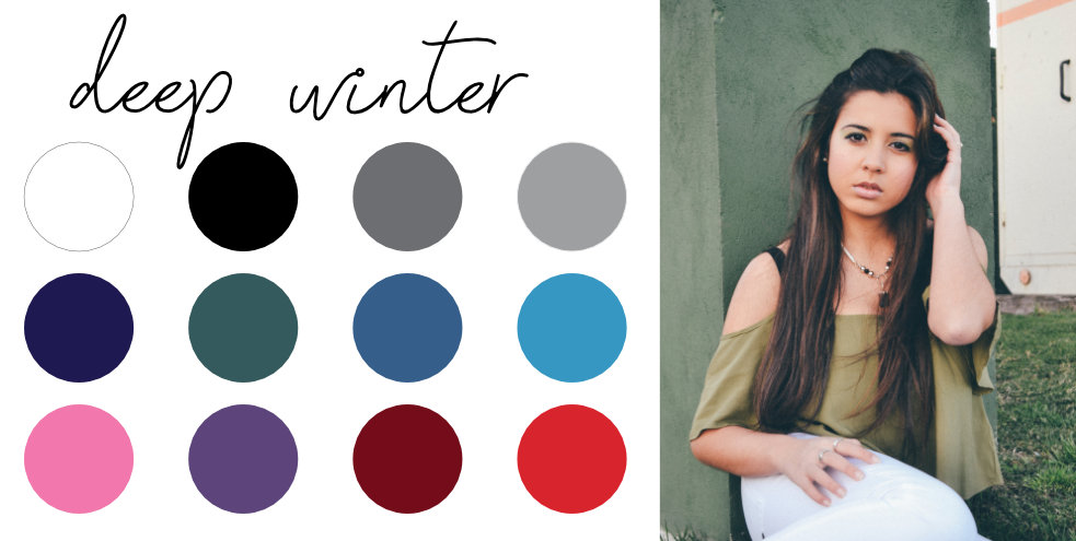
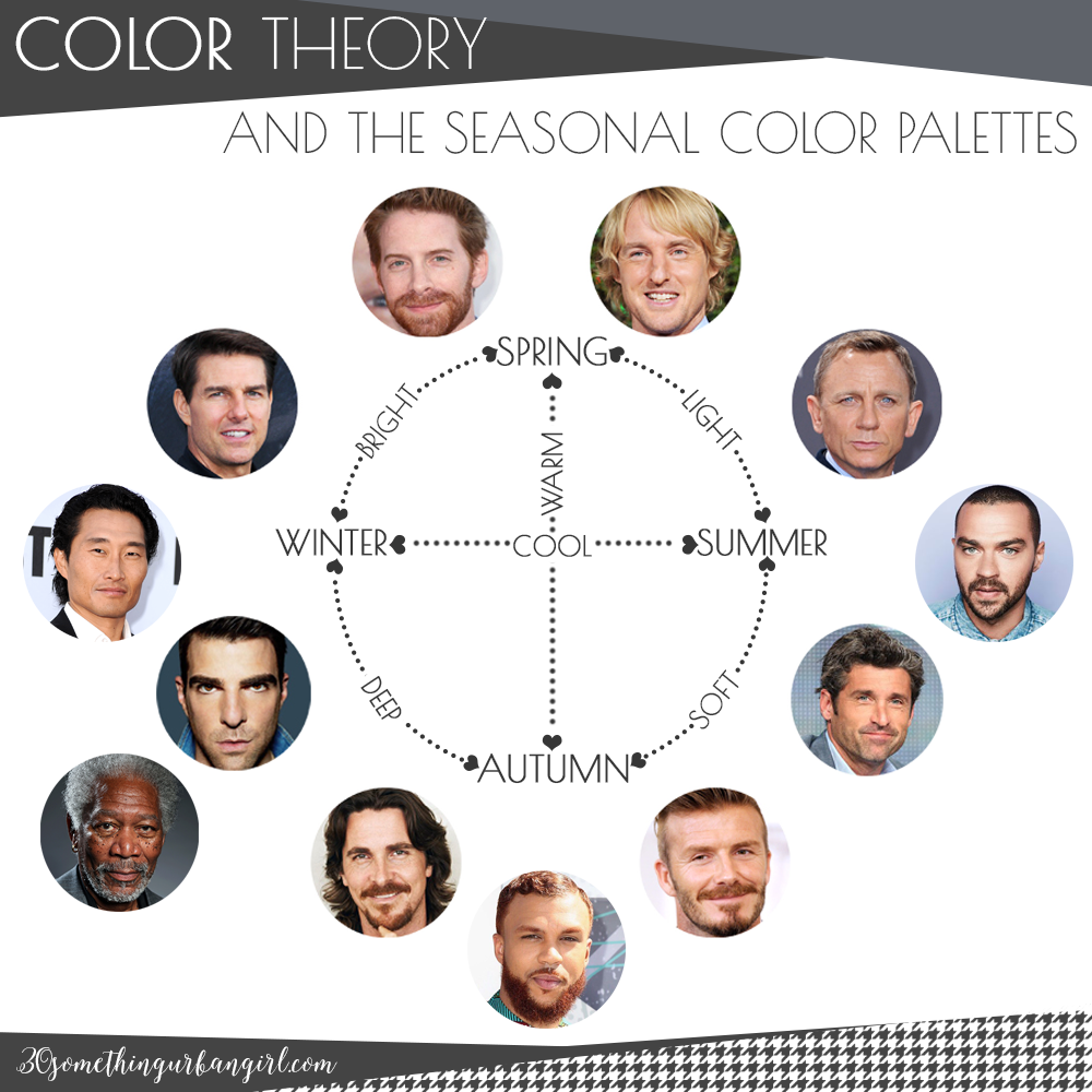
Once you have identified your undertone and dominant features, you can place yourself into one of the four seasons. Each season has a distinct "temperature" and "value" (lightness or darkness). Spring is warm and light. Summer is cool and soft. Autumn is warm and deep. Winter is cool and high-contrast. Understanding these distinctions ensures your color palettes work with your natural coloring, not against it.
Match colors to your skin tone
The goal of a seasonal color palette is to find hues that harmonize with your natural undertones rather than fighting them. When a color aligns with your skin, it acts like a reflector, brightening your complexion and making your features stand out. When it clashes, it can cast shadows, emphasize fatigue, or make your skin look sallow.
Think of your skin as a canvas with a specific temperature. Warm undertones (yellow, peach, golden) pair best with colors that have a warm base. Cool undertones (pink, red, blue) look best in colors with a cool base. Neutral undertones sit somewhere in between and can often wear a mix of both, though usually with a slight preference for one side.
Start by identifying the dominant vein color on your wrist under natural light. If your veins appear green, you likely have warm undertones. If they look blue or purple, you are cool-toned. If you cannot tell or they appear blue-green, you are neutral. This simple test helps narrow down the specific shades within your seasonal palette that will complement you best.
Once you know your undertone, look at the specific colors in your seasonal palette. Warm seasons (Spring and Autumn) thrive in earthy, golden, or creamy hues. Cool seasons (Summer and Winter) shine in jewel tones, icy pastels, and stark contrasts. Avoid colors that are the opposite of your undertone, as they will create a visual disconnect that draws attention away from your face.
Test palettes against natural daylight
Color perception shifts dramatically under different lighting conditions. Artificial indoor light often casts a yellow or blue tint that distorts how your seasonal palette appears. To truly evaluate your colors, you must test them in natural daylight, ideally near a north-facing window where the light is consistent and diffused.
Bring a selection of fabrics or garments from your potential palette into this light. Hold each item up to your face, starting with your neck. Observe how your skin tone reacts. Do the colors make your complexion look vibrant and even? Or do they emphasize redness, dark circles, or sallowness? Your eyes and hair should also appear brighter, not duller.
Common color mistakes to avoid
Even with a well-researched seasonal palette, small styling errors can dull your natural glow. The goal of color analysis is harmony, not just wearing "safe" colors. Below are the most frequent missteps people make when applying their seasonal palette to everyday outfits.
Wearing black when it isn't in your palette
Black is a universal staple, but it can be harsh on cool or light seasons. For Soft Summers and Light Springs, stark black creates a heavy contrast that washes out the skin, making you look tired rather than polished. If you must wear black, place it away from your face or pair it with a lighter scarf or necklace to soften the impact.
Ignoring undertone temperature
A common error is choosing a color because you like it, without checking if it matches your undertone. For example, a Warm Autumn with golden undertones might try on a bright, cool-toned fuchsia. While the color is vibrant, it clashes with your natural warmth, creating visual discord. Always test colors against your jawline in natural light to see if they harmonize or compete with your skin.
Choosing the wrong shade intensity
Seasonal analysis isn't just about hue; it's about value and chroma. A Deep Autumn can handle high-contrast, saturated colors, but a Soft Summer needs muted, dusty tones. Wearing bright, clear colors when you are a Soft season can overwhelm your features, making them appear small or faded. Stick to the muted or soft versions of your palette colors to maintain balance.
Clashing with accessories
Your jewelry and accessories should complement your palette, not fight it. Cool seasons look best in silver and white gold, while warm seasons shine in gold and bronze. Mixing metals or wearing plastic accessories that don't align with your season can break the harmony of your outfit. Keep your accessories in the same temperature family as your clothing for a cohesive look.
Build your seasonal wardrobe checklist
A color palette is only useful if you can apply it to the clothes you already own. Use this audit to edit your closet and guide future purchases. Focus on items that harmonize with your specific seasonal undertones.
The Essentials Audit
Start with the foundation pieces. These items appear most often in your daily rotation, so they must align perfectly with your skin tone and hair color.
- Tops and Blouses: Check if your neutrals (white, black, navy, beige) make your complexion look washed out or vibrant.
- Bottoms: Ensure pants and skirts in your core colors create a clean line without clashing with your top.
- Outerwear: Coats and jackets are significant color blocks. If your main winter coat clashes with your palette, it will throw off every outfit underneath it.
The Edit Process
Go through your closet item by item. Hold each piece against your face in natural light. If the color makes you look tired or highlights imperfections, set it aside. Do not donate immediately; store these items in a box for three months. If you don't reach for them, let them go.
Shopping for Gaps
Once you have edited your closet, identify the missing pieces. Use your seasonal color palette as a strict filter when shopping. Stick to the approved colors for new purchases to ensure every new item integrates seamlessly with your existing wardrobe.
-
Remove items that clash with your seasonal palette
-
Keep neutrals that brighten your complexion
-
Identify missing core pieces for future shopping
-
Store questionable items for 3-month trial
No comments yet. Be the first to share your thoughts!