
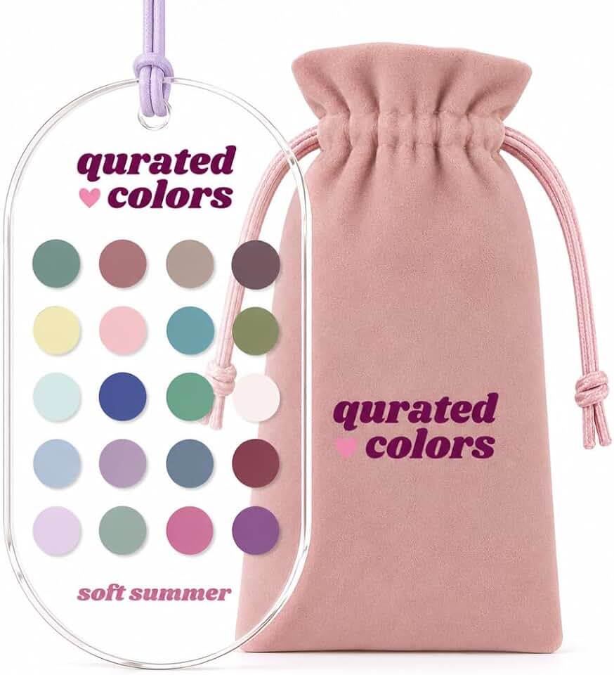
Identify your seasonal palette
Color analysis helps you determine which hues complement your natural skin tone, eye color, and hair. By identifying your specific seasonal category—such as Soft Summer, Deep Autumn, or Bright Spring—you can build a wardrobe that harmonizes with your physiology rather than fighting it. This process relies on observing how your body reacts to different drapes of fabric under neutral lighting.
Follow this sequence to narrow down your four-season group.
Look at the veins on the inside of your wrist in natural daylight. If they appear blue or purple, you likely have cool undertones. If they look green or olive, you have warm undertones. If you see a mix of both or cannot tell, you are neutral. This is the first filter that splits you into warm or cool families.
Hold a piece of silver jewelry and a piece of gold jewelry against your neck. Cool undertones usually look sharper and brighter with silver, while warm undertones glow with gold. If neither stands out, or if both look equally good, you may be neutral. High contrast between your hair, skin, and eyes often points toward Winter or Autumn, while low contrast suggests Summer or Spring.
Use a white cotton t-shirt and a cream or beige shirt. If white washes you out or makes you look tired, but cream enhances your complexion, you are warm. If white brightens your face and cream makes you look dull, you are cool. This drape test confirms whether you belong to a warm season (Spring/Autumn) or a cool season (Summer/Winter).
Once you have your season, you can refine it further. For example, if you are cool and high-contrast, you are likely a Winter. If you are cool and low-contrast, you are a Summer. Warm seasons split similarly: high contrast points to Autumn, while low contrast points to Spring. Tools like Colorwise can help you visualize these drapes digitally if you prefer a guided approach.
Filter 2026 trends through your palette
Adapting broad trend colors to your specific seasonal palette ensures that what looks good on a runway actually looks good on you. The goal is not to reject trends, but to translate them into shades that harmonize with your natural undertones.
Start by identifying the core 2026 trend color—such as a specific shade of blue, green, or neutral. Then, find the equivalent tone within your seasonal palette. If the trend is too bright or too dark for your season, look for a muted or softened version of that hue that aligns with your palette’s temperature and value.
Compare trend colors across seasons
The same trend color can appear drastically different depending on the season. Use this comparison to see how 2026’s key shades translate.
| Season | Trend Blue | Trend Green | Trend Neutral |
|---|---|---|---|
| Spring | Sky Blue | Ivory Green | Warm Camel |
| Summer | Powder Blue | Sage Green | Soft Taupe |
| Autumn | Teal | Olive Green | Terracotta |
| Winter | Royal Blue | Emerald Green | Jet Black |
Adjust for intensity
If a trend color is too vibrant for your season, reduce its intensity. For example, if you are a Summer and the trend is a bright turquoise, choose a softer, grayish-blue instead. This keeps you on-trend without clashing with your natural coloring.
Check the undertone
Ensure the trend color’s undertone matches your season. Warm seasons (Spring, Autumn) should look for yellow-based versions of trends, while cool seasons (Summer, Winter) should look for blue-based versions. This small adjustment makes a significant difference in how polished your outfit appears.
Final check
Before committing to a trend piece, hold it up against your face in natural light. If the color washes you out or makes you look tired, it is not the right fit for your palette, regardless of how trendy it is.
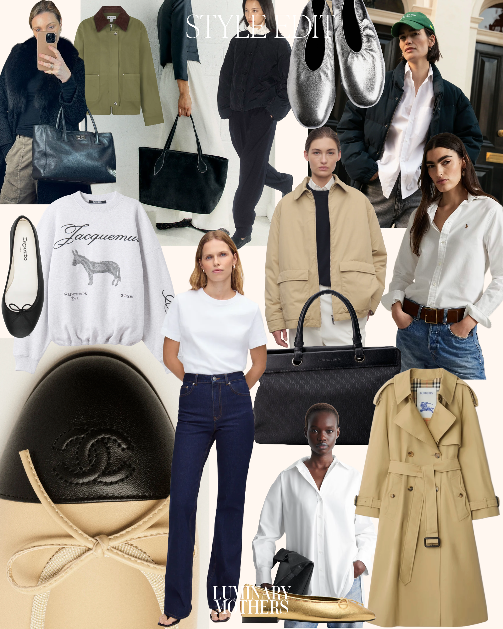
Build a cohesive 2026 capsule wardrobe
A color analysis identifies your optimal palette, but a capsule wardrobe ensures those colors work together daily. The goal is to select core pieces that align with your seasonal palette while adhering to current 2026 silhouettes. This approach reduces decision fatigue and maximizes outfit variety from fewer items.
Start by auditing your current closet. Remove anything that clashes with your identified seasonal colors or no longer fits the desired silhouette. Keep only items that serve as versatile foundations—blazers, trousers, and simple tops—in your core palette shades.
Next, identify gaps in your wardrobe. Look for missing neutrals or statement pieces that match your palette. Prioritize high-quality fabrics that drape well and maintain their shape, as these are the backbone of a functional capsule. Avoid fast-fashion trends that may fade quickly or conflict with your color harmony.
Finally, assemble your capsule. Aim for 10-15 core pieces that mix and match effortlessly. Ensure each item complements at least three others in your collection. This creates a cohesive look that feels intentional and polished, regardless of the occasion.
Select accessories and makeup accents
Accessories and beauty products act as the finishing layer of your color analysis wardrobe. They allow you to integrate seasonal trends without disrupting the harmony of your base palette. Because these items sit close to your face, choosing shades that align with your seasonal palette ensures your complexion remains bright and balanced.
Build a neutral accessory foundation
Start with bags, belts, and shoes in your neutral tones. These items anchor your outfit and provide a stable canvas for trendier pieces. For spring and summer types, lean toward warm neutrals like camel, cream, or soft tan. Autumn and winter palettes benefit from cooler neutrals such as charcoal, navy, or black. This approach keeps your wardrobe versatile while maintaining color integrity.
Introduce trend colors strategically
Use accessories to test trending colors before committing to clothing. A scarf, hat, or handbag in a current trend shade lets you assess how the color interacts with your skin tone. If the trend clashes with your palette, it will stand out awkwardly against your neutral base. If it harmonizes, you can confidently incorporate that color into larger garments later.
Choose makeup that complements your palette
Your makeup should enhance, not fight, your natural coloring. Lipsticks and eyeshadows in your seasonal palette create a cohesive look that makes your features pop. For example, warm-season types often look best in peach or terracotta tones, while cool-season types shine in berry or plum shades. This alignment prevents the "washed out" effect that occurs when makeup clashes with your undertones.


As an Amazon Associate, we may earn from qualifying purchases.
Common color analysis mistakes to avoid
Color analysis is not an exact science. As noted in early foundational texts like Color Me Beautiful, the process is about finding harmony, not hitting a rigid target. However, treating it as a rigid rulebook leads to costly mistakes, especially when chasing fast-fashion trends.
The most frequent error is ignoring lighting conditions. Store lighting is designed to sell, not to reveal truth. Fluorescent lights can wash out warm tones, making a flattering golden yellow look gray and dull. This distortion leads shoppers to reject their best colors and buy items that only look good under artificial store lights. Always test colors in natural daylight, not store lighting.
Another major pitfall is assuming your "season" is static. Skin tone changes with age, sun exposure, and health. A shade that worked in your twenties may clash with your complexion in your thirties. Color analysis is a baseline, not a permanent tattoo. Re-evaluate your palette every few years to ensure your wardrobe still complements your current natural features.
Finally, avoid buying entire outfits in your "best" color. Monochromatic looks can appear flat or overwhelming. Instead, use your seasonal palette to select accents—scarves, bags, or shoes—that brighten your face while keeping the rest of your outfit neutral. This approach maximizes the impact of your analysis without requiring a complete wardrobe overhaul.
Frequently asked questions about seasonal trends
Color analysis and annual fashion forecasts operate on different timelines. Personal color analysis identifies the hues that harmonize with your natural skin tone, hair, and eyes. These colors remain consistent regardless of what is trending in stores.
Fashion trends shift every season based on cultural and economic signals. While a trend might feature a specific shade of blue, your personal palette determines which version of blue looks best on you. You can adapt a trend by choosing the shade that aligns with your season.
If a trending color clashes with your palette, you can still participate in the trend through accessories or makeup. This allows you to stay current without compromising your natural appearance.
No comments yet. Be the first to share your thoughts!