
Prepare your neutral lighting
The single most common reason home color analysis fails is poor lighting. Artificial bulbs, window glare, and colored walls act as filters, shifting how your undertones appear. To get a true reading, you must control the light source before you ever touch a fabric drape.
Natural daylight is the gold standard for color analysis. It contains a full spectrum of light that renders colors accurately. If you can, perform your analysis near a large window facing north. North-facing light is consistent, indirect, and lacks the warm or cool bias found in east or west sunlight. If north light isn't available, use indirect daylight from any direction, but avoid direct sunlight hitting your face, which creates harsh shadows and washes out details.
If natural light is unavailable, you must rely on artificial lighting with specific technical requirements. You need high-CRI (Color Rendering Index) bulbs that mimic daylight. Look for bulbs labeled "daylight" or "full spectrum" with a color temperature between 5000K and 6500K. Avoid warm white (2700K-3000K) bulbs, which add a yellow cast and make warm undertones appear more dominant. Avoid cool white bulbs (4000K+ but not daylight), which can exaggerate blue undertones.
Eliminate all ambient color pollution. The walls, ceiling, and clothing you wear during the analysis will reflect onto your skin, altering your perceived tone. Wear a neutral white or gray shirt with no patterns or logos. Close blinds or curtains to block outside colors like green lawns or red brick buildings. Ideally, the room should have white or neutral gray walls. If you must analyze in a colored room, sit in a corner where reflected color is minimized.
Once the environment is set, ensure your face is clean and free of makeup. Foundation, blush, and bronzer mask your natural undertones, leading to incorrect draping recommendations. Wash your face with a gentle cleanser and wait ten minutes for your skin to return to its natural state. This neutral baseline allows the lighting to interact with your true complexion, providing the clear, unbiased data needed for accurate analysis.
Drape warm and cool fabrics to find your undertone
Color analysis begins with determining your undertone, which is the hidden hue beneath your skin's surface. Most people fall into one of two categories: warm or cool. Identifying this baseline allows you to select colors that harmonize with your natural coloring rather than fighting against it.
The most reliable method is the fabric drape test. This technique uses neutral-colored textiles to reflect light onto your face, revealing how your skin reacts to specific wavelengths. By comparing the effects of warm and cool shades, you can see which tones brighten your complexion and which ones cast shadows or emphasize imperfections.
Step-by-step draping process
Reading the results
Your undertone is determined by which fabric makes you look more alive. If the warm fabric (gold/orange) makes your skin glow and your eyes look brighter, you likely have a warm undertone. If the cool fabric (silver/blue) has the same effect, you have a cool undertone.
It is common to feel neutral if neither extreme works perfectly. In this case, look for the fabric that causes the least amount of discoloration or shadowing. Some people have a mix of both, but one usually dominates. Trust your immediate visual reaction rather than trying to analyze it logically.
Once you have identified your undertone, you can move on to determining your seasonal palette. This next step involves testing value and contrast, but knowing whether you are warm or cool narrows down your options significantly.
Test contrast and value depth
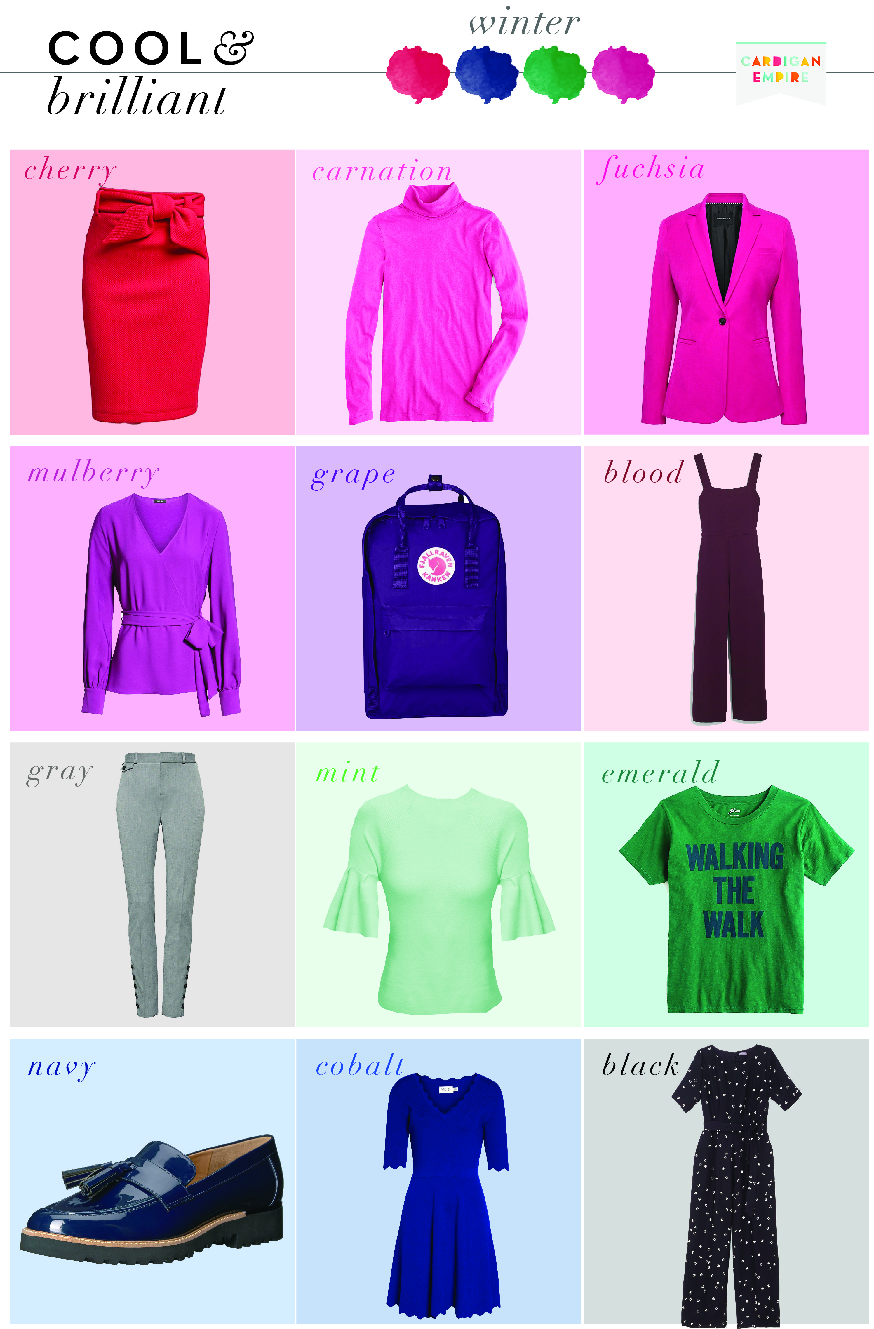
The final step in your home color analysis is determining your seasonal palette by measuring the contrast and value depth between your hair, skin, and eyes. This contrast level helps distinguish seasons that might otherwise look similar, such as Soft Autumn from True Autumn, or Winter from Summer.
Contrast refers to the difference in lightness and darkness between your features. High contrast means a sharp difference (e.g., dark hair and pale skin), while low contrast means your features blend together more softly (e.g., medium brown hair and medium beige skin). Value depth refers to how light or dark your overall coloring appears.
To assess this, look at yourself in natural light without makeup. Compare the darkness of your hair roots to the lightness of your inner wrist skin. Then, compare your iris color to your sclera (the white part of your eye). If the difference is stark, you likely have high contrast. If your features merge into a single tonal family, you have low contrast.
Comparison of Seasonal Contrast Profiles
Use this table to see where your features fit based on the combination of undertone and contrast.
| Season | Undertone | Contrast Level | Visual Example |
|---|---|---|---|
| Winter | Cool | High | Dark hair, pale skin, bright eyes |
| Summer | Cool | Low | Ashy blonde/gray hair, soft pink skin, muted blue eyes |
| Autumn | Warm | Medium to High | Copper/red hair, golden skin, hazel/green eyes |
| Spring | Warm | Medium | Golden blonde/light brown hair, peachy skin, bright blue/green eyes |
Applying the Comparison
Once you have identified your contrast level, you can narrow down your season. For example, if you have cool undertones and high contrast, you are likely a Winter. If you have warm undertones and low contrast, you are likely a Soft Autumn. This method reduces the ambiguity of color analysis by focusing on the structural relationships between your features rather than just individual colors.
Final Verification
After determining your season, verify it by testing a few key colors. A Winter should look better in pure white and black than in cream or beige. A Soft Autumn should look better in muted olive or dusty rose than in bright red or stark black. If the test colors make your complexion look dull or sallow, you may need to adjust your contrast assessment.
Verify with your best colors
Now that you’ve identified your season, it’s time to prove it. Theoretical analysis can feel abstract until you see how specific shades interact with your actual skin tone. This final validation step moves you from guessing to knowing by using high-contrast swatches to confirm your diagnosis.
1. Test the foundation tones
Start with the neutral base of your palette. For Winters, this means stark whites and true blacks; for Springs, warm creams and soft yellows. Hold these fabrics against your bare face in natural daylight. If your skin looks even and your features stand out clearly, you’re on the right track. If your skin appears sallow or gray, you’ve likely picked the wrong undertone.
2. Check the accent colors
Next, test the vibrant or muted accents specific to your season. A Summer might test soft blue, while a Fall tests burnt orange. Look for the "pop" effect. Your best colors should make your eyes sparkle and your complexion look fresh. If you look tired or washed out, that color is not your best fit, regardless of the season label.
3. Final verification checklist
Before you commit to a wardrobe overhaul, run through this quick mental check. If you fail any of these, revisit your season classification.
- Skin Tone: Does my skin look even and healthy?
- Eyes: Do my eyes pop with more definition?
- Complexion: Do I look rested, or do I look tired?
- Teeth: Do my teeth appear whiter by contrast?
See it in action
Visual confirmation often clears up lingering doubts. Watch this breakdown of the common pitfalls in home color analysis to ensure you’re not misinterpreting shadows or lighting effects.
Build confidence with swatches
Once you’ve validated your best colors, create a physical or digital swatch kit. This becomes your reference guide for shopping. Instead of guessing whether a new shirt works, you’ll have a concrete standard to compare it against. This simple tool eliminates buyer’s remorse and ensures every item in your closet truly serves you.
Common draping mistakes to avoid
Even with the right lighting, small errors can lead you to the wrong season. Personal color analysis relies on comparing your natural complexion against a fabric, so anything that alters your skin’s true tone will skew the result.
The most frequent error is testing with makeup on. Foundation, concealer, and powder mask your natural undertones, making warm skin look neutral or cool skin look warm. Similarly, heavy blush or bronzer changes the temperature of your cheeks, confusing the eye. For an accurate seasonal identification, strip your face back to basics.
Another common pitfall is using dyed hair as a reference point. If your hair color has been artificially altered, it no longer reflects your natural pigment depth. This can make you misjudge whether you belong in a high-contrast season like Winter or a low-contrast season like Summer. Ideally, test with your natural hair color, or pull your hair back tightly so it doesn’t reflect onto your face.
Finally, avoid testing in artificial yellow light. Incandescent bulbs cast a warm glow that makes everything look golden, leading many to incorrectly identify as Autumn or Spring. Natural daylight remains the only reliable source for seeing true color harmony.
No comments yet. Be the first to share your thoughts!