
Find your seasonal color season
Determining your seasonal color season is the foundation of building color palettes that flatter your natural features. This process identifies how your skin undertones, eye color, and hair shade interact with light. The goal is to find a "season"—Spring, Summer, Autumn, or Winter—that mirrors your natural contrast level and temperature. When you wear colors from your season, your complexion appears clearer, and your eyes look brighter.
Start by checking your skin’s undertone in natural daylight. Look at the veins on your inner wrist. If they appear blue or purple, you likely have cool undertones. If they look green or olive, you have warm undertones. If you can’t tell or see both, you might be neutral. This simple test helps narrow down your options before you assess contrast levels.
Next, assess your contrast level. Compare your hair, skin, and eye colors. High contrast means dark hair against light skin or vice versa. Low contrast means your features blend together with similar tones. Your season is determined by the combination of temperature (warm vs. cool) and contrast (high vs. low).
Warm Spring
Warm Spring individuals have a light, golden, or peachy undertone. Their hair is often strawberry blonde, golden brown, or light red. Eyes are typically bright blue, green, or hazel. This season thrives in clear, warm colors like coral, peach, and golden yellow. Avoid muddy or dark colors, which can wash out their fresh appearance.
Warm Autumn
Warm Autumn features have a rich, golden, or olive undertone. Hair ranges from deep auburn to dark brown. Eyes are often brown, hazel, or deep green. This season looks best in earthy, warm tones like olive green, rust, mustard, and chocolate brown. These colors complement the depth and warmth of their natural coloring.
Cool Summer
Cool Summer individuals have a pink, red, or blue undertone. Hair is usually ash blonde, ash brown, or soft gray. Eyes are typically soft blue, gray, or muted green. This season shines in soft, cool colors like lavender, powder blue, and soft pink. Avoid bright, warm colors like orange or gold, which can clash with their delicate features.
Cool Winter
Cool Winter features have a cool, blue, or pink undertone. Hair is often black, dark brown, or stark white. Eyes are typically dark brown, black, or piercing blue. This season looks striking in crisp, cool colors like pure white, black, royal blue, and emerald green. High contrast colors enhance their natural intensity and clarity.
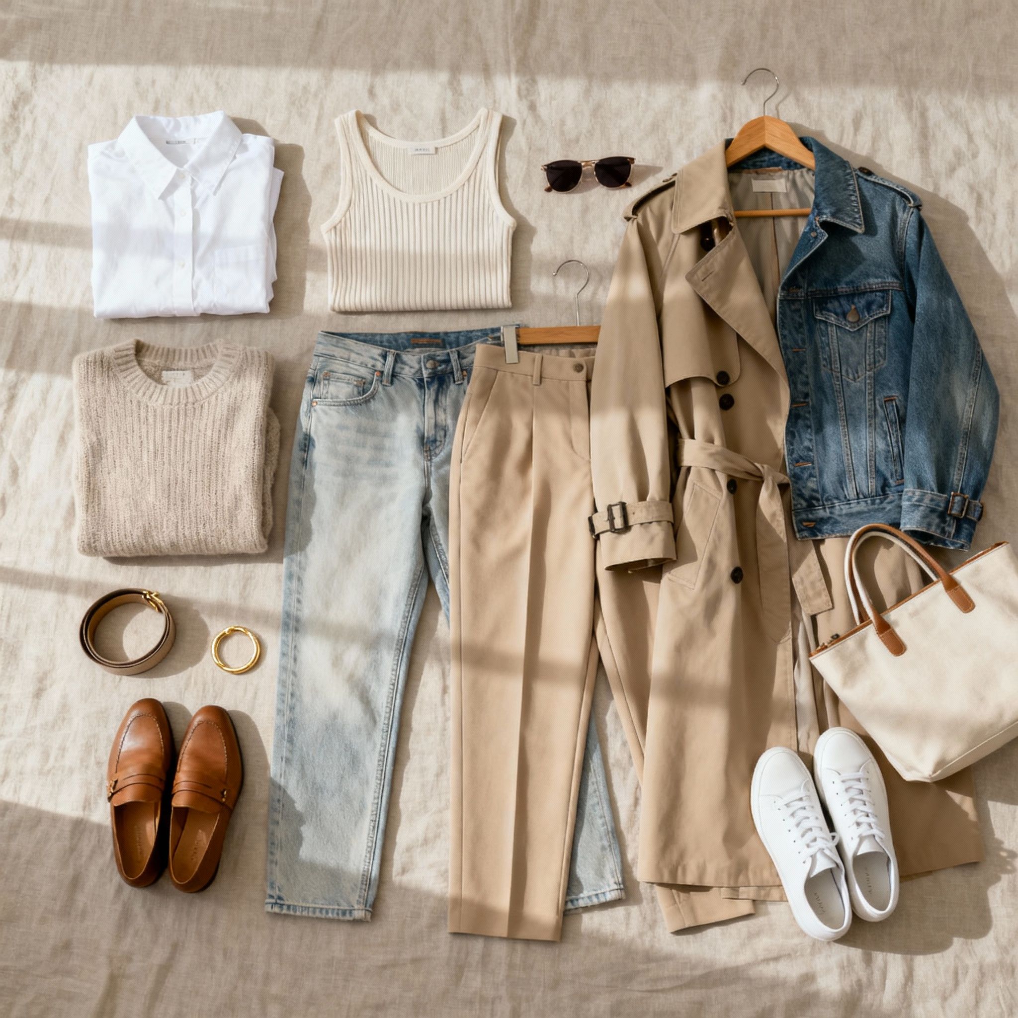
Select core colors for your palette
Your season determines the temperature and contrast level of your best colors, but within that framework, you need to pick the specific hues that will form your daily uniform. Think of your color palette as a curated gallery: you want a few anchor pieces (neutrals) and several accent works that bring energy without overwhelming the room. For your body type, the goal is to find hues that harmonize with your skin’s undertone and eye color, creating a natural glow rather than a stark contrast.
Start by identifying your primary neutral. This is the color you will wear closest to your face most often, such as a blouse, jacket, or sweater. If you are a Spring, this might be camel or warm ivory; for a Summer, it could be soft grey or navy; Autumn often shines in olive or chocolate brown; and Winter typically commands black, pure white, or deep charcoal. Choose one or two neutrals that make your skin look rested and clear.
Next, select your accent colors. These are the hues that appear in skirts, pants, or accessories. They should share the same temperature (warm or cool) and chroma (clear or muted) as your season. For example, a Summer’s palette might include dusty rose and slate blue, while a Winter’s might feature true red and royal blue. Avoid colors that are too close to your skin tone if they clash with your undertone, as this can wash you out.
To visualize this, consider how these colors work together in a cohesive outfit. The right combination creates a seamless flow from your face to your feet, making you look put-together without effort. Use tools like Coolors or Adobe Color to test combinations, but always trust your eyes in natural light.
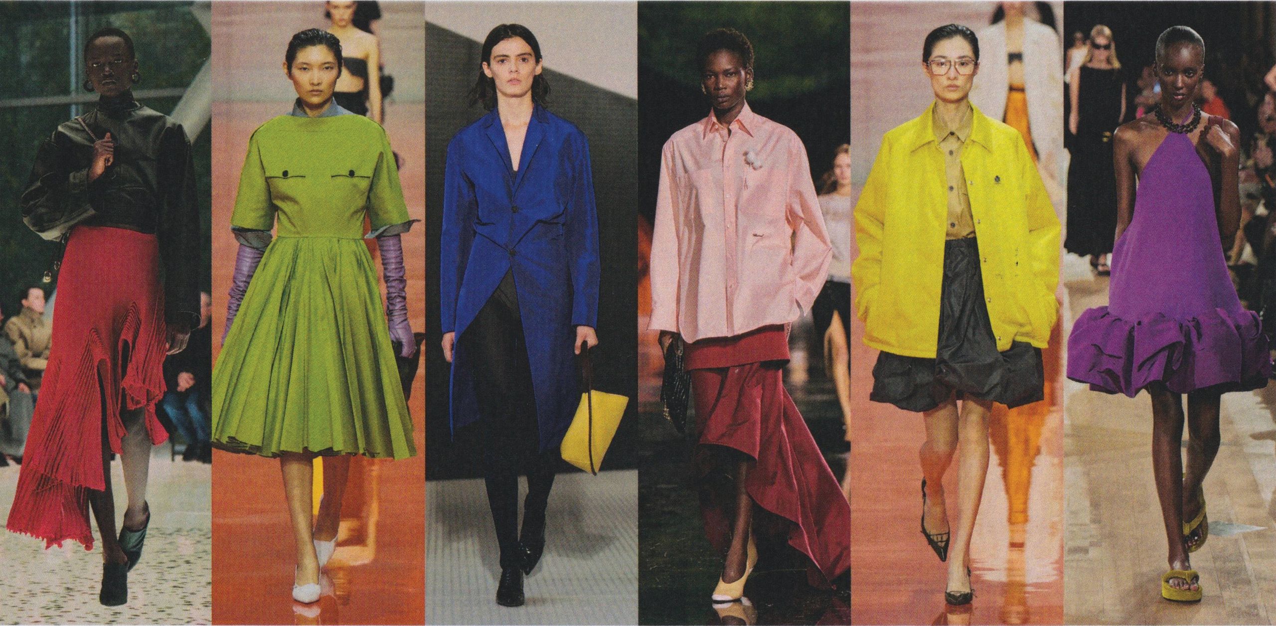
Adjust palettes for body shape
Color palettes do more than match your skin tone; they interact with your silhouette. By manipulating the intensity and placement of colors, you can guide the eye, create the illusion of balance, and highlight your favorite features. Think of your wardrobe as a canvas where color acts as both structure and shadow.
Strategic color placement
Darker shades naturally recede, making them ideal for areas you might want to minimize or visually slim. Conversely, brighter and more saturated colors attract attention, drawing the eye to specific zones. The goal isn't to hide your body but to harmonize your palette with your natural proportions.
For example, if you have an hourglass shape, you might use a bold, high-contrast palette to emphasize your waist, while keeping sleeves and legs in more neutral, receding tones. If you are aiming for a streamlined look, a monochromatic palette in darker shades creates a continuous vertical line, elongating the frame.
Balancing proportions
Placement matters as much as hue. Wearing a bright color on top and a dark color on the bottom balances a pear-shaped silhouette by drawing attention upward. Similarly, using a vibrant color for bottoms can ground a rectangular shape, adding visual weight where you want it.
Consider the "color blocking" technique: pair two distinct colors at the waist or hips to break up the vertical line intentionally. This can create the appearance of curves or add structure where the body is straighter. The key is to place your most intense palette colors where you want the viewer to look first.
| Body Shape | Primary Strategy | Recommended Placement | Visual Effect |
|---|---|---|---|
| Pear | Balance shoulders | Brights on top, darks on bottom | Draws eye upward |
| Apple | Elongate torso | Monochromatic vertical lines | Creates length |
| Hourglass | Highlight waist | High contrast at waistline | Emphasizes curves |
| Rectangle | Add dimension | Color blocking at hips/waist | Creates shape |
| Inverted Triangle | Soften shoulders | Dark tops, bright bottoms | Balances lower half |
Practical application
Start by identifying one area you want to emphasize and one you want to soften. Choose a palette where the "active" color (the one you want to highlight) is at least 20% lighter or more saturated than the "receding" color. Test this by holding up garments or digital swatches to see how the contrast affects your perceived proportions in a mirror or photo.
Remember, these are guidelines, not rules. Personal style often overrides strict proportion theory. Use these principles as a starting point to experiment with your color palettes, adjusting intensity and placement until the combination feels both authentic and flattering.
Test colors with natural light
A color palette that looks perfect on a screen or in a store’s harsh fluorescent lighting can look dull or washed out in everyday life. To ensure your chosen palettes truly flatter your body type, you need to see them under the same conditions you’ll wear them most often: natural daylight.
Natural light reveals the true undertones of fabric and makeup. It shows whether a blue makes your skin look healthy or gray, and if a beige complements your complexion or clashes with it. This step is your final quality check before committing to a wardrobe or updating your digital design assets.
Stand near a north-facing window if possible. North light is consistent, cool, and shadow-free, making it the best standard for evaluating color accuracy. If you only have south-facing windows, avoid direct noon sunlight, which can wash out colors and make it hard to see subtle undertones.
Hold the fabric swatch or your digital color palette mockup directly against your face, away from your body. Look at your reflection in a mirror, not at the screen. Focus on the area around your eyes and jawline. Do you look tired? Does your skin look sallow? Or does the color seem to lift your features and even out your skin tone?
Observe how the color interacts with your natural features. A good match should create a harmonious balance, not a harsh contrast that draws attention away from your face. If the color makes your eyes pop or your teeth look whiter, you’ve found a winner. If it creates shadows under your eyes or makes your skin look uneven, it’s likely the wrong shade for your body type.
This practical test removes the guesswork. By verifying your color palettes in real-world lighting, you ensure that every piece you buy or design will work hard to make you look your best, not just in theory, but in the mirror every morning.
Build a capsule wardrobe guide
Building a capsule wardrobe around your color season requires a clear sequence: define the constraint, compare the realistic options, test the tradeoff, and choose the path with the fewest hidden costs. That order keeps the advice usable instead of decorative.
After each step, pause long enough to check whether the recommendation still fits the reader's actual situation. If it depends on perfect timing, unusual access, or a best-case budget, include a simpler fallback.
The simplest way to use this section is to write down the real constraint first, compare each option against it, and choose the path that still works outside ideal conditions.
Common color mistakes to avoid
Even with a clear seasonal profile, it is easy to misstep when building a wardrobe. The most frequent error is treating black as a default neutral. While dark and cool seasons can often wear black, warm seasons usually look better in deep navy, charcoal, or forest green. Black can sometimes wash out warm undertones or create a harsh contrast that overwhelms the face.
Another trap is ignoring the value of a color. A shade might be the "perfect" hue for your season, but if it is too light or too dark for your natural contrast level, it will clash rather than complement. For example, a high-contrast person might look better in a bold, saturated red than a muted, dusty rose, even if both are technically warm colors.
Finally, avoid buying color palettes based solely on trends. A palette that looks stunning on a model with different skin tone and hair color may not work for you. Always test colors against your face in natural light before committing to a piece. If a color makes your skin look dull or your features disappear, it is not the right fit, regardless of how popular it is.
No comments yet. Be the first to share your thoughts!