

Why 2026 color palettes matter for your wardrobe
Color trends shift every season, but 2026 brings a specific focus on earthy tones and soft pastels that complement a wide range of skin undertones. These aren't just decorative choices; they are functional tools for styling. The right hues can brighten your complexion, balance your silhouette, and make your natural features pop without the need for heavy makeup or complex layering.
Choosing colors based on your body type and skin tone is like selecting the right frame for a painting. A cool-toned palette might wash out warm skin, while the wrong contrast level can flatten your features. By aligning your clothing with your natural coloring, you create a cohesive look that feels effortless and intentional.
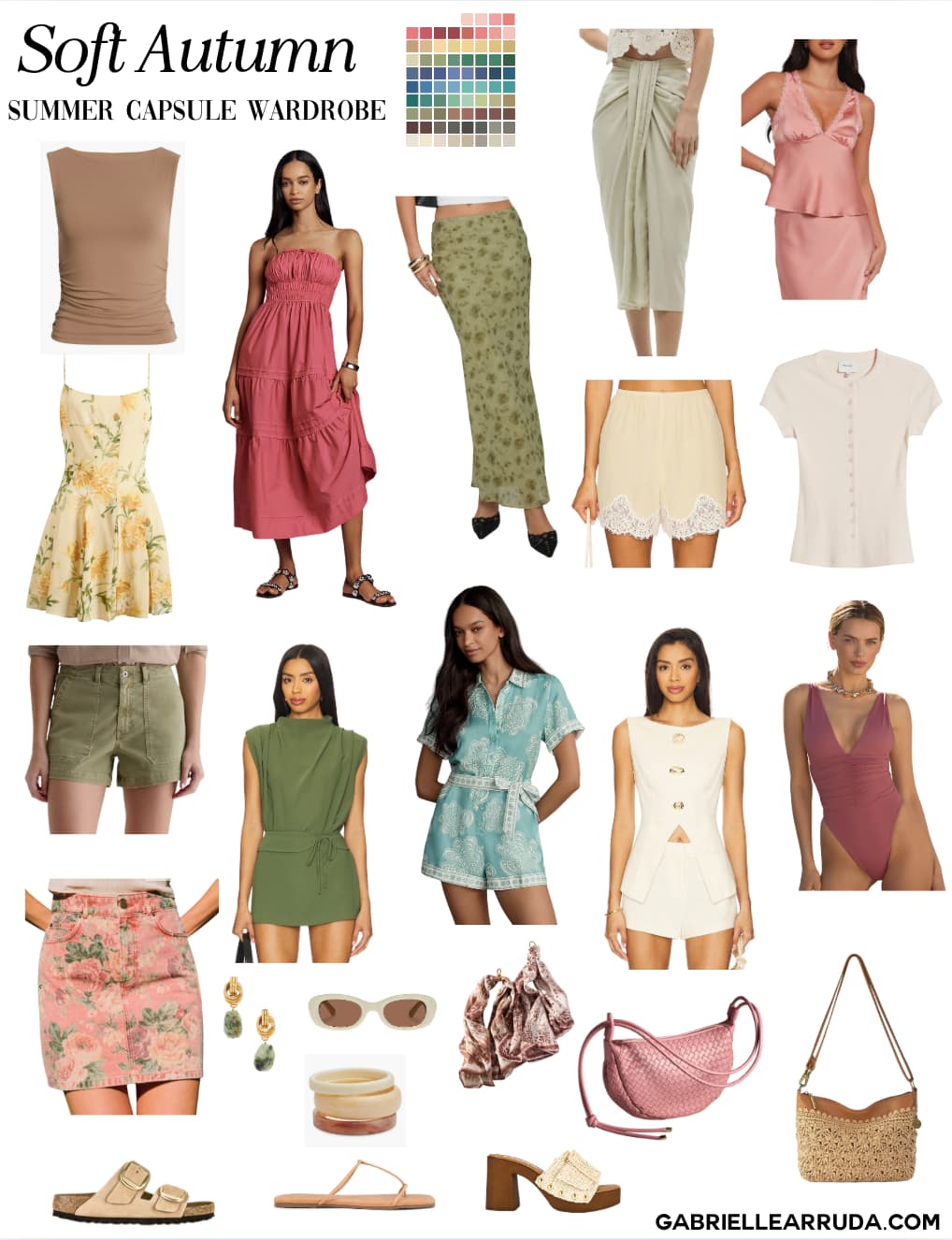
This approach moves beyond generic advice. It’s about understanding how specific shades interact with your unique physiology. Whether you have a cool, warm, or neutral undertone, the new palette offers options that enhance your natural glow rather than competing with it.
Warm earth tones for pear and hourglass shapes
Warm earth tones like terracotta, mustard, and olive act as a balancing force for pear and hourglass figures. These hues draw the eye upward, creating a visual anchor near the shoulders and waist. By wearing these colors in tops, jackets, or scarves, you emphasize your upper body, which naturally balances the proportions of a narrower waist and wider hips.
Terracotta is a rich, reddish-brown that adds warmth without overwhelming the frame. Use it in a structured blazer or a fitted turtleneck to highlight the shoulder line. Mustard yellow offers a pop of energy that works well in silk blouses or knitwear, pulling attention to the face and neck. Olive green provides an earthy, grounding contrast that pairs beautifully with darker denim or tailored trousers, keeping the lower half sleek while the upper half remains vibrant.
For hourglass shapes, these warm tones accentuate the natural curve of the waist. A terracotta wrap dress or a mustard satin camisole paired with high-waisted olive trousers creates a harmonious flow. The key is to keep the lower body in neutral or darker shades, allowing the warm upper colors to do the work of balancing the silhouette. This approach ensures the eye travels smoothly from the vibrant top to the streamlined bottom, celebrating the body’s natural proportions.
Cool jewel tones for apple and rectangle builds
Deep, saturated hues act like visual tailoring for apple and rectangle body types. In 2026, cool jewel tones—emerald, sapphire, and amethyst—provide the high contrast needed to create structure where the body might lack natural definition. These colors draw the eye inward, offering a sophisticated alternative to the black often relied upon for slimming effects.
Emerald green serves as a powerful anchor for apple shapes. Because it is a cool, dark tone, it recedes visually, minimizing the appearance of the midsection. Pair an emerald wrap dress with a V-neckline to break up the torso's expanse. The deep saturation adds richness without overwhelming the frame, creating a focal point that feels intentional rather than corrective.
Sapphire blue offers similar benefits for rectangles seeking curves. This cool, intense blue creates a sharp silhouette that can be softened with texture or layering. A structured sapphire blazer over a lighter camisole adds dimension to the shoulders and waist, giving the illusion of an hourglass figure. The cool undertones complement fair to medium skin tones, enhancing clarity around the face.
Amethyst purple brings a regal touch to rectangle builds. Its cool, violet base provides enough depth to define the waistline without the harshness of black. Use amethyst in tailored pieces, such as a pencil skirt or a fitted tunic, to add visual weight to the hips. This balance helps create the curves that rectangle bodies often lack, resulting in a harmonious, elongated line.
Soft pastels for inverted triangle and petite frames
Use this section to make the Color Palettes decision easier to compare in real life, not just on paper. Start with the reader's actual constraint, then separate must-have requirements from details that are merely nice to have. A practical choice should survive normal use, maintenance, timing, and budget. If a recommendation only works in an ideal situation, call that out plainly and give the reader a fallback path.
The simplest way to use this section is to write down the must-have criteria first, then compare each option against those criteria before weighing nice-to-have features.
How to test if a palette suits your skin tone
Finding the right 2026 color palette for your body type starts with your skin undertone. Colors that harmonize with your natural undertones will brighten your complexion, while clashing hues can make you look tired or washed out. This test helps you determine whether warm, cool, or neutral shades will enhance your features.
Hold your hand up to a window with natural daylight. Look at the veins on the inside of your wrist. If they appear blue or purple, you likely have cool undertones. If they look green or olive, you probably have warm undertones. If you can’t tell or see both, you likely have neutral undertones.
Notice which metal looks better against your skin. Silver and platinum usually complement cool undertones by matching their blue-pink hues. Gold and brass tend to flatter warm undertones by echoing their golden-yellow bases. If both metals look equally good, your neutral undertones can handle a wide range of 2026 seasonal hues.
Hold a white cotton shirt and a cream-colored blouse near your face in natural light. If white makes your skin look brighter and cream makes you look dull or sallow, you are likely cool-toned. If cream brightens your complexion and white makes you look gray or tired, you are likely warm-toned. This fabric test is the most reliable way to confirm your palette.
No comments yet. Be the first to share your thoughts!