
The new rules of remote style
Remote work changed how we dress for the job. For decades, office life relied on a strict uniform to signal status and competence. Now that most of our interactions happen through a 1080p webcam, those old rules don't quite apply, but the impression we leave still matters.
This isn’t to say that anything goes. The idea that pajamas are acceptable for client meetings is, for most industries, a miscalculation. Instead, we’re seeing a shift towards a more nuanced understanding of 'digital presence.' How you appear on video calls, in online presentations, and even in your profile pictures now carries significant weight. Color, as a powerful form of nonverbal communication, plays a surprisingly large role in shaping those first impressions.
I believe intentionality is key. While comfort is important, so is projecting an image that aligns with your professional goals. The goal isn’t to replicate the office dress code exactly, but to translate its underlying principles – respect, competence, trustworthiness – into a virtual environment. It’s about understanding how color impacts perception and using that knowledge to your advantage. We’re entering an era where personal style meets professional necessity, and understanding that intersection is crucial.
How color actually works on screen
Color psychology is often oversimplified. It's not simply that red equals energy and blue equals calm. The impact of color is far more nuanced, influenced by shade, saturation, and context. A pale, dusty rose will evoke a very different feeling than a vibrant magenta, despite both being 'pink.' Similarly, a navy blue suit communicates something different than a bright cerulean shirt.
Research consistently shows that colors influence our perceptions of trustworthiness and competence. A 2010 study published in the Journal of Personality and Social Psychology found that participants perceived individuals wearing blue as more trustworthy than those wearing other colors. While this isn't a universal rule, it highlights the subtle power of color in shaping initial judgments. Color combinations are also important; a high-contrast pairing can signal confidence, while a monochromatic scheme can convey sophistication.
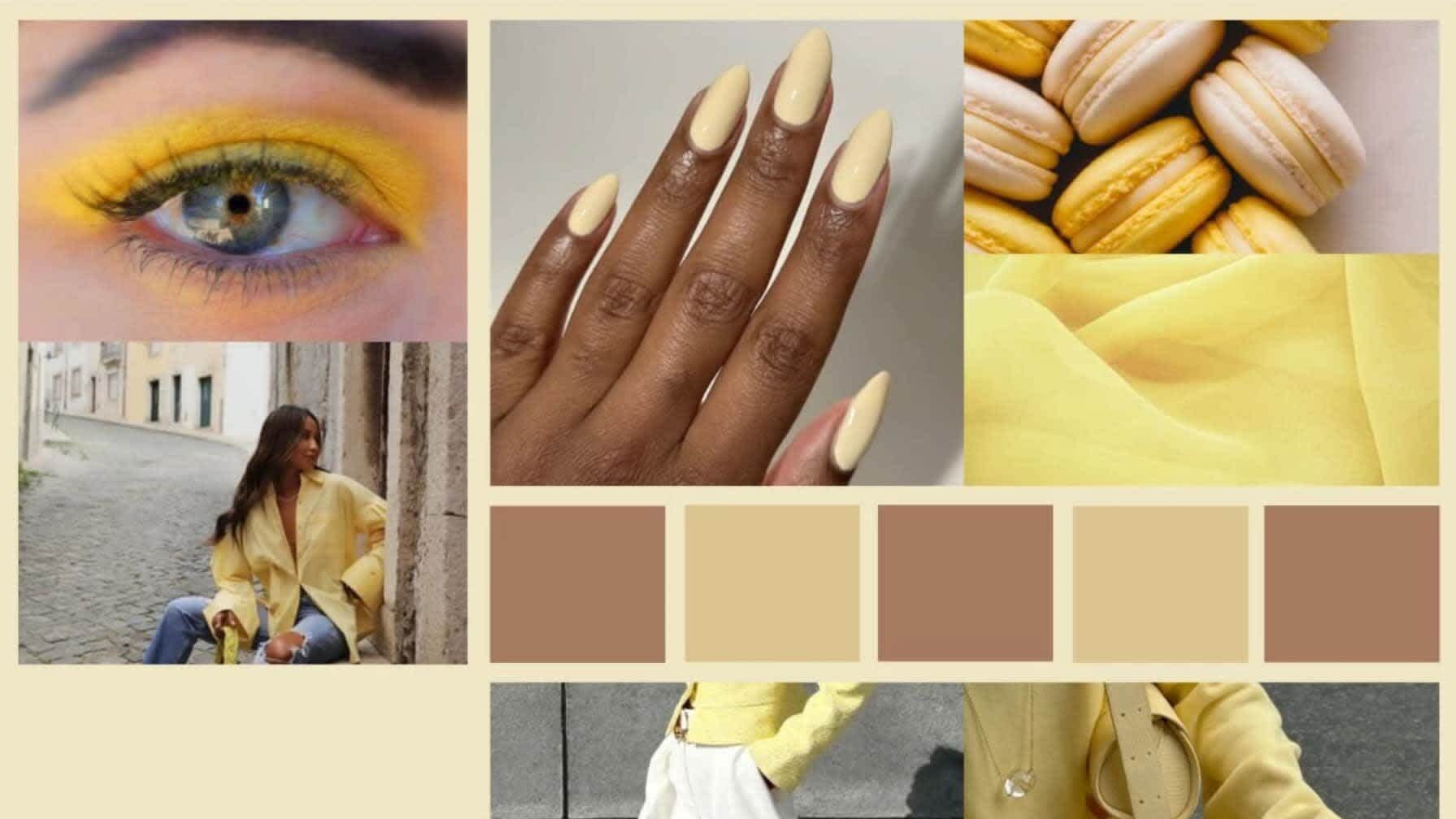
Approachability matters as much as authority. If you look too stiff, people might hesitate to ping you for a quick question. Muted oranges or yellows make you look more open, though going too bright can look a bit casual for a board meeting. It's about finding a middle ground that fits your specific role.
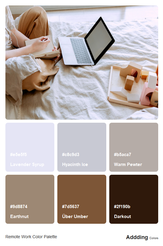
Color palettes for 2026
Looking ahead to 2026, several color trends are emerging as particularly relevant for the hybrid workplace. Coolors.co is currently showcasing palettes that lean towards both grounding neutrals and optimistic brights, reflecting a desire for stability combined with a sense of hope. These trends aren’t arbitrary; they’re often a response to broader cultural and economic shifts.
Here are four palettes to consider:
Confident Neutrality: This palette centers around earth tones – warm grays, creams, olive greens, and terracotta. It evokes a sense of stability, reliability, and understated sophistication. This is ideal for roles requiring a high degree of trust and authority, such as finance, law, or management. Think of a well-tailored blazer in charcoal gray or a cream-colored blouse.
Digital Optimism: Dominated by blues, teals, and accented with pops of bright yellow or coral, this palette conveys innovation, creativity, and forward-thinking energy. It suits roles in technology, marketing, and design. A cobalt blue sweater or a teal-colored top can project a sense of confidence and competence.
Creative Energy: Featuring muted purples, oranges, and yellows, this palette is ideal for those in creative fields. It signals originality, passion, and a willingness to take risks. This doesn’t mean wearing neon – think more along the lines of a lavender cardigan or a mustard-colored scarf.
Sophisticated Depth: Based on navy, burgundy, and forest green, this palette exudes elegance, maturity, and trustworthiness. It’s well-suited for roles requiring a sense of gravitas, such as consulting or academia. A navy blazer or a burgundy dress can make a powerful statement.
Professional Color Palettes
- Serene Blue - Evokes trust, calmness, and intelligence. Projects approachability and competence. A muted, dusty blue (think Benjamin Moore’s ‘Smoke’ 2122-40) is particularly effective.
- Confident Charcoal - Communicates authority, sophistication, and strength. A deep, neutral charcoal gray (like Behr’s ‘Graphic Charcoal’ N520-6) is versatile and impactful.
- Warm Terracotta - Projects creativity, warmth, and grounded energy. This earthy tone (similar to Sherwin-Williams’ ‘Cavern Clay’ SW 7701) is inviting and demonstrates a collaborative spirit.
- Dynamic Olive Green - Suggests growth, harmony, and balance. It’s a modern, approachable alternative to navy, offering a sense of reliability (consider PPG’s ‘Olive Sprig’ PPG-1137).
- Polished Camel - Radiates optimism, capability, and accessibility. A light-to-medium camel tone (like Pantone’s 14-1316 TPX Buttercream) conveys a sense of put-togetherness without being overly formal.
- Focused Burgundy - Conveys passion, power, and ambition, but with a touch of approachability. A deep, wine-inspired burgundy (such as Benjamin Moore’s ‘Dinner Party’ 2070-30) can be very commanding.
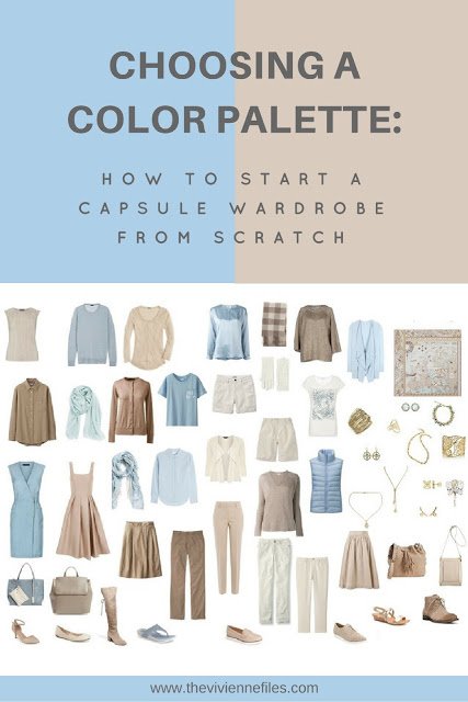
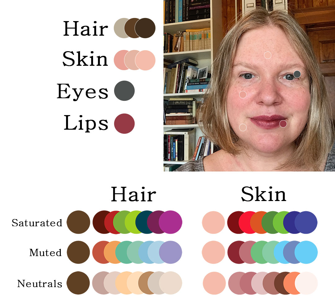
Color & Body Type: Finding Your Harmony
Color analysis isn’t about following rigid rules; it’s about understanding how different colors interact with your natural coloring and body shape to create visual balance. The traditional seasonal color analysis – Winter, Spring, Summer, Autumn – can be a useful starting point, but it’s important to adapt those principles for the realities of remote work. We’re often seen from the chest up on video calls, so focusing on colors that complement your skin tone and hair color is especially important.
For example, someone with warm undertones (Autumn or Spring) might find that earthy colors like olive green and terracotta enhance their complexion. Conversely, someone with cool undertones (Winter or Summer) might look best in blues, grays, and purples. The goal isn’t to 'flatter' in a superficial way, but to create a harmonious overall look. This is also about understanding how color can draw the eye – a bright color can accentuate a feature, while a darker color can minimize it.
I encourage experimentation. Try different color combinations and see what makes you feel confident and comfortable. Don't be afraid to break the 'rules' if it feels right for you. Consider your overall proportions – a bold color can balance a broader frame, while a more subdued palette can create a sense of length. Ultimately, the best color for you is the one that makes you feel your best.
Virtual Backgrounds & Color Coordination
A uniquely remote work challenge is coordinating your clothing with your virtual background. A clashing color combination can be visually jarring and distracting. The key is to create a cohesive look that doesn’t overwhelm the viewer. Think of your virtual background as another element of your outfit.
Generally, it’s best to avoid wearing the same color as your background. If you have a neutral background, you have more flexibility with your clothing choices. However, if your background is a bright color, opt for a more subdued outfit. For example, if you're using a virtual office background with a lot of blue, avoid wearing a blue shirt.
Lighting and camera angle also play a role. Ensure you have adequate lighting to avoid shadows that can distort colors. Experiment with different camera angles to find the most flattering view. A well-lit and thoughtfully coordinated look will project professionalism and attention to detail.
- Step 1: Choose your virtual background.
- Step 2: Select clothing in a complementary color.
- Step 3: Test the combination under different lighting conditions.
Professional Color 'Do's and Don'ts'
Here’s a quick guide to help you navigate the world of professional color in remote work. These aren’t hard-and-fast rules, but rather helpful suggestions to keep in mind.
Do: Use color to emphasize your best features. A strategically placed pop of color can draw attention to your face or highlight your eyes. Don't: Overdo bright colors on video calls – they can be distracting and overwhelming. Do: Consider your industry's culture. A more conservative industry might require a more subdued palette. Don't: Be afraid to experiment, but always prioritize professionalism. A little creativity is good, but avoid anything that could be perceived as unprofessional.
Beyond the Palette: Accessories & Details
Accessories and details are the finishing touches that can elevate your professional look. A well-chosen piece of jewelry, a stylish scarf, or even a pair of glasses can add personality and polish. Don’t underestimate the power of these small elements.
Consider your virtual accessories as well. A Zoom background can be a subtle way to express your style, but be mindful of color coordination (as discussed earlier). A professional-looking profile picture is also essential – it’s often the first impression you make on potential clients or colleagues.
Ultimately, the goal is to create a cohesive and polished look that reflects your professionalism and attention to detail. Pay attention to the small things – they can make a big difference. A thoughtful approach to accessories and details demonstrates that you care about your presentation and take your work seriously.
What's Your Remote Work Color Personality?
The rise of hybrid work has blurred the lines between professional and personal life, and even extends to how we present ourselves on camera. Color psychology suggests that what we wear can influence both our own mindset and how others perceive us. This quick quiz will help you discover a starting color palette that aligns with your work style, communication preferences, and core values, setting you up for success in the 2026 hybrid workplace.
No comments yet. Be the first to share your thoughts!