
Beyond the Seasons: Gen Z's Color Shift
For decades, fashion has followed seasonal color analysis, assigning people to 'Springs,' 'Summers,' 'Autumns,' and 'Winters' based on skin tone, hair, and eye color to determine flattering shades. Gen Z is breaking these rigid rules, embracing a fluid, personalized approach to color driven by self-expression and a rejection of prescriptive style guidelines.
Social media platforms like TikTok and Instagram are driving this shift. Influencers and users showcase a wide range of colors, mixing shades previously deemed 'off-limits' for their season. This exposure normalizes experimentation and encourages breaking free from traditional constraints. The hashtag #coloranalysis is now often used to deconstruct the system, not just adhere to it.
The traditional system has limitations, struggling to categorize individuals with complex undertones or those who don't fit neatly into the four seasonal boxes. Historically, it favored lighter complexions, leaving many feeling excluded. Gen Z demands inclusivity and a nuanced understanding of color that celebrates diversity.
The Problem with 'Your Season'
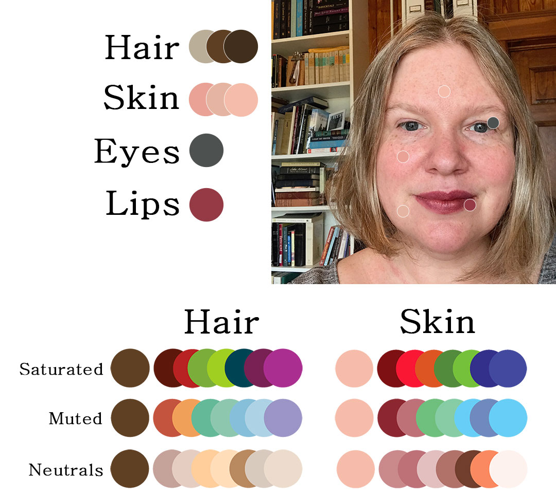
The issue with traditional seasonal color analysis isn't coordinating colors to complexion, but its presentation. It focuses on surface appearance—hair, skin, and eyes—without adequately considering undertones. These subtle hues beneath the skin’s surface are more impactful in determining which colors harmonize with your natural coloring.
The system overlooks personal preferences and the transformative power of makeup and hair color. Someone identified as a 'Winter' might adore warm, earthy tones, and a hair color change could dramatically alter their best shades. The emphasis on a fixed 'season' can feel restrictive and discourage exploring colors they genuinely love. Feeling comfortable with your choices is important.
Historically, the system has been criticized for its biases. Early development often centered around European phenotypes, leading to inaccurate assessments for people of color. While not inherently flawed, it's crucial to acknowledge its exclusionary aspects and approach it critically.
Undertones: The New Foundation
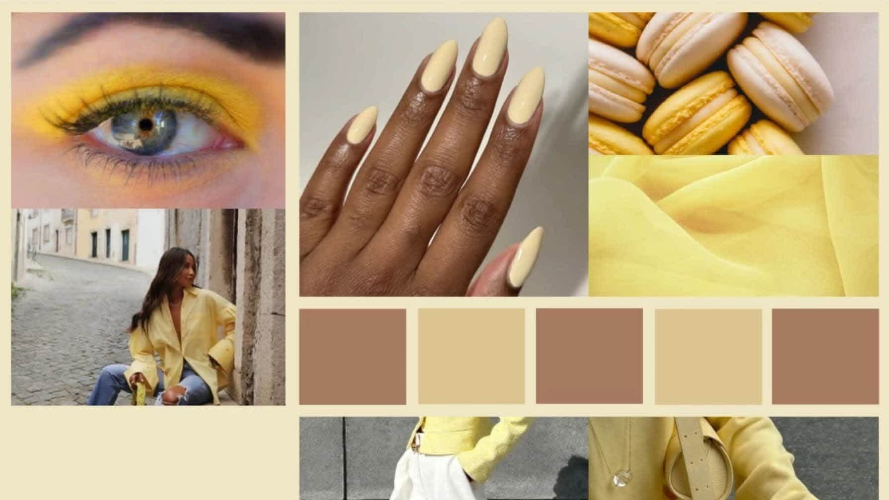
Forget the seasons. The key to unlocking your best colors lies in understanding your true undertone. There are four primary undertones: warm, cool, neutral, and olive. Identifying yours is the first step and more reliable than assigning yourself to a season. This is where many people get tripped up – it’s more than just whether you tan easily.
Simple tests can help determine your undertone. The vein test involves examining the color of veins on your wrist. Blue or purple veins typically indicate a cool undertone, while green veins suggest a warm undertone. If it’s difficult to tell, you likely have a neutral undertone. The jewelry test can also be revealing: do you look better in silver or gold? Silver generally complements cool undertones, while gold flatters warm undertones.
Hold up white and off-white fabrics next to your face. If off-white looks better, you likely have a warm undertone. If pure white is more flattering, you likely have a cool undertone. Undertones can subtly shift with sun exposure, lifestyle changes, and age. What might have been a predominantly cool undertone in your youth could become more neutral over time.
Color Harmony: Beyond the Wheel
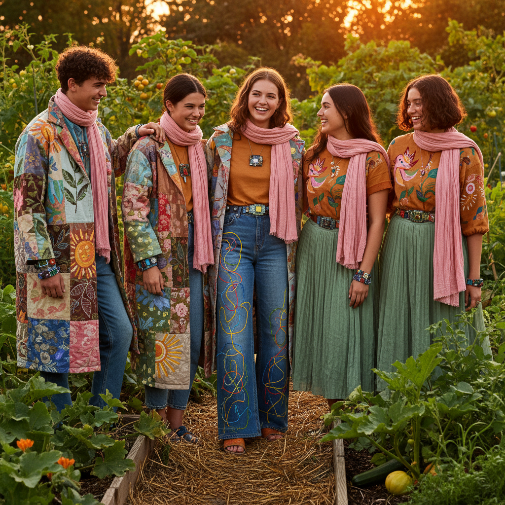
Understanding color harmony principles—complementary (opposites on the color wheel), analogous (colors next to each other), triadic (three equally spaced colors)—is still valuable, but Gen Z is rewriting the rules of color combination. The emphasis is less on strict adherence and more on experimentation and individual expression.
We’re seeing a surge in color blocking, where bold, contrasting colors are intentionally paired together. Think electric blue with vibrant orange, or hot pink with lime green. Clashing colors, once a fashion faux pas, are now embraced as a statement. This rejects the idea that colors must "match" conventionally.
Gen Z understands color is a powerful tool for expressing individuality and mood. They use color to make a statement, challenge norms, or express how they’re feeling. This willingness to experiment with unconventional pairings sets their approach to color apart.
Body Type & Color: A Nuanced Relationship
Color Posh’s body type guides offer advice on dressing to flatter your shape, and color can play a supportive role. This isn’t about "hiding’ or ‘correcting" perceived flaws, but about creating visual balance and enhancing your overall silhouette.
For example, someone with a rectangle body type might use color blocking to create the illusion of curves. A darker color on the sides and a brighter color in the center can visually widen the waistline. Someone with a pear shape might use darker colors on the lower body to minimize that area and brighter colors on the upper body to draw attention upwards. The guides for rectangle, pear, and apple body types offer a starting point.
The key is to use color strategically to create harmony and proportion. Don’t be afraid to experiment and find what works best for you. These are simply guidelines, not hard and fast rules. Ultimately, the most important thing is to wear colors that make you feel confident and comfortable.
Color & Body Type Styling Principles for 2026
| Color Family | Body Type | Styling Principle | Garment Suggestion |
|---|---|---|---|
| Bright Red | Rectangle | Create Curves & Define Waist | A-line red dress with a defined belt, or a red blazer paired with wide-leg trousers and a tucked-in blouse. |
| Navy Blue | Pear | Balance Proportions & Draw Attention Upward | Navy peplum top to accentuate the waist, or a navy wrap dress. Avoid overly tight skirts. |
| Olive Green | Apple | Create Vertical Lines & Define the Torso | Olive green utility jacket worn open over a dark top, or an olive green shirt with strategic draping. Avoid boxy shapes. |
| Pastel Pink | Hourglass | Enhance Curves & Highlight Waist | Fitted pastel pink wrap dress, or a pastel pink top tucked into high-waisted jeans. Focus on garments that follow the natural waistline. |
| Mustard Yellow | Rectangle | Add Warmth & Create Illusion of Shape | Mustard yellow cardigan layered over a contrasting camisole, or wide-leg mustard trousers paired with a fitted top. |
| Deep Teal | Pear | Add Sophistication & Balance Lower Body | Deep teal color-blocked top with darker bottoms, or a teal jacket that hits just above the widest part of the hips. |
| Terracotta | Apple | Define Upper Body & Draw Attention to Face | Terracotta-colored tunic top with a V-neckline, or a terracotta blazer worn open to create a vertical line. |
| Lavender | Hourglass | Enhance Femininity & Highlight Curves | Lavender fitted knit dress, or a lavender blouse paired with a pencil skirt. Utilize fabrics that drape well. |
Illustrative comparison based on the article research brief. Verify current pricing, limits, and product details in the official docs before relying on it.
Gen Z Style Icons: Breaking the Mold
Gen Z celebrities and influencers are challenging traditional color rules. Olivia Rodrigo, for example, mixes vintage-inspired pastels with edgier, darker tones, creating a unique and unpredictable aesthetic. She pairs lavender with black leather, defying expectations and embracing contrast.
Billie Eilish, known for her bold and unconventional style, utilizes neon colors and unexpected color combinations. She uses color to express her personality and challenge societal norms. Bad Bunny pairs vibrant hues with oversized silhouettes and gender-fluid designs.
These style icons set trends. They demonstrate that fashion is about self-expression and individuality, not adhering to outdated rules. They prove anyone can pull off any color with confidence.
- Olivia Rodrigo: Pastel and dark tone mixes.
- Billie Eilish: Neon colors and unconventional pairings.
- Bad Bunny: Vibrant hues with gender-fluid designs.
Style Influencers & Color Aesthetics
- Bella Poarch - Known for her playful, often hyper-saturated looks, Bella frequently mixes traditionally 'contrasting' colors like neons with pastels. She often incorporates bright pinks, electric blues, and lime greens, defying the typical seasonal boundaries. Instagram: @bellapoarch
- Wisdom Kaye - Wisdom’s style is characterized by a masterful blending of textures and a willingness to experiment with unexpected color combinations. He regularly pairs earth tones with vibrant jewel tones, and isn't afraid to wear colors typically associated with different seasons simultaneously. Instagram: @wisdm
- Emma Chamberlain - Emma's aesthetic leans towards comfortable, everyday wear, but she consistently subverts expectations with her color choices. She's known for pairing muted, 'Autumn' shades like olive green and rust with brighter, 'Spring' colors like lavender and coral. Instagram: @emmachamberlain
- Noah Beck - Noah’s style incorporates a lot of streetwear and athletic wear, and he frequently utilizes color-blocking with shades that wouldn't traditionally be considered harmonious. He often mixes cool grays with warm oranges and yellows. Instagram: @noahbeck
- Addison Rae - Addison often embraces a 'soft girl' aesthetic, but frequently incorporates bolder, unexpected colors into her looks. She’s been seen pairing traditionally 'Winter' shades like icy blues and charcoal grays with warmer 'Summer' tones like peach and coral. Instagram: @addisonrae
- Khaby Lame - While often opting for minimalist styles, Khaby uses color strategically. He frequently incorporates pops of bright, saturated colors like cobalt blue or cherry red against a neutral base, demonstrating that impactful color doesn’t always require complex combinations. TikTok: @khaby.lame
- Dixie D’Amelio - Dixie’s style is often experimental and trend-driven. She’s frequently seen mixing different textures and patterns with a wide range of colors, often disregarding traditional seasonal color rules. She’s not afraid to combine pastels with neons or earthy tones with metallics. Instagram: @dixiedamelio
The Rise of 'Dopamine Dressing' and Color Psychology
"Dopamine dressing’—wearing colors known to boost mood—is a major trend among Gen Z. It"s a deliberate attempt to use fashion as self-care and emotional regulation. Certain colors can trigger the release of dopamine, a neurotransmitter associated with pleasure and reward.
Different colors have different psychological effects. Yellow is associated with optimism and energy, blue is calming, red evokes passion, and green is linked to nature. Gen Z intentionally leverages these associations to create a desired emotional impact through their clothing choices.
Social media heavily influences this trend, with users sharing outfits and discussing the emotional power of color. It’s
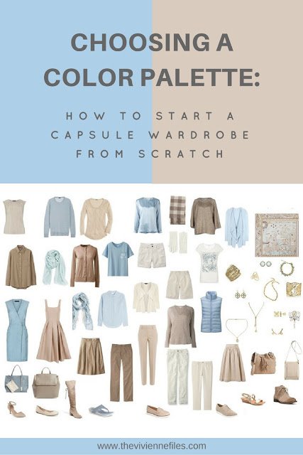
Building a 'Future-Proof' Wardrobe
The best approach to building a wardrobe in this new era of color rebellion is to prioritize versatility and self-expression. Invest in high-quality basics in neutral colors—think black, white, gray, navy, and beige—that can serve as a foundation for countless outfits. These pieces will provide a blank canvas for experimentation.
Then, add pops of color through accessories—scarves, jewelry, bags, and shoes—and statement pieces—a brightly colored blazer, a patterned dress, or a bold pair of pants. This allows you to incorporate trends and express your individuality without committing to a full-color overhaul.
Don’t be afraid to take risks and have fun with fashion. Experiment with different color combinations, try new styles, and embrace your unique personality. The most important thing is to wear what makes you feel confident and comfortable. I think a checklist can help keep things organized:
- Invest in neutral basics.
- Add pops of color with accessories.
- Experiment with bold statement pieces.
- Prioritize comfort and confidence.
No comments yet. Be the first to share your thoughts!