

Set up your lighting and tools
Start by clearing a space where you can see your face clearly without shadows or distractions. The goal is to isolate your natural skin tone, eye color, and hair color so you can determine which color analysis season fits you best. This process relies on seeing your true undertones, which means you need a neutral environment free from colored walls, bright artificial lights, or makeup that alters your complexion.
Choose the right light source
Natural daylight is the gold standard for color analysis because it provides a full spectrum of light that reveals your true undertones. Aim to perform your analysis near a large window with indirect sunlight. Direct sun can be too harsh and create glare, while overcast days often provide the most even, diffused light. If you cannot access natural light, use a daylight-balanced LED bulb (5000K–6500K) placed directly in front of you. Avoid warm yellow or cool blue indoor bulbs, as they cast a tint that will skew your results.
Prepare your skin and clothing
Your skin should be bare to accurately assess your undertones. Remove all makeup, including foundation, concealer, and blush. If you have hair color that is significantly different from your natural root color, pull your hair back or cover it with a neutral headband to prevent it from influencing the perception of your skin tone. Wear a plain white or black top, or wrap yourself in a white towel. This creates a neutral canvas that doesn’t reflect color onto your face.
Gather your tools
You don’t need expensive equipment to begin. Have a full-length mirror or a handheld mirror handy so you can step back and view your overall effect. Keep a set of color drapes or solid-colored fabric swatches nearby—white, black, navy, gray, and various shades of red, blue, and yellow. These will help you compare how different hues interact with your skin. A smartphone camera can also be useful for taking photos in consistent lighting to review your results later.
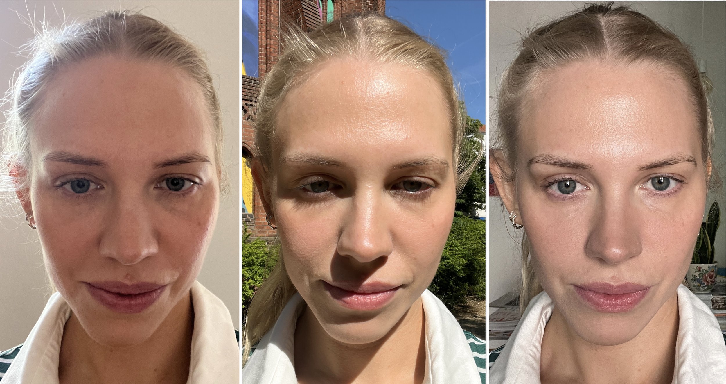
Position yourself near a north-facing window for consistent, indirect daylight. If using artificial light, ensure it is daylight-balanced (5000K–6500K) and positioned directly in front of you to avoid shadows.
Wash your face and remove all makeup. Pull your hair back to expose your neck and jawline. Wear a plain white or black shirt, or wrap yourself in a white towel to create a neutral background.
Place a mirror at eye level so you can see your face clearly. Keep your color drapes or fabric swatches within reach. Ensure your smartphone is charged and ready to take reference photos.
Determine your skin undertone
Your undertone is the subtle hue beneath your skin’s surface, distinct from your surface tone (which changes with sun exposure). Identifying whether you are cool, warm, or neutral is the foundation of an accurate color analysis. This step reveals which colors will harmonize with your natural palette and which will clash.
Perform these two simple tests in natural daylight. Stand near a window without artificial lighting, as bulbs can distort your true undertone.
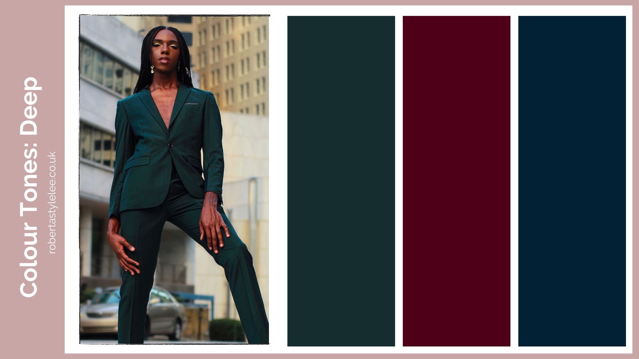
Look at the veins on the inside of your wrist. If they appear blue or purple, you likely have cool undertones. If they look green or olive, you have warm undertones. If you cannot clearly distinguish between blue and green, or if your veins appear both, you are probably neutral.
Hold a piece of silver jewelry and a piece of gold jewelry near your face, one at a time. Silver that makes your skin look bright and clear suggests cool undertones. Gold that enhances your complexion indicates warm undertones. If both metals look equally flattering, you likely have neutral undertones.
A neutral undertone means you can wear both cool and warm shades, though you may look best in muted or balanced versions of these colors. Once you have identified your undertone, you can move on to determining your seasonal color palette.
Test fabric drapes against your neck
To determine your best colors, you need to see how different hues interact with your natural contrast. This hands-on color analysis method relies on simple draping to reveal whether a shade brightens your complexion or casts shadows on your face.
Set up your lighting and mirror
Find a spot with bright, natural daylight. Artificial bulbs often distort colors, making warm tones look green or cool tones look gray. A large mirror is essential so you can see your face and neck clearly without straining. Remove any makeup to see your true skin tone, and pull your hair back if it shares similar tones with your skin.
Drape the fabric under your chin
Hold a piece of fabric up to your neck, letting it rest just below your jawline. The fabric should cover your chest but stay away from your face. This placement ensures the color reflects light onto your skin, showing you exactly how it affects your complexion. Use a neutral gray or white cloth as a baseline first to establish your natural contrast level.
Observe the changes in your face
Look closely at your skin, eyes, and lips. If the color makes your skin look even, reduces the appearance of dark circles, and makes your eyes pop, it is likely a match. Conversely, if the shade makes you look tired, gray, or highlights blemishes, it is clashing with your undertones. Take photos in natural light to compare, as our eyes adjust quickly to different colors.
Compare warm and cool tones
Hold up a gold-toned fabric next to a silver-toned one. See which metal color makes your skin look healthier. This quick test helps narrow down whether you fall into a warm or cool seasonal palette. Repeat this with various shades within those categories to pinpoint your specific color analysis result.
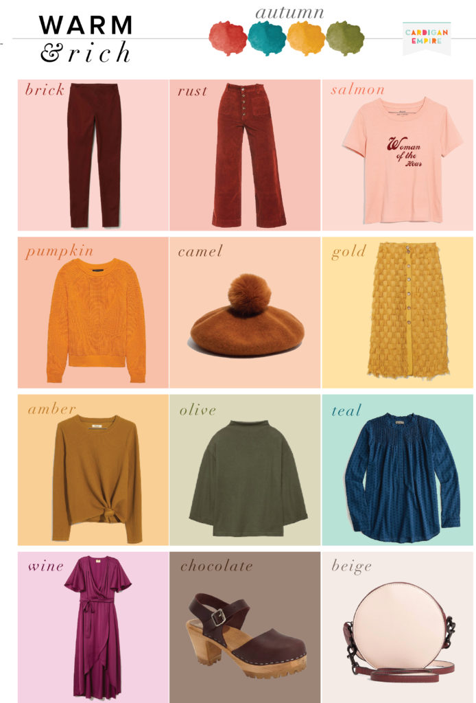
Gather a variety of fabric swatches in different colors. Include bright whites, off-whites, navy, black, and various shades of red, blue, and green. Natural fabrics like silk or cotton work best because they drape smoothly and reflect light accurately.
Stand in front of a mirror with natural light. Hold the fabric under your chin, ensuring it covers your chest but does not touch your face. This isolates the color's effect on your skin tone without interference from your clothing or hair.
Look for changes in your skin's appearance. Does the color make your skin look brighter and more even? Or does it cast shadows and make you look dull? Note which colors enhance your natural features and which ones detract from them.
Take photos of yourself with each fabric drape. Compare the images side-by-side to identify clear winners and losers. This visual record will help you build a wardrobe palette that consistently flatters your complexion.
Match your season to your body shape
Knowing your seasonal palette tells you which colors flatter your skin, but your body shape determines how those colors sit on your frame. The goal is to create harmony between the intensity of your colors and the lines of your silhouette. High-contrast seasons like Winter often benefit from structured cuts that mirror their sharp coloring, while Soft Summer’s muted tones pair best with relaxed, flowing fabrics that echo their gentle contrast.
Think of your body shape as the canvas and your seasonal colors as the paint. A heavy, dark coat might overwhelm a petite frame regardless of how well the color matches your complexion. Conversely, a crisp, high-contrast outfit can get lost on a soft, low-contrast body type if the silhouette is too rigid. The trick is balancing visual weight.
Use the table below as a quick reference. It maps common seasonal characteristics to body shape adjustments, focusing on color intensity and fabric weight rather than rigid fashion rules.
| Season | Body Shape Note | Color Intensity | Style Adjustment |
|---|---|---|---|
| Winter | Athletic or Angular | High | Use sharp lines and bold, saturated colors to match your natural contrast. |
| Spring | Petite or Curvy | Warm/Bright | Choose lighter fabrics in warm tones to avoid overwhelming a smaller frame. |
| Summer | Soft or Rounded | Muted | Opt for fluid silhouettes in dusty pastels to complement your gentle features. |
| Autumn | Heavy or Broad | Deep/Earthy | Use rich, heavy fabrics in deep earth tones to anchor your natural warmth. |
When applying this to your wardrobe, start with your core neutrals. If you are a Winter, your black and white should be stark and pure, paired with structured tailoring. If you are a Soft Summer, your neutrals should be oatmeal or slate gray, worn in loose knits. This alignment ensures that your color analysis serves your entire look, not just your face.
Avoid common draping mistakes
Even with the right fabrics, small environmental or personal details can skew your color analysis results. The goal is to see your skin in its most neutral, true state. Artificial lighting is the most common culprit. Standard indoor bulbs often cast a yellow or blue tint that masks your natural undertones, making cool colors look muddy or warm colors look harsh. Always test draping in natural daylight near a window, or use a high-quality, daylight-balanced LED bulb (5000K–6500K) if you must work indoors.
Heavy makeup, particularly foundation, concealer, and blush, can also mask your natural skin tone. These products add layers of pigment that interfere with how fabrics reflect light against your skin. For the most accurate color analysis, come bare-faced or with minimal, skin-toned products that don’t shift your complexion’s natural hue. This ensures you’re evaluating how colors interact with your actual skin, not a manufactured base.
Another frequent error is using fabrics with textures or finishes that distract from the color itself. Shiny silks, sequins, or heavily patterned materials reflect light in complex ways, making it difficult to judge the true hue. Stick to matte, solid-color fabrics for your initial draping. This allows you to focus purely on how the color complements your skin, eyes, and hair without visual noise.
Finally, ensure you are comparing colors against a neutral background. A cluttered room or a brightly colored wall behind you can influence your perception of the draping fabric. Stand in front of a white or gray wall to maintain a consistent, neutral reference point throughout your color analysis session.
Build your seasonal capsule wardrobe
Now that you know your season, it’s time to edit your closet. The goal is a capsule wardrobe where every piece works with every other piece, reducing decision fatigue and maximizing outfit combinations. This process relies on the core principles of color analysis: value, chroma, and undertone.
Start by purging items that clash with your palette. If a garment makes your skin look dull or shadows appear deeper, it doesn’t belong in your capsule, regardless of how much you paid for it. Keep only the neutrals and accent colors that harmonize with your seasonal profile.
Next, identify gaps in your foundational pieces. A true capsule needs balance. Check your inventory against the checklist below to ensure you have versatile options for different occasions.
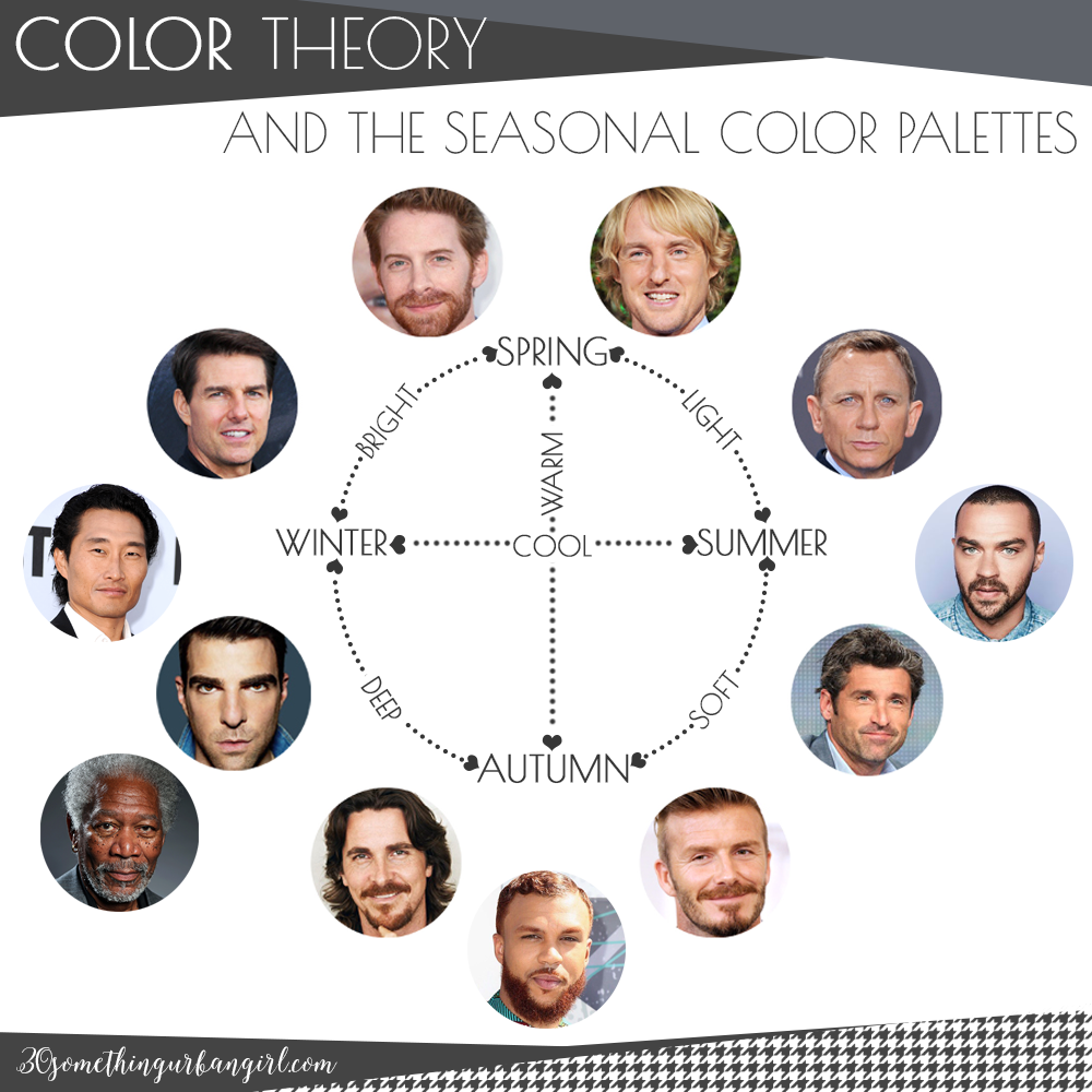
Group your remaining clothes by your season’s specific hues. Separate your primary neutrals (blacks, navies, grays, or browns) from your accent colors. This visual sort helps you see exactly how many options you have for tops, bottoms, and outerwear.
Test mixing your tops with your bottoms. If you have a "Soft Autumn" palette, a muted olive top should pair seamlessly with warm khaki trousers. If items clash, set them aside. Consistency is the hallmark of a functional capsule.
Look for missing essentials in your dominant colors. You might have plenty of tops but lack a jacket in your signature shade. Prioritize high-quality basics in your most-worn colors before adding statement pieces.
Store off-season items out of sight. Keep only the clothes suitable for the current weather in your daily rotation. This keeps your visual field clean and ensures you’re wearing colors that match the season’s light.
Use this checklist to audit your current inventory:
-
Neutrals: Do you have at least three versatile bottoms in your season’s neutral shade?
-
Tops: Are your shirts and blouses in colors that brighten your complexion?
-
Outerwear: Do you have a jacket or coat in a neutral that matches your palette?
-
Accessories: Can your shoes and bags be swapped between outfits without clashing?
-
Versatility: Does every top pair with every bottom in your capsule?
For a deeper dive into digital draping tools, you can try virtual services like Colorwise.me to test how specific shades interact with your photo before buying new clothes.
Frequently asked questions about color analysis
How much should a color analysis cost?
Professional in-person color analysis sessions typically range from $100 to $300, depending on the stylist’s experience and location. If you are doing a color analysis at home, the cost drops to near zero. You only need natural daylight and some fabric swatches or clothing items you already own to compare against your skin tone.
Can ChatGPT do my color analysis?
ChatGPT cannot perform a color analysis because it cannot see your physical features. A proper color analysis relies on observing how specific hues interact with your undertones, contrast levels, and eye color in real lighting. AI text models can explain the theory or suggest palettes based on descriptions, but they cannot replace the visual assessment required to determine your season.
What is the best free color analysis app?
Apps like Dressika and Color-Analysis.app use AI to scan your photo and suggest a seasonal palette. While these tools offer a convenient way to figure out your color analysis without an appointment, they are not as accurate as a human expert. They work best as a starting point or a rough guide rather than a definitive professional diagnosis.
How do I figure out my color analysis?
You can figure out your color analysis by identifying your skin’s undertone (cool, warm, or neutral). Look at the veins on your wrist under natural light; blue veins usually indicate cool tones, while greenish veins suggest warm tones. Once you know your undertone, you can test which colors make your skin look brighter and your eyes pop versus those that make you look tired or washed out.
No comments yet. Be the first to share your thoughts!