

Start with your skin undertone
Start Build Your Personal Color Palette with the constraint that matters most in real life: space, timing, budget, skill level, maintenance, or availability. That first constraint should shape the rest of the plan instead of appearing as an afterthought. Keep the first pass simple enough to verify. Compare the main options against the same criteria, remove choices that only work in ideal conditions, and save optional upgrades for later.
The simplest way to use this section is to write down the real constraint first, compare each option against it, and choose the path that still works outside ideal conditions.
Select your primary and accent colors
Choosing a personal color palette is less about picking pretty shades and more about building a cohesive system. You need a core set of 3-5 colors that work together harmoniously and flatter your natural undertones. Think of this group as your visual uniform: the primary colors form the foundation, while the accent colors provide the necessary contrast and interest.
Start by identifying your base. This is usually a neutral or a muted tone that matches your skin’s undertone—cool, warm, or neutral. For example, if you have cool undertones, a soft gray or navy might serve as your primary anchor. If you are warm-toned, think taupe, olive, or camel. This base color should appear most frequently in your wardrobe or designs, covering about 60% of your visual space.
Next, select two to three supporting colors that complement your base. These should be slightly more saturated but still harmonious. A helpful trick is to look at nature: a forest green pairs naturally with warm browns, just as a dusty rose works well with cool grays. These secondary colors should make up about 30% of your palette, providing depth without overwhelming the base.
Finally, add one or two accent colors. These are your bold moves—brights or high-contrast shades that draw the eye. An accent should only make up the remaining 10% of your visual presence. Use it sparingly for accessories, highlights, or focal points. The goal is balance; if every color competes for attention, the palette feels chaotic rather than curated.
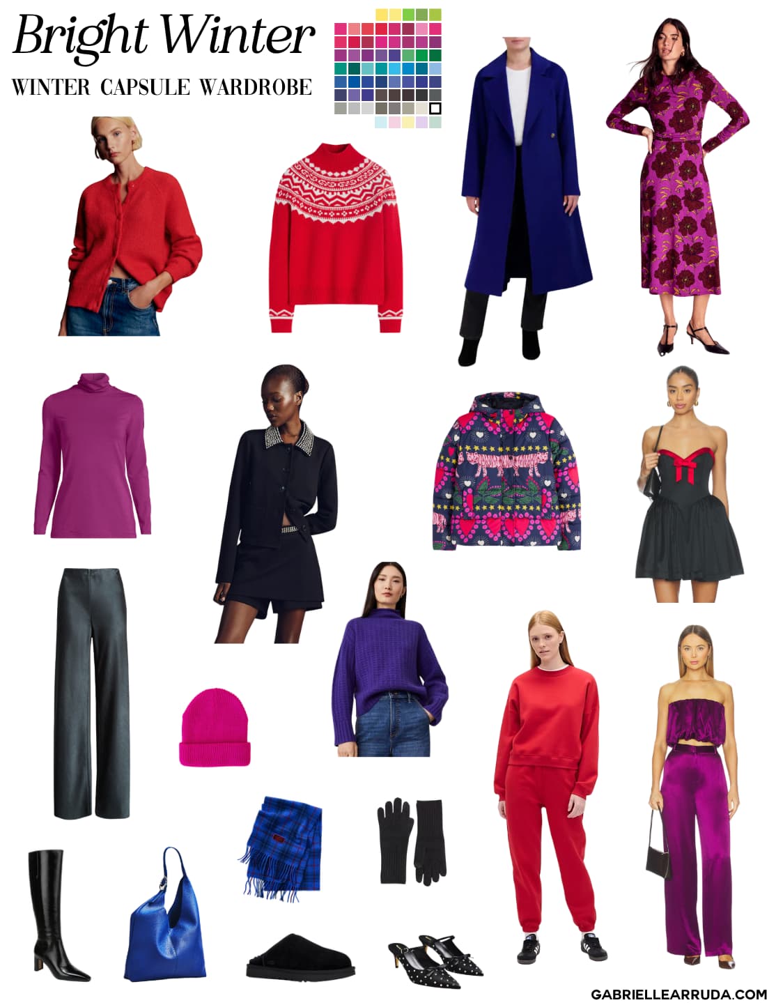
Test your palette with fabric swatches
A color that looks perfect on a digital screen or a small paint chip often behaves differently against your skin and in natural light. Before you commit to buying new clothes, you need to validate your choices with physical or digital fabric samples. This step ensures your palette works in the real world, not just in theory.
Gather your materials
Collect swatches of each color in your chosen palette. If you don’t have fabric scraps, print high-quality color chips on matte paper or use a digital color palette app that simulates fabric textures. You will also need a mirror and access to natural daylight. Avoid testing under yellow indoor bulbs or harsh fluorescent lights, as they distort color perception.
Drape and observe
Stand in front of a mirror near a north-facing window. Drape each swatch next to your face, holding it against your neck and chest. Observe how the color interacts with your skin tone. Does it brighten your complexion or make you look tired? For digital swatches, use a mirror app to overlay the colors on your photo. Look for clarity and harmony, not just attraction.
Check in different lighting
Move to different areas of your home and step outside. Colors shift dramatically between morning, noon, and evening light. A warm beige might look golden in sunlight but dull in shadow. Take photos of yourself wearing the colors in various lighting conditions to review later. This helps you identify which colors are versatile enough for everyday wear.
Evaluate versatility
Consider how well the colors work together. Can you mix and match the swatches to create multiple outfits? A successful palette should offer cohesion and flexibility. If a color feels isolated or clashes with the rest, reconsider its place in your wardrobe. The goal is a harmonious collection that simplifies dressing and boosts confidence.
Avoid common color mistakes
Building a personal color palette is less about following rigid rules and more about understanding how colors interact on your skin and with each other. Even with a carefully selected set of hues, small coordination errors can make an outfit look disjointed or unintentionally muddy. The goal is cohesion, not just possession of trendy shades.
Mismatching undertones
The most frequent error is mixing warm and cool undertones in a single look. For example, pairing a warm mustard yellow with a cool steel blue creates visual friction that can make skin look sallow or washed out. Instead, stick to one temperature family per outfit or ensure the transition between colors is gradual. If you must mix, use a neutral bridge like cream, navy, or charcoal to separate the conflicting tones.
Overpowering the base
Bold accent colors are exciting, but they lose their impact when they compete with the main garment. A common mistake is using two high-saturation colors of equal weight, such as a bright red top with electric blue pants. This creates a "loud" effect that distracts from your face. Reserve intense hues for accessories or one statement piece, letting neutrals or softer shades form the foundation of your ensemble.
Ignoring fabric texture
Color behaves differently depending on the material. A matte olive green looks entirely different than a satin olive green. When building your palette, consider how light reflects off your fabrics. Shiny materials amplify brightness, while matte fabrics deepen saturation. Test your chosen colors in natural light to see how the texture changes the perception of the hue before committing to a full wardrobe.
Practical fixes for better coordination
To quickly correct these issues, apply the 60-30-10 rule: 60% dominant neutral, 30% secondary color, and 10% accent. This structure prevents any single color from dominating unintentionally. Additionally, keep a physical or digital swatch book of your chosen palette to reference when shopping, ensuring every new purchase complements your existing core colors.
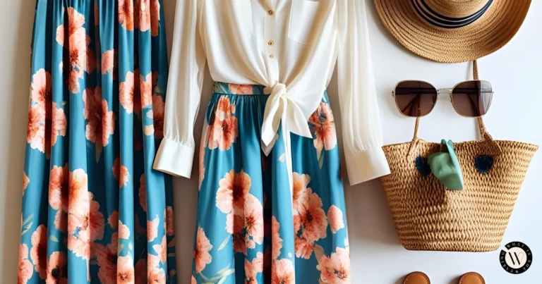
Lay out your current clothes and group them by color. Identify which items clash or look muddy together. This visual audit reveals which undertones dominate your existing wardrobe and highlights pieces that don't fit your new palette.
Hold potential new purchases next to your core colors in natural light. Check for harmony between warm and cool tones. If a piece looks jarring against your best colors, it likely has an incompatible undertone and should be set aside.
Structure your outfits using this proven ratio. Let a neutral base (60%) anchor the look, add a secondary color (30%) for interest, and use a bright accent (10%) for a pop of personality. This prevents color competition and ensures a polished finish.
Compile fabric swatches or photos of your approved colors into a small binder or digital album. Use this reference when shopping to instantly verify if a new item fits your palette. This step eliminates guesswork and reduces impulse buys that don't coordinate.
Check your palette against current trends
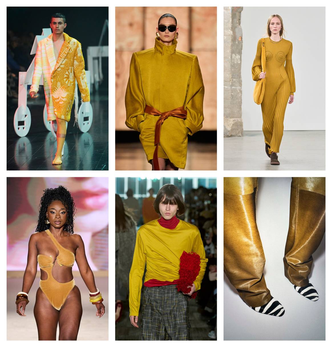
Trends shift, but your personal color palette is built to last. The goal isn't to chase every new hue, but to see how the season's colors can refresh what you already own. Think of trends as spices in your kitchen: a pinch of the latest shade can elevate a familiar dish without changing the recipe.
Start by identifying the top colors for the upcoming season. Fashion reports and trend forecasts usually highlight two or three key shades. Look for colors that complement your primary palette rather than clash with it. If your palette is neutral, a bold seasonal accent can add energy. If you already wear vibrant colors, look for subtle variations of your existing shades.
Next, test the new colors against your core neutrals. Hold a swatch of the trend color next to your most-worn items. Does it brighten your complexion? Does it harmonize with your base colors? If the answer is yes, plan to incorporate that shade into one or two key pieces, like a coat or a bag. This approach keeps your wardrobe current without requiring a complete overhaul.
Avoid buying entire outfits in trend colors. Instead, use them as accents. A seasonal scarf, a pair of shoes, or a statement piece can bring the trend into your life without overwhelming your personal style. This method allows you to experiment safely and ensures that your palette remains cohesive and authentic to you.
Finalize your wardrobe color guide
You have identified your season and selected the core hues. Now, turn those findings into a practical reference you can use every morning. A digital or physical swatch card prevents decision fatigue and ensures every outfit feels intentional.
Create a master palette using a free tool like ColorSpace to generate hex codes for your chosen neutrals and accents. Save these as a single image on your phone’s home screen. This becomes your quick-reference guide when shopping or packing for travel.
Organize your closet by grouping similar tones together. This visual sorting makes it easier to see what matches and what is missing. Keep your physical swatch card in a visible spot, like the inside of your closet door, to reinforce your choices.
Step-by-step setup

Use an online generator to create a cohesive set of colors based on your skin’s undertones. Save the hex codes for your primary neutral and two accent colors.
Design a simple image with the hex codes and color blocks. Save this as your lock screen or a dedicated folder on your phone for instant access.
Group clothing items by color family. This visual audit highlights gaps in your wardrobe and prevents purchasing items that do not match your new palette.
No comments yet. Be the first to share your thoughts!