

Match skin tone to seasonal palettes
Color analysis begins with your skin’s undertone, not your body shape. Your undertone determines which hues harmonize with your natural coloring, creating a cohesive look that enhances your features. Once you identify whether your skin leans warm, cool, neutral, or deep, you can narrow down the four main seasonal palettes: Spring, Summer, Autumn, and Winter.
Start by looking at the veins on your wrist under natural light. If they appear greenish, you likely have warm undertones. If they look blue or purple, you are probably cool-toned. Neutral undertones show a mix of both, while deep skin tones often have rich, complex undertones that can align with any season depending on contrast levels.
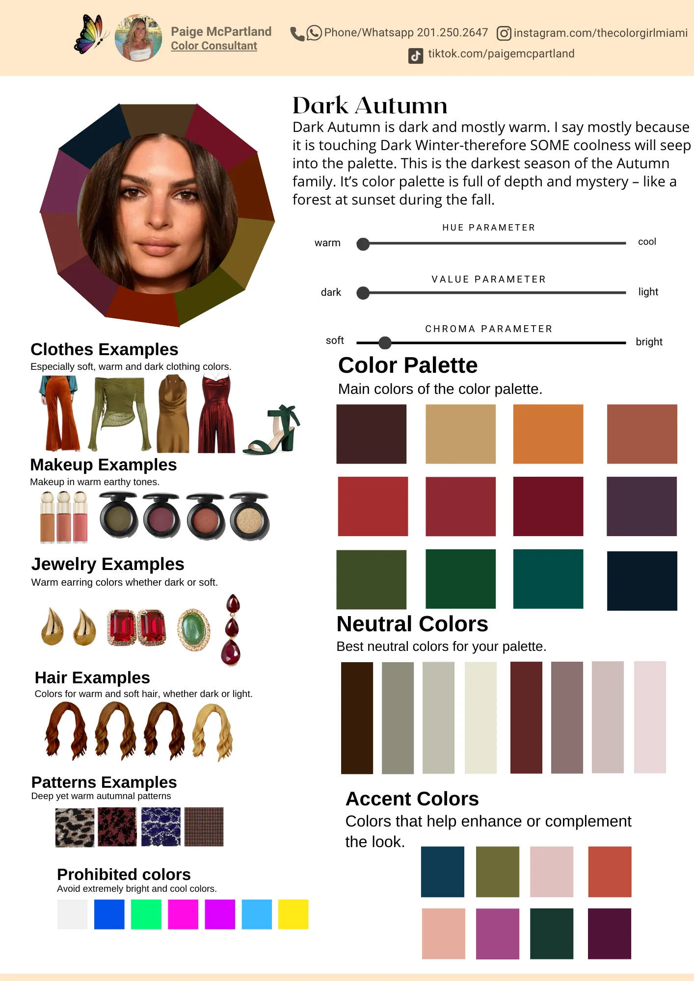
Understanding these distinctions helps you build a palette that works for every body type. For instance, a warm-skinned person might thrive in earthy Autumn tones, while a cool-skinned individual may shine in crisp Winter shades. This foundation ensures that your color choices complement your skin, regardless of your silhouette.
Match color theory to your body shape
Color isn't just about what looks good on your skin; it's about how light interacts with your silhouette. The right palette can create optical illusions that balance proportions, drawing the eye to your strengths and softening areas you'd rather downplay. For 2026, the goal is intentional visual harmony rather than following rigid rules like "no black" or "always wear neutrals."
Think of color as structural engineering for your outfit. Darker tones recede, making areas appear smaller, while lighter, brighter tones advance, adding volume. By placing high-contrast colors strategically, you can reshape how your body is perceived. This approach moves beyond generic style advice to create a customized look that fits your unique geometry.
1. Balance the athletic build with soft blends
Athletic builds often feature straighter silhouettes with balanced shoulders and hips. To add dimension, use soft blends and mid-tone colors that create gentle curves rather than sharp lines. Avoid high-contrast blocks that might emphasize width without adding shape.
Instead, opt for tonal dressing where shades of the same color vary slightly in brightness. This creates a vertical flow that elongates the frame. Add volume to the hips or bust with textured fabrics in lighter shades, while keeping the midsection in slightly darker tones to maintain a smooth line. This technique adds femininity and shape without relying on excessive layering.
2. Define the pear shape with strategic contrast
Pear shapes carry more weight in the hips and thighs, with narrower shoulders. The goal here is to draw attention upward and balance the lower half. Use brighter, lighter colors on top to expand the shoulder line, while keeping the lower half in darker, more subdued tones to minimize volume.
A monochromatic bottom half works well to create a long, unbroken line. Pair this with a top that features interesting details, like ruffles or bright colors, to shift focus to the face and shoulders. Avoid heavy patterns on the hips, which can add unwanted visual weight. Instead, let the color contrast do the work of balancing your proportions.
3. Elongate the hourglass with continuous lines
Hourglass figures are naturally balanced, so the aim is to highlight the waist without breaking the silhouette. High-contrast color blocking can work, but it must be placed carefully to accentuate the narrowest point. Avoid horizontal color breaks at the widest parts of the hips or bust.
Instead, use continuous vertical color flows that draw the eye up and down. A single-color outfit with varying textures can create depth without adding bulk. If you use contrasting colors, place the break at the waistline to emphasize your natural curve. This approach maintains the elegance of the hourglass shape while adding modern interest through tone-on-tone layering.
4. Streamline the rectangle with defined edges
Rectangle bodies have balanced shoulders, waist, and hips with minimal curve definition. The challenge is to create the illusion of shape without relying on structure that might feel restrictive. Use color to carve out a waistline and add dimension to the frame.
Try color blocking with a darker midsection and lighter shoulders or hips to create the appearance of curves. A belt in a contrasting color can also define the waist effectively. Avoid overly loose, shapeless silhouettes in a single color, as they can hide your natural proportions. Instead, use sharp color contrasts to create structure and visual interest where it's needed most.
Select 2026 trending shades
Integrating 2026’s forecasted colors into your personal palette requires matching the trend’s undertone to your seasonal sub-type. Rather than wearing head-to-toe trends, use them as accents that complement your natural coloring. This approach keeps the look current without clashing with your skin, hair, or eyes.
For warm seasons (Spring and Autumn), lean into earthy, sun-kissed hues like terracotta, olive green, and mustard yellow. These shades mirror the warmth in your skin and add depth to your wardrobe. Cool seasons (Summer and Winter) should look to jewel tones and icy pastels, such as sapphire blue, emerald, or soft lavender. These colors reflect the cool undertones in your complexion, creating a harmonious and brightening effect.
If you are unsure of your exact sub-type, start with neutral shades that work for everyone: crisp white, navy, charcoal, and camel. These serve as a base, allowing you to introduce one trending shade at a time. For example, a warm-toned person might add a terracotta scarf or handbag, while a cool-toned person might opt for a sapphire blue blouse. This method lets you experiment with trends safely.
Use tools like Coolors or Color Hunt to generate palettes that combine your seasonal neutrals with the current year’s trending shades. These platforms allow you to extract colors from images or manually adjust hues until you find a combination that feels right. The goal is to create a cohesive look where the trend enhances, rather than overwhelms, your natural features.
Test palettes with fabric samples
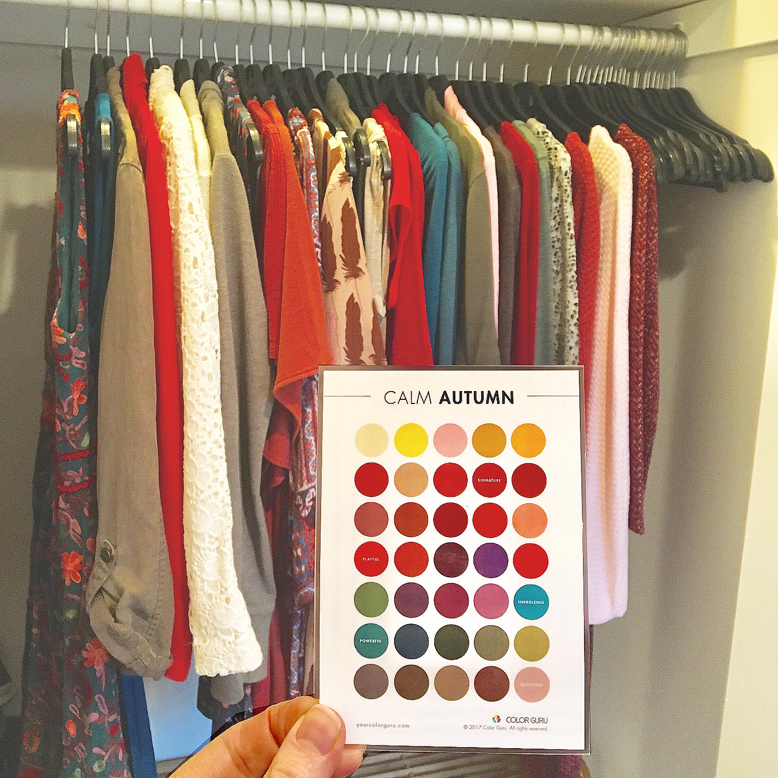
Digital screens lie. A hex code that looks vibrant on your monitor often appears muddy or washed out when printed on cotton, silk, or wool. To build a color palette that truly flatters your body type, you need to see how pigments interact with skin under real lighting.
Start by swatching. Order fabric samples or cut small squares from old garments in your chosen shades. Hold them up to your face in natural daylight—the most accurate light source. Notice how the color reflects onto your skin tone. Does it create a healthy glow, or does it cast shadows and emphasize dullness? This physical test reveals nuances that pixel-perfect designs miss.
Pay close attention to texture. A matte linen absorbs light differently than a shiny satin. A color that looks bold and confident on a smooth fabric might look flat or cheap on a rough weave. Since 2026 trends emphasize tactile richness, ensure your palette’s textures complement the hues, not fight them.
Fix common color mistakes
Even with a calculated palette, small execution errors can dull your complexion or distort your silhouette. The most frequent pitfall is testing colors away from the face. Skin tone analysis requires the light to hit your jawline directly; swatching a shirt on your arm ignores the subtle interplay between fabric hue and facial undertones. Always hold potential tops against your chin in natural light to see if the shade brightens or drains your features.
Another common error is ignoring contrast levels relative to body type. High-contrast combinations, like stark black and white, create visual weight that can overwhelm smaller frames or shorten the torso. Conversely, low-contrast palettes—such as navy on charcoal—can wash out lighter skin tones, making the outfit look flat rather than sleek. Adjust your contrast ratio to balance your proportions: use higher contrast to draw attention to your face, and lower contrast to elongate the body.
Finally, avoid mixing warm and cool undertones in the same outfit unless you are intentionally layering. A cool-toned blue top paired with a warm-toned brown skirt often creates a muddy visual disconnect that confuses the eye. Stick to one undertone family per outfit to maintain a clean, intentional look that complements your natural coloring.
Plan your seasonal capsule wardrobe
Start by selecting a base of neutral staples—trousers, blazers, and simple tops—in your primary seasonal palette. These pieces act as the canvas for your body type, providing structure and balance without competing with your complexion. Stick to fabrics that drape well, such as cotton blends or lightweight wool, to ensure the silhouette flatters your shape regardless of the season.
Next, layer in accent colors drawn from your secondary palette. Choose three to five statement pieces, like a silk scarf, a knit cardigan, or a tailored jacket, that complement your skin tone. This approach keeps the collection cohesive while adding visual interest. For 2026 trends, lean into muted earth tones or soft pastels that align with your specific seasonal analysis.
Finally, verify that every item mixes with at least two other pieces in the capsule. This ensures versatility and maximizes outfit combinations. A well-planned capsule reduces decision fatigue and creates a polished, intentional look year-round.
Frequently asked: what to check next
How do I choose colors for my body type?
Start by identifying your undertone (warm, cool, or neutral) using the vein test or jewelry comparison. Match your palette to that undertone, then adjust saturation based on your contrast level. High-contrast body types look best in bold, distinct colors, while low-contrast types shine in muted, blended shades.
Can I wear black if I have a warm undertone?
Yes, but it can sometimes wash out warm skin. Try replacing pure black with charcoal, deep navy, or dark chocolate brown. These darker neutrals maintain the slimming effect of black while harmonizing better with warm undertones, creating a more flattering silhouette.
How often should I update my color palette?
Your base palette remains stable as long as your natural hair, eye, and skin pigmentation doesn't change significantly. However, you can refresh your wardrobe seasonally by swapping out accent colors. Use tools like Coolors to test new 2026 trend colors against your existing core palette before buying.
Put Color Analysis Update into practice
No comments yet. Be the first to share your thoughts!