

Start with your seasonal palette
Before integrating specific 2026 color trends into your wardrobe, you must identify your underlying skin undertones. Seasonal color analysis groups people into four categories based on how their body temperature interacts with light: warm, cool, neutral, and deep. This foundation determines which shades make your complexion glow versus which ones cast shadows or emphasize imperfections.
Pantone has announced Cloud Dancer (PANTONE 11-4201) as its Color of the Year for 2026, a soft, airy off-white that sits between subtle warm and cool tones. Because this trend color is so balanced, it serves as an excellent neutral base for almost every palette, but your specific undertone will dictate how it pairs with bolder seasonal hues.
To determine your base, look at the veins on the inside of your wrist under natural light. If they appear greenish, you likely have warm undertones and will thrive in earthy 2026 shades like terracotta and mustard. If they look blue or purple, you are cool-toned and should lean toward the season’s prominent icy blues and crisp whites. Blue veins that appear indistinct or a mix of both suggest neutral undertones.
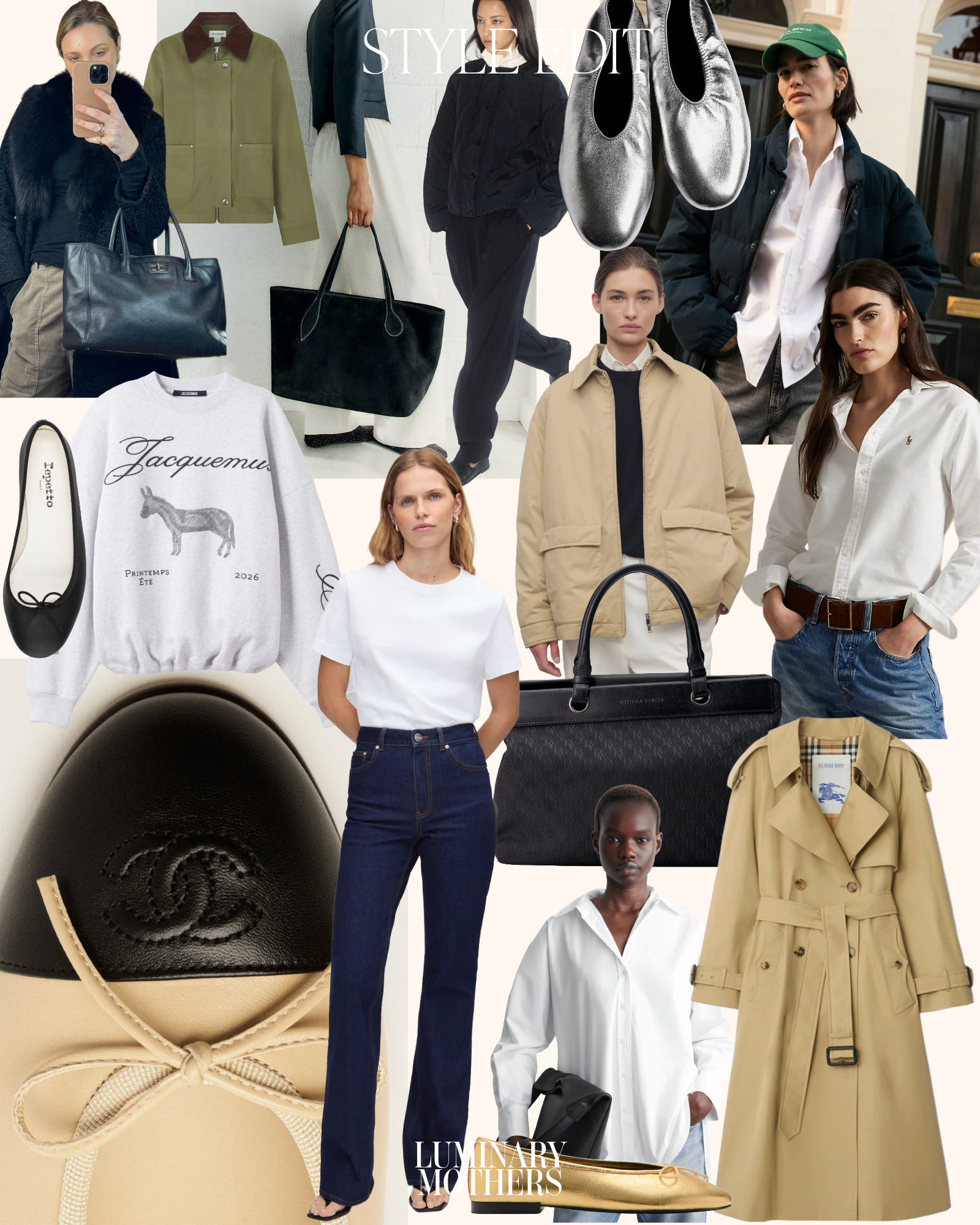
Once you have identified your season, use it as a filter for the 2026 palette. Warm seasons should prioritize the year’s earthy, organic tones, while cool seasons should focus on the icy, clear hues dominating the runways. Neutral seasons can bridge the gap, allowing you to wear the full spectrum of 2026 trends with ease.
Map 2026 color trends to your undertones
Matching the 2026 color trends to your natural undertones ensures that forecasted shades enhance your complexion rather than washing it out. By filtering these predictions through your seasonal palette, you can adopt the year’s aesthetic while maintaining a polished, cohesive look.
Warm Undertones
Warm skin types (yellow, golden, or peachy bases) thrive in earthy and spicy tones. For 2026, lean into the warm orange and chartreuse notes highlighted in the Pinterest Palette. Avoid the stark, cool off-white of Pantone’s Color of the Year, as it can create a harsh contrast against golden skin. Instead, opt for the muted, warm neutrals that Vogue identifies as the season's grounding base.
Cool Undertones
Cool skin types (pink, red, or blue bases) look best in clear, jewel-toned shades. The 2026 forecast features bold purples and cool blues that complement redness in the skin. Skip the warm, yellow-based oranges and chartreuse, which can make cool skin appear sallow. The cloud-like neutral from Pantone works well here if it leans slightly cool, offering a fresh, crisp backdrop for bright accessories.
Neutral Undertones
Neutral undertones (a balance of warm and cool) have the flexibility to wear most of the 2026 palette. You can bridge the gap between the warm oranges and cool blues by choosing muted, dusty versions of these colors. The versatile off-white from Pantone is your best neutral friend this year, as it sits comfortably between warm and cool spectrums, allowing you to experiment with both bold and subtle 2026 color trends.
| 2026 Trend Color | Warm Undertones | Cool Undertones | Neutral Undertones |
|---|---|---|---|
| Cloud Dancer (Pantone 11-4201) | Avoid | Best | Best |
| Persimmon / Orange (Pinterest) | Best | Avoid | Good |
| Bold Purple (Vogue) | Avoid | Best | Good |
| Chartreuse (Pinterest) | Good | Avoid | Good |
Choose cuts that balance your shape
Color Trends works best as a clear sequence: define the constraint, compare the realistic options, test the tradeoff, and choose the path with the fewest hidden costs. That order keeps the advice usable instead of decorative. After each step, pause long enough to check whether the recommendation still fits the reader's actual situation. If it depends on perfect timing, unusual access, or a best-case budget, include a simpler fallback.
The simplest way to use this section is to write down the real constraint first, compare each option against it, and choose the path that still works outside ideal conditions.
Build a 2026 capsule wardrobe
Start with the base. Sherwin-Williams and PPG identify Neutral Ground and Universal Khaki as the foundational neutrals for 2026. These earthy, warm tones replace cool greys and serve as the canvas for your body type. Buy high-quality basics in these shades first: a tailored blazer, straight-leg trousers, and a fine-knit sweater. Because these colors are neutral, they match every skin tone and provide the structure your wardrobe needs.
Add one accent color that complements your complexion. If you have warm undertones, choose Lemon Chiffon or Warm Mahogany for a top or accessory. For cool undertones, Still Water or Cordovan offers a sophisticated pop of color. Limit accents to two items per outfit to keep the look polished. This approach ensures that every piece in your 2026 color trends wardrobe works together without clashing.
Focus on fabric weight and cut. A capsule wardrobe relies on versatility, not volume. Choose pieces that can be dressed up or down. A Creamy silk blouse pairs with Universal Khaki trousers for work and jeans for weekends. Prioritize natural fibers like wool, cotton, and linen. These materials age better and maintain their color integrity through multiple seasons, protecting your investment in the latest trends.
Review your current closet before buying. Remove anything that doesn't fit the new neutral base or your specific body type guidelines. Keep only items that can be mixed with the 2026 palette. This strict editing process prevents clutter and ensures that every new purchase has a purpose. A streamlined wardrobe makes getting dressed easier and keeps your style consistent.
Select Universal Khaki, Neutral Ground, or Creamy for your core staples. These shades flatter most body types and provide a neutral foundation.
Pick one 2026 trend color that complements your skin tone. Use it for statement pieces like a coat, bag, or knitwear to add personality without overwhelming your look.
Invest in wool, cotton, and linen blends. These materials drape well on various body shapes and ensure your pieces last through multiple seasons.
Remove items that clash with the new palette. Keep only pieces that can be paired with your new 2026 color trends staples.
Common styling mistakes to avoid
The 2026 color trends—from Pantone’s Cloud Dancer to Pinterest’s Persimmon—demand precision. Wearing a shade that clashes with your natural undertones or choosing a silhouette that fights your proportions creates visual friction. Avoid these three errors to ensure the trend serves your look, not the other way around.
Ignoring undertone contrast
A color’s temperature must complement your skin’s underlying hue. Cloud Dancer, a soft off-white with subtle warm-cool balance, can wash out cool-toned skin if worn as a close-to-face layer without contrast. Pair it with a crisp white collar or a cool-toned scarf to maintain definition. Conversely, warm earth tones like PPG’s Warm Mahogany can overpower fair, warm complexions if used as a head-to-toe monolith. Break it up with neutral accessories to let the color breathe.
Disregarding scale and proportion
Trend colors often carry visual weight. Bold hues like Vogue’s noted “Tomato” or “Lime” can overwhelm petite frames if used in oversized, unstructured cuts. Scale the intensity to your frame: smaller silhouettes or strategic placement (like a bag or shoes) work better for smaller builds. For taller frames, larger blocks of color like Dunn-Edwards’ “Jade” or “Plum” can anchor the look, but avoid cutting the body in half with equal-weight color blocks at the waist.
Using trend colors as base layers
Treating a strong 2026 trend shade as a foundation for your entire outfit is a common misstep. These colors are meant to be accents or focal points, not background noise. If you wear Persimmon, let it be the top or the skirt, not the entire ensemble. Mix it with classic neutrals like Universal Khaki or Neutral Ground to ground the look. This prevents the outfit from feeling costume-like and keeps the focus on intentional styling.
Frequently asked questions about 2026 color trends
What colors are trending for 2026?
2026 color trends lean toward a palette that balances bold energy with grounding neutrals. According to Vogue, the year brings a mix of brights like tomato and lime alongside a specific neutral anchor. Pinterest’s 2026 Palette™ reinforces this shift, highlighting cool blue, jade, plum, chartreuse, and persimmon. These shades are designed to inspire personal styling choices that feel both current and cohesive.
What color is replacing grey in 2026?
While grey remains a staple, 2026 sees a move toward warmer, more nuanced neutrals. The "particular neutral" cited by Vogue suggests a shift away from cool grays toward tones that complement the year’s brighter accents like chartreuse and persimmon. This transition allows for more vibrant outfits without sacrificing versatility.
What are the key fashion trends for 2026?
Beyond specific hues, 2026 fashion trends focus on color blocking and tonal layering. The juxtaposition of cool blues against warm plums or limes against tomato reds creates dynamic visual interest. Styling these 2026 color trends involves matching shades to your body type to ensure the boldness flatters rather than overwhelms.
How do I match 2026 colors to my body type?
Matching 2026 color trends to your body type starts with identifying your undertones. Warm undertones pair well with tomato, persimmon, and jade, while cool undertones shine in cool blue, plum, and chartreuse. Use the "particular neutral" from Vogue as a base to balance these brighter accents, ensuring a harmonious look that highlights your natural features.
No comments yet. Be the first to share your thoughts!