

Why color and shape matter together
Personal color analysis and body shape styling are often treated as separate silos, but they work best as complementary tools. Knowing your seasonal palette tells you which hues harmonize with your natural skin tone, hair, and eyes. Understanding your body shape reveals which silhouettes balance your proportions. When you combine these two elements, you stop guessing and start building a cohesive wardrobe where every piece reinforces the other.
Think of color as the lighting and shape as the frame. A bright, high-contrast outfit might overwhelm a petite frame, while a muted, low-contrast palette might wash out a sharp, angular structure. By pairing your best colors with your most flattering cuts, you create a look that feels intentional rather than accidental. This approach reduces decision fatigue because you only buy items that work on both fronts.
For example, a Soft Autumn with a pear shape will look stunning in warm, muted earth tones paired with A-line skirts that skim the hips. In contrast, a Clear Winter with an hourglass shape shines in high-contrast black and white with fitted waistlines that highlight her natural curves. The goal isn't to follow rigid rules, but to use these insights to highlight your best features.
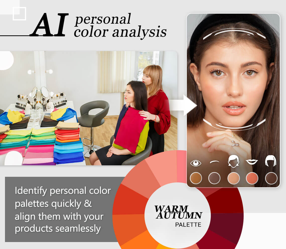
Spring palettes for warm body types
Spring palettes bring a natural brightness to warm-toned body shapes. The core principle here is harmony: aligning the warmth of your skin undertone with the vibrant, clear hues of the Spring season. When these elements meet, the result is a cohesive look where color and silhouette support each other rather than competing.
Think of your wardrobe as a canvas. Warm body types often carry golden, peachy, or olive undertones that respond well to the sunny, fresh colors of Spring. Instead of muted or heavy tones, these lighter, clearer shades reflect light onto the face, creating a natural glow that enhances your natural features.

The following combinations illustrate how specific Spring colors work with different warm body shapes to create balance and visual interest.
Spring color pairings for warm body types
-
Chili Pepper Red for Apple Shapes
Use this warm, bright red on the torso or as a statement top. The vertical line of a V-neck or open cardigan elongates the midsection, while the warm hue complements golden undertones without overwhelming the frame. -
Pineapple Yellow for Pear Shapes
Direct this sunny, clear yellow to the upper body. A bright blouse or structured jacket draws the eye upward, balancing wider hips. The lightness of the color keeps the look airy and prevents the outfit from feeling heavy. -
Mango Orange for Hourglass Figures
This vibrant, warm orange highlights the natural waistline. Use it in fitted tops or wrap dresses that follow your curves. The clarity of the color adds energy to the silhouette without adding visual bulk, celebrating the shape rather than hiding it.
Soft Summer for Cool Body Shapes
Soft Summer palettes are defined by muted, cool tones that sit between true gray and pastel. For body shapes with cool undertones, these colors act like a gentle filter, softening facial features and creating a harmonious, elegant silhouette. The goal is to avoid harsh contrasts; instead, choose shades that blend smoothly with your natural complexion.
Think of this palette as watercolor on wet paper. The colors bleed slightly into one another, creating a look that is cohesive rather than sharp. This approach works particularly well for body shapes that benefit from visual softening, such as those with rounded curves or delicate bone structures. The muted quality of Soft Summer hues prevents any single color from overwhelming your frame.
Best Color Choices
- Soft Blue: A dusty, gray-infused blue that complements cool skin without adding starkness.
- Lavender: A pale, muted purple that adds a touch of color while remaining understated.
- Rose Pink: A warm-leaning but still cool pink that flatters the skin tone.
- Muted Green: A sage or seafoam green that brings nature-inspired calm to the outfit.
These shades work best when worn close to the face or as the dominant color in an outfit. They create a unified look that enhances your natural cool undertones without drawing attention away from your features.
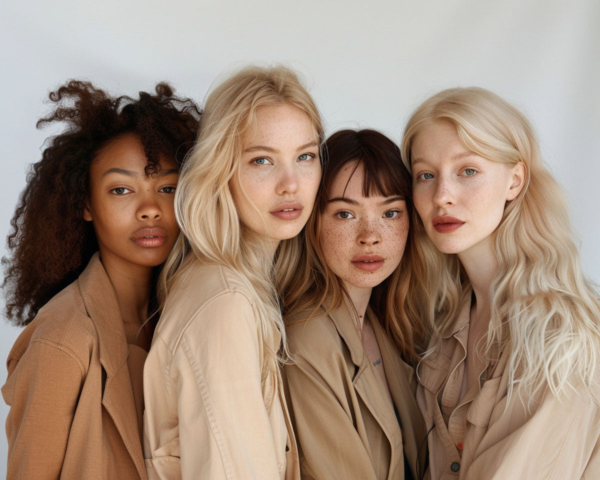
warm autumn palettes for warm body types
Autumn palettes act as a grounding force for warm body shapes, anchoring the silhouette with rich, earthy tones. Unlike the sharp contrast of winter or the airy lightness of spring, Autumn colors provide depth that complements the natural warmth of the skin and hair. Think of these shades as the foundation of a well-built structure: they don't distract from the body shape but rather support it with visual weight.
Olive green and terracotta are the cornerstones of this palette. Olive offers a sophisticated alternative to black, softening the edges of tailored trousers or structured blazers. Terracotta brings warmth to the face, echoing the natural flush of healthy skin while adding a vibrant pop without overwhelming the frame. These colors work because they mirror the natural environment, creating a harmonious flow from head to toe.
To maximize the effect, pair these hues with fabrics that have a bit of texture. Wool, linen, and cotton absorb these deep colors in a way that highlights the body's natural lines. A terracotta knit sweater over olive chinos creates a balanced look that is both comfortable and visually striking. The goal is to let the color enhance the body's natural warmth, not compete with it.

Winter palettes for cool body types
High-contrast, cool-toned Winter colors create sharp definition for cool body shapes. This combination emphasizes structure and clarity, turning the body into a canvas for bold, crisp lines. The goal is to match the inherent coolness of the skin and hair with colors that reflect light sharply, avoiding any muddiness or softness that might wash out the features.
Winter palettes are defined by their intensity and purity. These are not pastel shades or earthy tones; they are deep, saturated hues that stand out against the skin. Think of them as the visual equivalent of a black-and-white photograph: high contrast, clear edges, and no gray areas. This intensity helps to frame the face and highlight the natural cool undertones, creating a striking, polished appearance.
Deep Winter: Rich Jewel Tones
Deep Winter is the most common Winter subtype, characterized by very dark hair and deep skin tones. This palette thrives on richness and depth. Colors like emerald green, royal blue, and plum look incredibly vibrant against this skin tone. These jewel tones provide a luxurious backdrop that enhances the natural contrast without overwhelming it.
For body shape styling, Deep Winter benefits from structured silhouettes that mirror the boldness of the colors. A tailored blazer in navy or a dress in black creates a sharp, elongated line. The high contrast of the color draws the eye to the structure of the garment, emphasizing the shoulders and waist. Avoid soft, flowing fabrics in muted colors, as they can dull the natural vibrancy of the palette.
Bright Winter: Clear, Cool Hues
Bright Winter features high contrast with lighter skin and hair, often with a cool, clear undertone. This palette is all about clarity and brightness. Colors like true red, electric blue, and crisp white pop against the skin, creating a fresh, energetic look. These hues are cool and clear, reflecting light in a way that makes the skin look radiant and awake.
When styling for Bright Winter, focus on clean lines and simple shapes that allow the color to take center stage. A white shirt with blue trousers or a red coat over a black dress creates a striking visual impact. The key is to avoid any color that has a yellow or warm undertone, as these can clash with the cool brightness of the palette. Stick to pure, cool shades that enhance the natural clarity of the skin and hair.
Build your seasonal wardrobe checklist
Start by auditing your current closet. Lay out your most-worn items and hold them against your seasonal palette. If a color washes you out or makes your skin look dull, set it aside. This step separates the pieces that enhance your natural coloring from those that clash with your undertones.
Next, evaluate fit and silhouette. Your body shape dictates the structure that flatters you most. For example, if you are a Deep Winter with an hourglass frame, look for high-waisted trousers and structured blazers that define your waist. If you are a Soft Autumn with a pear shape, prioritize soft knits and A-line skirts that drape gently over your hips.
Use the steps below to organize your audit. Each step includes a visual example to help you visualize the final look.
Separate warm-toned items (yellows, oranges, earthy greens) from cool-toned ones (blues, pinks, jewel tones). Keep only the ones that match your season. A Soft Summer, for instance, should keep muted blues and grays while discarding bright white or orange.
Match fabric to your season’s texture profile. Light Summers and Soft Autumns look best in lightweight, blended fabrics like linen or soft cotton. Deep Winters and Bright Springs can carry heavier wools, silks, and crisp cottons without overwhelming their features.
Ensure your clothes complement your body shape. Rectangle shapes benefit from belted coats to create curves. Inverted triangles should choose wide-leg pants to balance broader shoulders. The goal is harmony between your cut and your color.
Your neutrals (jeans, jackets, shoes) should anchor your palette. A True Winter might wear black and navy, while a True Spring prefers camel and off-white. These pieces go with everything in your seasonal palette, reducing decision fatigue.
Once your audit is complete, you have a clear picture of what to keep, what to alter, and what to replace. This targeted approach saves money and ensures every item in your closet works hard for you.
Frequently asked questions about color analysis
Personal color analysis can feel like a puzzle, especially when trying to balance seasonal palettes with body shape. Here are answers to the most common questions about finding your best colors and silhouettes.
No comments yet. Be the first to share your thoughts!