
Color analysis beyond the fabric drapes
For decades, color analysis has been around, often involving dramatic draping with fabric swatches to determine your "season’ – Spring, Summer, Autumn, or Winter. It felt a bit… theatrical, and frankly, inaccessible. The process often relied heavily on a stylist"s eye, which could introduce subjectivity and a hefty price tag. But things are changing, and changing fast.
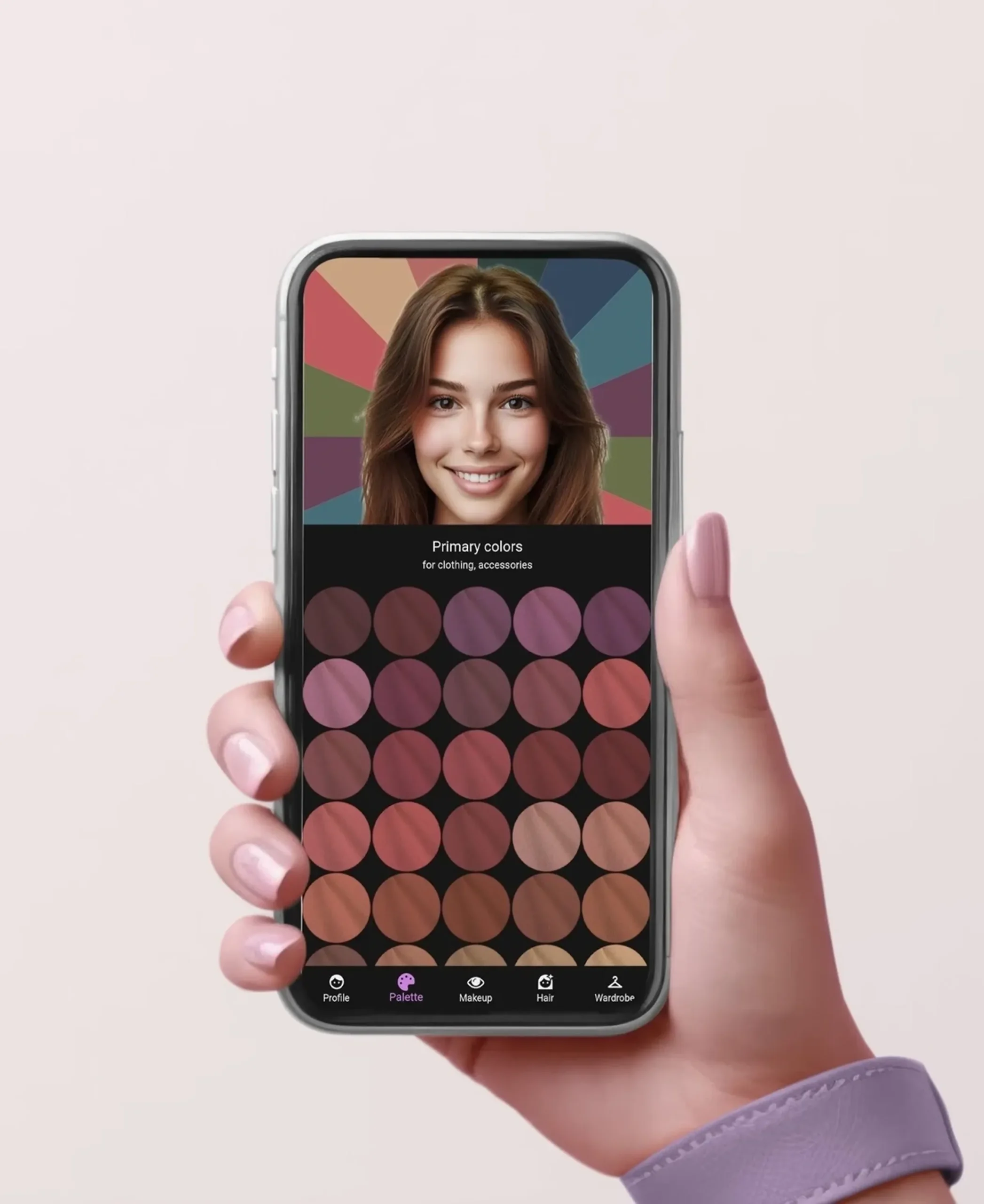
Smartphone apps are changing how we pick clothes. You don't need to book an expensive consultant to figure out which shades work for you. These tools give you a starting point to understand your own skin tones and build a closet that actually fits your look.
The beauty of these apps is their ability to analyze your unique coloring with greater nuance than the traditional seasonal system allows. They can consider subtle undertones, contrast levels, and even your individual features to create a truly personalized color palette. This increased accessibility means more people can benefit from the confidence that comes with wearing colors that make them shine. It's about understanding why certain colors work, not just being told what to wear.
Five apps to try in 2026
The app market is flooded with options, so finding the right one can feel overwhelming. Here are five of the best color analysis apps available in 2026, each with its own strengths and weaknesses. I've focused on apps that primarily analyze color from photos, as that's what makes this accessible for most people.
First, there's MyColorsPop (founded by Kate Stoltzfus). This app is lauded for its detailed analysis and ability to pinpoint your exact color season, even within sub-seasons. It works by having you upload a clear, well-lit photo of your face and then uses its algorithms to determine your undertones and ideal colors. Users report it’s remarkably accurate, and the app provides detailed guides on how to incorporate your palette into your wardrobe. Pricing is $49.99 for a one-time purchase.
Next, HueSnap offers a slightly different approach. It focuses on creating custom palettes based on your skin tone, hair color, and eye color. It’s particularly good for those who want to experiment with different styles and aren't necessarily tied to the traditional seasonal system. HueSnap is free to download, with a premium subscription ($9.99/month) unlocking additional features like personalized style recommendations and wardrobe planning tools.
Stylebook is more of a wardrobe organizer than a dedicated color analysis app, but it includes a powerful color palette feature. You can input your existing clothes, and Stylebook will analyze their colors and suggest complementary pieces. It’s a great option for those who want to maximize their current wardrobe. Stylebook is available for $9.99.
ChromaCode is a newer app gaining traction for its use of AI-powered analysis. It claims to be able to identify over 1,000 different color variations, providing a highly personalized palette. While still relatively new, early user reviews are positive, praising its accuracy and ease of use. ChromaCode operates on a subscription model – $14.99/month or $99.99/year.
Finally, ColorWise is a free app that provides a basic color analysis based on your skin tone. It’s a good starting point for those who are unsure about their coloring, but it lacks the depth and accuracy of the paid options. It’s a useful tool for initial exploration, but don't expect a comprehensive analysis.
Essential Tools for Flawless Virtual Color Analysis

18-inch LED ring light · 55W, 5600K daylight-balanced · Includes stand and phone holder
Provides consistent and adjustable lighting essential for accurate color analysis app readings.

5x7ft foldable backdrop · Reversible green and blue sides · Includes 8.5ft stand
Offers a neutral and consistent background to prevent interference with color analysis app results.

9.25-inch diameter · Hardboard construction · Illustrates color mixing and relationships
Helps users visualize color theory and relationships, complementing the insights gained from color analysis apps.

67-inch height · Tripod and selfie stick functionality · Includes wireless remote
Ensures a stable and steady platform for your phone, crucial for capturing consistent images for color analysis.

16x16 inch softbox · Two 85W LED bulbs · Adjustable color temperature (3000K-7500K)
Delivers soft, diffused lighting with adjustable color temperature to ensure true color rendition for analysis.
As an Amazon Associate I earn from qualifying purchases. Prices may vary.
What the results actually mean
Many color analysis apps still rely on the traditional seasonal system – Spring, Summer, Autumn, and Winter. Understanding what these terms actually mean is key to interpreting your results. Spring and Summer palettes typically feature lighter, brighter colors and cool undertones. Autumn and Winter palettes lean towards deeper, richer colors with warmer or cooler undertones, respectively.
However, the best apps aren’t simply boxing you into one of these four categories. They're moving towards a more nuanced approach, recognizing that most people fall somewhere in between seasons or have a combination of characteristics. You might be a "Light Spring’ or a ‘Soft Autumn" – these sub-seasons provide a more precise understanding of your coloring.
Your app will likely present you with a series of color swatches. These aren't just random colors; they're carefully selected to harmonize with your skin tone, hair color, and eye color. Pay attention to the undertones of each swatch – is it warm (golden, peachy) or cool (blue, pink)? Experiment with wearing these colors near your face to see how they affect your complexion. Remember, these are guidelines, not strict rules. The goal is to find colors that make you feel confident and look your best.
Traditional Seasonal Color Analysis Comparison
| Season | Skin Undertone | Contrast Level | Best Colors | Celebrity Examples |
|---|---|---|---|---|
| Spring | Warm | Light to Medium | Bright, clear colors – think coral, peach, light greens, and golden yellows. Colors that 'pop' and have a youthful vibrancy. | Blake Lively, Reese Witherspoon, Amanda Seyfried |
| Summer | Cool | Low to Medium | Soft, muted, and cool colors – dusty rose, lavender, powder blue, and seafoam green. Colors that are gentle and understated. | Princess Diana, Lily Collins, Emma Stone |
| Autumn | Warm | Medium to High | Rich, earthy, and muted colors – olive green, rust, mustard yellow, and chocolate brown. Colors that evoke nature and warmth. | Julia Roberts, Jennifer Aniston, Jessica Alba |
| Winter | Cool | High | Bold, dramatic, and cool colors – true red, navy blue, black, and icy pink. Colors that create a striking contrast. | Lucy Liu, Anne Hathaway, Cate Blanchett |
| Light Spring | Warm | Very Light | Pale and delicate versions of Spring colors. Think pastel peach, light apricot, and soft yellows. | Gwyneth Paltrow, Kate Hudson |
| True Summer | Cool | Medium | Clearer, but still muted, cool tones. Think rose-beige, mauve, and soft blues. | Naomi Watts, Cameron Diaz |
| Soft Autumn | Warm | Low | Muted and blended Autumn tones. Think camel, olive, and dusty rose. | Nicole Kidman, Helen Mirren |
| Deep Winter | Cool | Very High | Intense and dramatic cool colors. Think deep burgundy, charcoal gray, and sapphire blue. | Sofia Vergara, Viola Davis |
Illustrative comparison based on the article research brief. Verify current pricing, limits, and product details in the official docs before relying on it.
Wardrobe Building: From Palette to Outfit
Now that you have your color palette, it’s time to put it into practice. Start by identifying your core neutrals – these are the foundational pieces that will form the backbone of your wardrobe. These might include navy, gray, beige, or off-white, depending on your palette. Make sure these neutrals are the right shades for you – a cool-toned palette will require cooler neutrals, while a warm-toned palette will benefit from warmer shades.
Next, add in accent colors – these are the pops of color that will bring your outfits to life. Choose a few key accent colors from your palette and incorporate them into your wardrobe through tops, scarves, jewelry, and shoes. Don’t be afraid to experiment with different combinations, but always keep your core neutrals as the starting point.
When building your wardrobe, focus on versatile pieces that can be mixed and matched. A well-fitting blazer in your best neutral shade is a must-have. A classic pair of trousers or a skirt in a complementary color is also a good investment. And don’t forget the little black dress – but make sure it’s the right shade of black for your coloring!
- Pick your core neutrals like navy or gray first.
- Add in accent colors.
- Focus on versatile pieces.
Troubleshooting App Results & Common Mistakes
Color analysis apps are powerful tools, but they’re not foolproof. One of the most common issues is inaccurate results due to poor lighting or photo quality. Make sure you’re taking your photos in natural daylight, avoiding harsh shadows and direct sunlight. A neutral background is also helpful.
Another mistake is not holding your phone at the correct distance. You want to ensure your entire face is visible in the frame, and the app can clearly analyze your skin tone. If you’re still getting inaccurate results, try taking multiple photos from different angles and under different lighting conditions.
Apps have limits. They often struggle if you're wearing heavy makeup, have dyed hair, or a fresh tan. If the results feel off, a human stylist is still the best way to get a second opinion.

No comments yet. Be the first to share your thoughts!