

Find your seasonal color profile
Your seasonal color profile is the foundation of any flattering palette. It determines which hues make your skin look healthy and which ones cast shadows or wash you out. Think of it as a filter: warm tones amplify golden skin, while cool tones brighten pink or blue-based complexions. Getting this right means you spend less time guessing and more time wearing colors that work.
Start by looking at the veins on your inner wrist in natural light. If they appear green, you likely have a warm undertone. If they look blue or purple, you are probably cool-toned. If you can’t tell the difference, you might be neutral. This simple test is the first step in narrowing down your season.
Next, consider how your skin reacts to the sun. Warm undertones usually tan easily and rarely burn. Cool undertones often burn first and tan minimally. Neutral skin might burn initially but eventually tan slightly. This reaction helps confirm whether your base is warm or cool.
Look at your hair and eye color for additional clues. Warm seasons (Spring and Autumn) often feature golden, copper, or warm brown hair with gold or light brown eyes. Cool seasons (Summer and Winter) typically have ash brown, black, or platinum hair with blue, gray, or cool brown eyes. Mixing these traits helps pinpoint your specific seasonal identity.
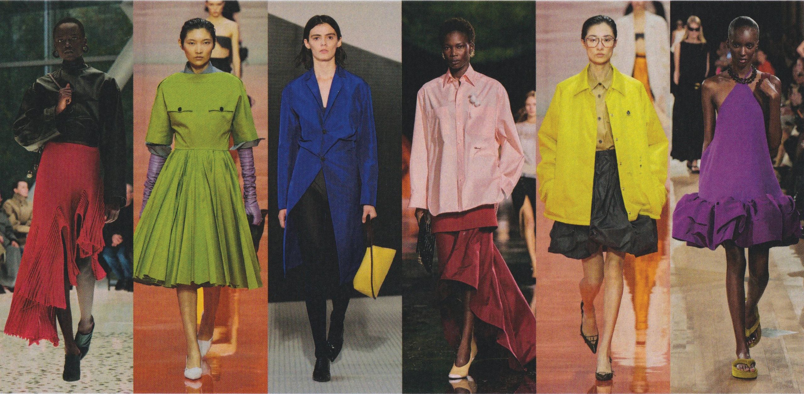
Map your body shape to color intensity
Color intensity isn't just about personal taste; it's about scale. Your body shape determines the visual weight you can carry. A palette that works for a petite frame might get lost on a tall, athletic build. The goal is to match the contrast and saturation of your colors to your physical proportions.
Think of your body as a canvas and the colors as the paint. Heavy, high-contrast palettes add visual mass, while low-contrast, muted tones recede. By aligning the "weight" of your colors with your body type, you create a balanced look that feels intentional rather than accidental.
Compare body shapes and color needs
Use this table to quickly identify the right color intensity for your specific proportions. The goal is to find a harmony between your natural frame and the visual impact of your wardrobe.
| Body Shape | Recommended Intensity | Contrast Level | Reasoning |
|---|---|---|---|
| Petite | Medium to High | Clear | Small frames need distinct colors to avoid looking overwhelmed by fabric. |
| Tall | Low to Medium | Soft | Tall frames can carry subtle, blended tones without looking washed out. |
| Curvy | Medium | Moderate | Balanced intensity highlights curves without adding unnecessary visual bulk. |
| Athletic | High | Sharp | Strong contrasts create the illusion of dimension and definition. |
Choose your palette step-by-step
Follow these steps to build a palette that flatters your specific shape. Start with your base color and layer in intensity based on the guidelines above.
Finalize your color checklist
Before committing to a wardrobe, run through this quick checklist to ensure your colors align with your body shape.
-
Does the palette have enough contrast to define my shape?
-
Are the colors too heavy for my frame?
-
Do the hues complement my skin tone as well as my body type?
-
Can I mix and match at least three pieces from this palette?
Your color palette should feel like it was made for you. When the intensity matches your proportions, everything else falls into place.
Assemble your core wardrobe palette
Now that you’ve identified your seasonal color profile and body shape, it’s time to select the specific hues that will form the backbone of your closet. Think of this as curating a small, reliable team of colors rather than buying every shade you like. A focused palette ensures that every top pairs with every bottom, reducing decision fatigue and creating a cohesive look.
Start by picking three to five key colors. One should be a neutral base—like navy, charcoal, or beige—that covers about 50% of your wardrobe. Add one or two accent colors drawn from your seasonal analysis, and perhaps one texture or pattern that complements them. This mix allows for versatility while keeping your style intentional.
Use tools like Coolors or Adobe Color to test these combinations digitally before shopping. These platforms help you visualize how colors interact and ensure they meet accessibility standards for contrast, which often translates to visual harmony in clothing. Preview your selected swatches against your skin tone in natural light to confirm they flatter your complexion.
Once you have your list, audit your current closet. Identify which existing pieces fit this new core palette and which ones clash. This exercise highlights gaps you need to fill and items you might want to replace or donate, ensuring your future purchases integrate seamlessly into your new system.
Test colors with fabric and lighting
A palette that looks striking on a screen often behaves differently in the real world. Fabric texture and ambient light can mute vibrancy or cast unwanted shadows on your skin. Before committing to a wardrobe or design scheme, run your chosen colors through a physical reality check.
Hold your fabric swatches or garments near a north-facing window during midday. Natural daylight reveals the true hue without the yellow or blue tint of indoor bulbs. Notice if the color washes you out or creates a harsh contrast against your complexion. This is the most accurate way to judge how a color flatters your body type in daily life.
Turn on the lights in the room where you spend the most time, such as your office or living room. Incandescent bulbs tend to warm up colors, making reds and oranges appear more intense, while fluorescent lights can make blues and greens look sterile. If a color looks dull or muddy under these lights, it will likely feel heavy or unflattering during evening events or work hours.
Color interacts differently with various materials. A vibrant silk may reflect light and brighten your face, while the same hue in heavy wool might absorb light and weigh you down. Drape the fabric over your shoulder or wrist to see how it settles. Look for wrinkles or stiffness that might distract from the color’s intended effect. Smooth, flowing fabrics often enhance the flattering qualities of a palette.
Test your chosen colors alongside the accessories and makeup you typically wear. A lipstick shade can shift the perceived warmth of a top, while gold or silver jewelry can change how a metal tone complements your skin. Ensure the primary color doesn’t clash with your usual palette. If a color works well with your everyday staples, it’s a reliable choice for your wardrobe.
By testing your palette in these real-world conditions, you ensure that your color choices are not just theoretically sound but practically flattering. This step prevents costly mistakes and helps you build a wardrobe that consistently enhances your natural features.
Common color pairing mistakes
Even with a perfect undertone analysis, your palette can fall flat if you ignore contrast. Many people treat color selection as a purely aesthetic choice, pairing two light neutrals or two dark shades together. This creates a "muddy" effect where the colors blend into a single, undefined blob rather than defining your features. Think of contrast as the frame around a painting; without it, the image loses its shape and impact.
Another frequent error is mismatching saturation levels. Pairing a muted, dusty rose with a neon bright can overwhelm the eye, creating visual tension that clashes with your natural complexion. Instead, aim for harmony by keeping saturation levels relatively consistent. If your base tone is soft, choose accents that are equally gentle. If you have high-contrast features, don't be afraid to use deeper, more saturated hues to balance the look.
Always test your combinations under natural light before committing to a wardrobe or design. Artificial lighting can distort hues, making a cool gray look warm or vice versa. A quick check against a white sheet in daylight reveals the true relationship between the colors. This simple step prevents costly mistakes and ensures your palette flatters you consistently, regardless of where you are.
No comments yet. Be the first to share your thoughts!