

Find your seasonal color palette
Define the constraint, compare realistic options, test the tradeoff, and choose the path with the fewest hidden costs. This sequence keeps advice usable instead of decorative.
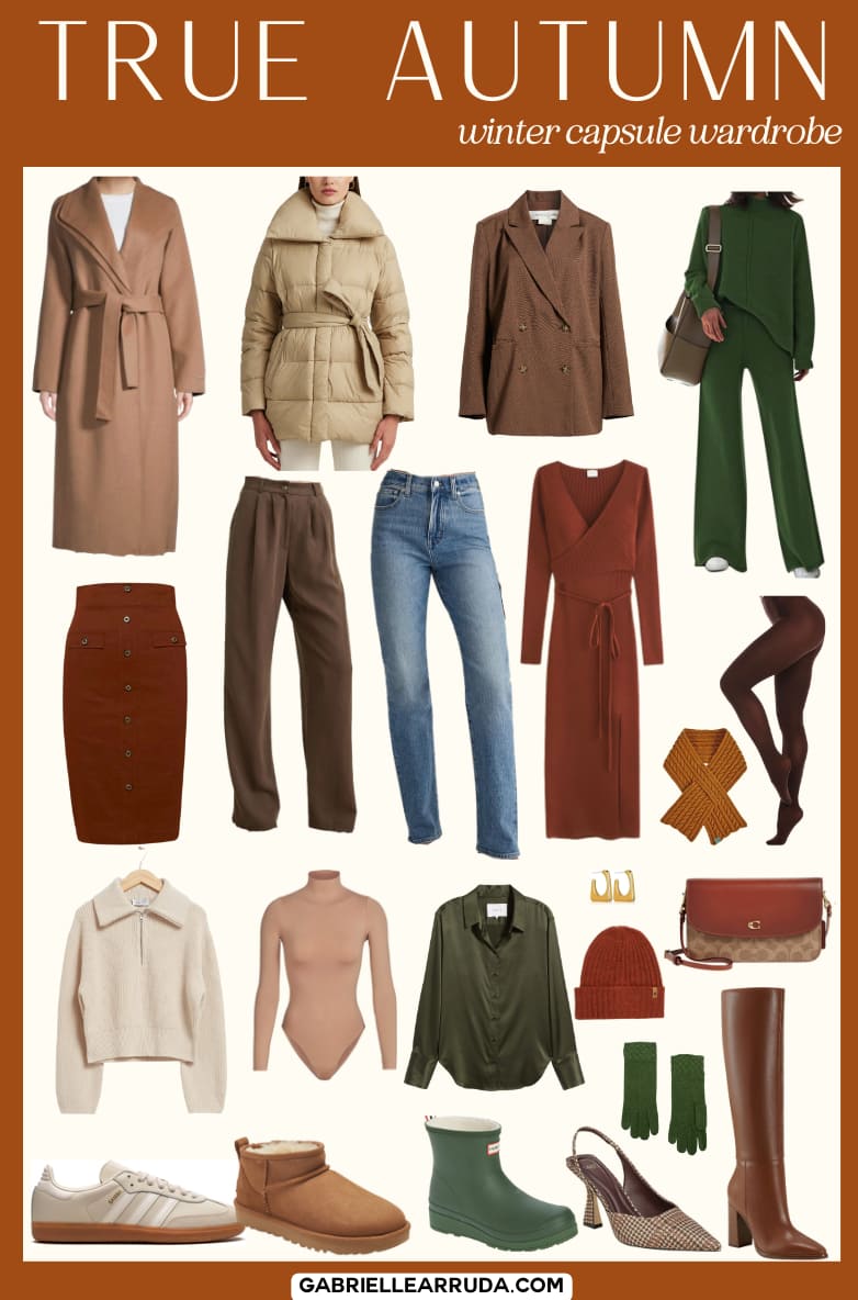
Map body shapes to color intensity
Color intensity is the visual weight of a palette. It ranges from soft, muted tones to deep, saturated hues. Matching this weight to your body proportions creates balance. A mismatch draws the eye to areas you want to minimize or overlooks features you want to highlight.
Think of color intensity like fabric weight. Heavy wool coats look natural on larger frames. Light silk looks elegant on slender frames. If you wear a heavy, dark coat on a petite frame, it can swallow your silhouette. If you wear a pale, airy dress on a larger frame, you might look washed out. The goal is to align the "weight" of the color with the "weight" of the body.
Use the comparison table below
Use the table below to find your starting point. It maps common body shapes to recommended palette intensities.
| Body Shape | Recommended Intensity | Example Colors |
|---|---|---|
| Pear/Triangle | Medium to Low | Olive, dusty rose, navy |
| Apple/Rectangle | Medium to High | Emerald, burgundy, charcoal |
| Hourglass | Medium | Teal, slate blue, terracotta |
| Inverted Triangle | Low to Medium | Soft gray, lavender, cream |
| Petite/Slender | Low to Medium | Pastels, muted earth tones |
Adjust saturation for visual balance
Saturation is how pure or diluted a color appears. High saturation demands attention. Low saturation recedes. Use this principle to guide the viewer's eye.
If you have broader shoulders or a larger bust, high-intensity colors on top can overwhelm your frame. Shift your palette toward medium or low intensity in the upper body. Save high-intensity colors for the lower body or accessories. This creates a vertical line that elongates the torso.
Conversely, if you have a smaller frame, very low-intensity colors can make you disappear. Introduce medium-intensity colors to add presence. A medium-intensity sweater in a muted teal or slate gray adds structure without heaviness. Avoid neon brights, which can look jarring against delicate features.
Build your wardrobe guide
Follow these steps to apply intensity mapping to your wardrobe guide.
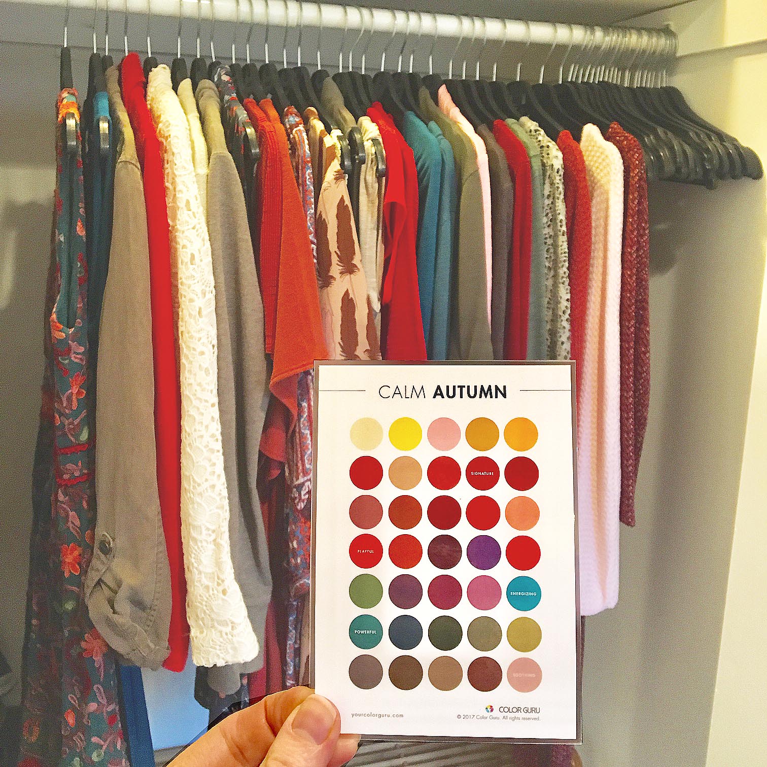
Stand in front of a mirror. Note where your widest point is. Is it your hips, shoulders, or midsection? This determines your base shape.
Look at the comparison table. Choose the intensity level recommended for your shape. This becomes your primary palette tone.
Hold up a garment in your chosen intensity against your face. Does it brighten your complexion? Does it overwhelm your frame? Adjust up or down one level if needed.

Write down the specific colors and intensities that worked. This becomes the core of your personal wardrobe guide.
Quick checklist for intensity mapping
-
Identify your widest body point (hips, shoulders, or waist).
-
Match your shape to a medium, low, or high intensity level.
-
Place high-intensity colors on the narrowest part of your frame.
-
Use low-intensity colors on the broadest part of your frame to soften.
-
Test colors against your face in natural light before buying.
Assemble your core color palette
Your seasonal color analysis gives you the raw ingredients, but a cohesive wardrobe requires a structured menu. Think of your palette not as a random collection of favorites, but as a unified system where every piece supports the others. When colors share the same undertone and intensity, mixing and matching becomes automatic, reducing decision fatigue and ensuring you always look polished.
To build this system, select five to seven colors that cover three distinct roles: neutrals, main tones, and accents. This distribution ensures you have enough variety for daily wear while maintaining visual harmony. Stick to colors that naturally complement your skin, hair, and eye tones identified in your season.

Choose two strong neutrals
Neutrals form the backbone of your wardrobe, accounting for about 60% of your outfits. Instead of defaulting to black and white, choose the neutrals that flatter your specific season. For example, a "Soft Summer" might find charcoal and ivory more flattering than stark black and pure white. These colors should work for workwear, basics, and outerwear, providing a stable foundation for brighter pieces.
Pick three main tones
Main tones make up the next 30% of your palette and include colors you wear on shirts, dresses, and trousers. These should be the hues that make you look most alive and healthy. If you are a "Deep Autumn," earthy olive, mustard, or rust might serve as your main tones. These colors bridge the gap between your subtle neutrals and your vibrant accents, creating a smooth visual transition across your closet.
Select two accent colors
Accents are the final 10% of your palette, reserved for statement pieces, accessories, or seasonal pops of color. These are the brightest or most saturated colors in your range. A "Bright Spring" might use coral or turquoise as accents. Because they are limited in number, these colors draw attention and add personality without overwhelming your overall look.
Test the combinations
Before committing to this palette, lay out your existing wardrobe items against these five to seven colors. You should be able to create at least ten different outfits using only these hues. If a piece looks out of place or clashes with the group, it likely doesn't belong in your core palette, even if you love it. This test ensures your palette is practical and versatile.
Check your palette against skin tone
A seasonal color palette is only useful if it harmonizes with your natural complexion. When the right colors meet your skin, you look rested and vibrant. When the wrong colors clash, you may appear washed out or tired, even if the outfit is stylish. This verification step ensures your wardrobe guide actually works for you, not just on paper.
To test this, hold a swatch from your seasonal palette against your bare neck in natural daylight. Artificial lighting can distort how colors interact with your undertones, leading to inaccurate results. Look at your reflection in a mirror and observe two things: does the color brighten your eyes, and does it even out your skin tone? If the fabric makes your skin look gray or sallow, that color is likely outside your optimal range.
Consider the contrast between the fabric and your skin. High-contrast seasons (like Winter or Summer) thrive on sharp differences, while low-contrast seasons (like Spring or Autumn) look best with softer blends. If a color blends too seamlessly into your skin, losing definition, it may not be the right fit. Conversely, if it creates a harsh, disjointed line, it might be too intense. The goal is a harmonious glow, not a stark separation.
Keep a small mirror in your dressing area with these verified swatches. Before committing to a new purchase, hold it up against your skin. This quick check prevents impulse buys that don't align with your seasonal palette, ensuring every piece in your wardrobe guide enhances your natural beauty.
Avoid common color matching mistakes
Even with a perfect seasonal palette, small execution errors can throw off your entire look. The most frequent pitfall is ignoring undertones. A warm autumn might accidentally pair an orange-toned red with a cool-toned navy, creating visual friction instead of harmony. Always check if your colors share the same temperature family.
Another common error is letting color dominate your body shape. If you are petite, wearing a monochrome block of dark, heavy colors can overwhelm your frame. Conversely, high-contrast combinations can shorten your silhouette if not balanced with vertical lines. Use color to guide the eye, not hide your proportions.
Don’t forget to test fabrics in natural light. A palette that looks cohesive in store lighting might clash under sunlight due to different material sheens. Matte and shiny fabrics reflect light differently, which can make two "matching" colors look distinct. When in doubt, layer a neutral base to ground the outfit.
No comments yet. Be the first to share your thoughts!