
Prepare your lighting and tools
To get an accurate color analysis at home, you need to control two variables: light and background. Professional consultants use specialized lighting to neutralize shadows and color casts. You can replicate this environment with a few simple adjustments.
Step 1: Find natural daylight
Sunlight is the most accurate light source for color analysis because it contains a full spectrum of colors. Artificial bulbs often skew warm (yellow) or cool (blue), which distorts how your skin undertones appear.
Stand in front of a north-facing window if possible. North light is consistent and diffused, providing even illumination without harsh shadows. If you only have south-facing windows, draw sheer curtains to soften the direct rays. Perform your analysis during mid-morning or early afternoon when the sun is high.
Step 2: Remove makeup and clear your face
Makeup alters your natural color profile. Foundation changes your skin tone, while eyeliner and mascara darken your features. For a true assessment, wash your face and let it dry completely. Do not apply any products. If you have dark circles or redness, leave them as is; you are analyzing your natural canvas, not a corrected version.
Step 3: Use neutral draping materials
You need fabrics that are pure white and pure black, as well as neutral grays. These serve as your baseline contrasts. White reveals your undertone (warm, cool, or neutral) by showing how your skin reacts to brightness. Black shows your contrast level and depth.
Avoid colored drapes at this stage. Stick to neutrals first to establish your base season. You can use towels, sheets, or large scarves. Ensure the fabric is matte, not shiny, as reflections can interfere with light perception.
Step 4: Clear your background
Your surroundings affect your perception. Stand in front of a plain white wall or drape a white sheet behind you. Avoid busy patterns or colorful walls, which can reflect light onto your face and create false impressions of how certain colors interact with your skin.
Drape neutral fabrics to test undertones
Color analysis relies on observing how different shades interact with your skin. The goal is to determine whether your undertone is warm, cool, or neutral by comparing the effect of stark white against a cream or off-white fabric. This simple visual test reveals which colors harmonize with your natural coloring and which ones create discord.
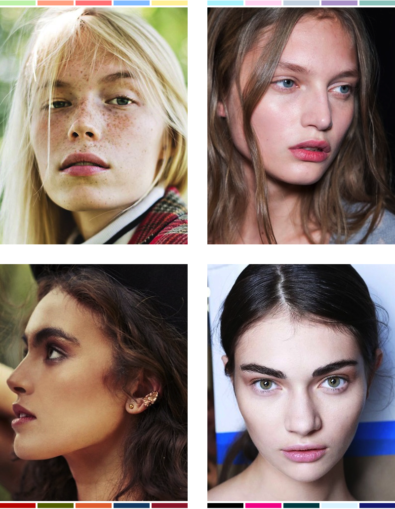
Wash your face and dry it thoroughly. Remove all makeup, including foundation and concealer, to ensure you are seeing your true skin tone. Natural lighting is essential for this test; stand near a large window during the day, but avoid direct sunlight which can wash out details. Dim or yellow indoor lighting will skew your perception of the colors.
Hold a piece of bright, pure white fabric (or a white shirt) under your chin. Look at your skin in the mirror. If the white makes your skin look sallow, yellowish, or highlights dark circles and blemishes, your skin may have warm or neutral undertones. If your skin looks clear, bright, and healthy against the white, you likely have cool undertones.
Pay attention to how your skin reacts to the high contrast. Do you look tired or washed out? Or does the white enhance your natural glow? Also, look at the veins on your inner wrist in this natural light. Blue or purple veins often suggest cool undertones, while greenish veins suggest warm undertones. This is a secondary check to support what you see with the fabric.
Now, hold a cream, ivory, or off-white fabric under your chin. Compare this to the pure white. If the cream fabric makes you look brighter and healthier than the stark white, you likely have warm undertones. Warm undertones generally look better in earth tones and creams than in stark whites.
If neither white nor cream looks distinctly better, you may have a neutral undertone. Neutrals can often wear both white and cream well, though they might look slightly more balanced in one than the other. The fabric that makes your skin look most even-toned, vibrant, and free of shadows is the one that matches your undertone.
This method is the foundation of the "Color Me Beautiful" theory, which categorizes people into seasonal types based on these variables. By identifying your undertone, you can narrow down your color palette significantly. For a deeper understanding of how these variables define your type, you can refer to guides from color analysis experts like Anuschkarees.
If you find the results ambiguous, try using gold and silver jewelry as a secondary test. Gold jewelry typically complements warm undertones, while silver complements cool undertones. However, the fabric drape test is generally more reliable for determining the primary undertone.
Match your season to the four categories
The Color Me Beautiful system categorizes skin tones into four primary seasons: Spring, Summer, Autumn, and Winter. This classification relies on two measurable variables: your undertone (warm or cool) and your contrast level (light/deep or muted/clear). By cross-referencing these traits, you can identify which palette harmonizes with your natural coloring.
Use the comparison below to narrow down your specific type. Look for the row that aligns with your vein test results and your skin’s value and chroma.
| Season | Undertone | Value | Chroma |
|---|---|---|---|
| Spring | Warm | Light | Clear |
| Summer | Cool | Light | Muted |
| Autumn | Warm | Deep | Muted |
| Winter | Cool | Deep | Clear |
Test specific colors against your skin
To verify your seasonal classification, you need to observe how your skin reacts to specific hues. The goal is to see which colors make your complexion look clear and rested, and which ones emphasize shadows, redness, or fatigue. This process relies on direct visual comparison rather than theoretical assumptions.
Start by draping a piece of fabric or holding a garment against your bare face in natural daylight. Stand in front of a mirror and look away from the cloth to avoid color reflection bias. Compare the effect of two contrasting colors side by side. For example, test a bright white against an off-white, or a cool pastel against a warm earth tone.
Warm Seasons: Spring and Autumn
If you have a warm undertone, you will typically look better in colors that mirror nature’s earthy or sunny palette. Spring types often shine in clear, bright warm colors like peach, coral, and light yellow. Autumn types tend to look best in deeper, muted warm tones like olive green, rust, and mustard.
If you look washed out or sallow in these shades, you may not be warm-toned. Conversely, if cool pastels make you look gray or tired, you likely do not belong in a cool season. The rule of thumb is that warm colors should make your skin glow, not clash.
Cool Seasons: Summer and Winter
Cool undertones generally harmonize with colors that have a blue or pink base. Summer types often look best in soft, muted cool colors like lavender, soft blue, and rose. Winter types typically stand out in high-contrast, vivid cool colors like true red, navy, and emerald green.
If you look dull or shadowed in these cool hues, you may be warm-toned. If bright, warm colors like orange or gold make your skin look ruddy or inflamed, you likely lean cool. The aim is to find the shades that even out your skin tone and make your eyes appear brighter.
Neutral Seasons
If you struggle to decide between warm and cool, you might have a neutral undertone. Neutral seasons often look best in colors that are balanced or slightly muted. For instance, a neutral spring might prefer a softer peach over a bright coral, while a neutral winter might prefer a berry red over a true blue red.
When testing, look for the colors that create the most harmony. If no single color stands out as clearly "better," you may be neutral. In this case, you can often wear a wider range of colors, but you will still look best when the intensity matches your natural contrast level.
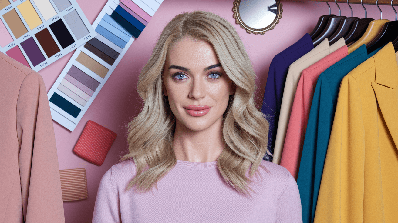
Build a cohesive capsule
Translating your personal color analysis into a wardrobe requires treating your palette as a unified system rather than a list of favorites. When you wear colors that harmonize with your natural skin tone, eye color, and hair, the result is a polished look that feels effortless. The goal is to maximize outfit combinations while minimizing decision fatigue.
Start by auditing your current closet. Remove items that clash with your specific season—this might mean clothes that make you look washed out or sallow. Keep your neutrals (blacks, whites, grays, or navy) if they align with your palette, as these form the backbone of your capsule.
Next, introduce your accent colors strategically. Choose two or three shades from your palette that you love and wear most often. This creates a cohesive visual identity. As you shop, prioritize pieces in these core hues to ensure everything mixes and matches easily.
Pull every item from your closet onto your bed. Separate pieces into three piles: keep, donate, and maybe. Be strict with the maybe pile; if you haven't worn it in a year, it likely doesn't fit your new color strategy.
Determine which neutrals flatter you most. For example, a "Cool Summer" might look better in charcoal gray than black. Stick to these verified neutrals for bottoms and outerwear to ensure consistency.
Select 3-5 colors from your analysis that appear most often in your kept items. These are your "power colors." Prioritize buying new items in these shades to build a cohesive capsule.
-
Remove clashing colors
-
Keep neutrals
-
Add one accent color
Common color analysis: what to check next
Can ChatGPT do your color analysis?
AI tools and large language models cannot accurately determine your seasonal palette. Color analysis depends on subtle interactions between natural features like skin undertones, eye color, and hair shade against specific fabric drapes. Current AI lacks the nuanced visual perception required to distinguish these delicate variations, making it unreliable for personal styling. For accurate results, rely on physical draping with a professional or a trusted at-home kit.
How much does a color analysis cost?
Professional color analysis services typically range from $150 to $300, depending on the consultant’s expertise and location. Higher-end image consultants or specialized studios may charge more for comprehensive styling packages. While this is an investment, it provides a permanent guide for your wardrobe and makeup choices, potentially saving money by reducing trial-and-error purchases.
What does a Winter person look like?
"Winter" is one of the four main seasonal palettes, characterized by high contrast and cool undertones. Winters typically have deep, cool hair colors (black or dark brown), cool skin tones (pink, blue, or olive), and dark eyes (black, brown, or deep blue). They look best in clear, intense colors like pure white, black, navy, and jewel tones, avoiding muted or warm earth tones.
How can I figure out my color analysis?
To determine your palette at home, start by identifying your skin’s undertone: check the veins on your wrist (blue/purple indicates cool, green indicates warm) or see if silver or gold jewelry looks better against your skin. Next, observe your natural hair and eye colors to assess contrast levels. Finally, drape neutral fabrics in warm (gold/earth) and cool (silver/blue) tones near your face in natural light to see which brightens your complexion.
No comments yet. Be the first to share your thoughts!