
Prepare your natural lighting
Start your home color analysis by identifying the single constraint that matters most: natural light availability, budget, or time. This constraint dictates your method. If you lack consistent daylight, focus on neutral-toned artificial lighting tests. If you have perfect north-facing windows, use the full draping protocol.
Keep the initial pass simple. Compare options against the same criteria, remove choices requiring ideal conditions, and save upgrades for later.
Drape fabric near your face
The core of home color analysis is observation. You need to see how specific colors interact with your skin, eyes, and hair when placed directly against your complexion. This process, known as draping, reveals which hues harmonize with your natural features.
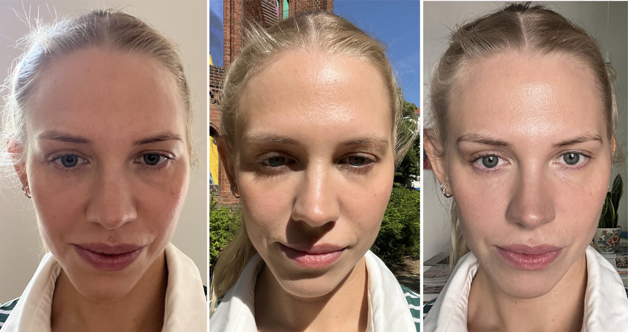
Wash your face to remove makeup or oils. Sit in front of a mirror with natural daylight if possible. Remove jewelry that might reflect color onto your skin. Your face should be neutral and bare.
Step 1: Prepare your neutral base
Establish a baseline before introducing color. Drape a plain white or black cloth under your chin and shoulders. Observe your skin tone against these extremes. Does white make you look washed out or bright? Does black create a harsh contrast or blend in? This helps determine your underlying value (light vs. deep) and contrast level.
Step 2: Drape the first test color
Select a fabric swatch from your suspected seasonal palette. Hold it directly under your chin, ensuring it covers your chest and shoulders. The fabric should touch your skin or be very close to it. Look straight into the mirror, not at the fabric itself. Observe the immediate reaction of your skin.
Step 3: Observe and compare
Watch for changes in your complexion. Do dark circles or blemishes become more noticeable? Does your skin look sallow, gray, or ruddy? Or does it look clearer, brighter, and more even-toned? A flattering color makes your skin look healthy and your eyes sparkle. An unflattering color makes you look tired or highlights imperfections.
Step 4: Test multiple hues
Repeat the process with several colors from your palette. Test both warm and cool tones if you are unsure. Compare the results side-by-side if possible. The best colors will consistently make you look vibrant, while the worst will make you look dull. Trust your initial visual impression over your preference for the color itself.
Step 5: Record your findings
Take notes or photos of the colors that worked best. Save images of the draping process to compare later. This creates a reference for your personal color palette.
Compare warm versus cool tones
Finding your undertone is the foundation of personal color analysis. Your skin has a natural underlying hue that determines which colors make you look vibrant and which make you look washed out. This underlying hue falls into two main categories: warm or cool.
To distinguish between warm and cool undertones, look for these physical indicators. Warm undertones typically have yellow, golden, or peachy hints, while cool undertones lean pink, red, or blue.
| Indicator | Warm Undertone | Cool Undertone |
|---|---|---|
| Vein Color | Green or olive | Blue or purple |
| Jewelry | Gold looks best | Silver looks best |
| Sun Reaction | Tans easily, burns rarely | Burns easily, tans minimally |
| White Fabric | Cream/ivory blends | Bright white stands out |
A simple way to check your vein color is to look at the inside of your wrist in natural light. If your veins appear green, you likely have warm undertones. If they look blue or purple, you are cool-toned. If you can't tell, or if they look teal, you might be neutral.
Another quick test is the jewelry test. Try on a gold piece and a silver piece. If gold makes your skin look brighter and your features pop, you are warm. If silver provides a clearer, more striking contrast, you are cool.
Identify your specific season
The 12-season system breaks the traditional four categories into more precise groups based on two factors: value (light vs. dark) and chroma (clear vs. muted). By mapping your observed undertones against these variables, you can pinpoint the exact palette that harmonizes with your skin tone.
Start by checking the value. If your hair and eyes are deep and high-contrast, you likely lean toward the Deep seasons (Deep Autumn or Deep Winter). If your features are soft and low-contrast, you fall into the Light seasons (Light Spring or Light Summer).
Next, determine your chroma. Clear, bright colors suit Clear seasons (True Spring, True Winter, Bright Spring, Bright Winter). Muted, dusty, or grayish tones suit Muted seasons (Soft Summer, Soft Autumn, Deep Autumn, Deep Winter). Combining value and chroma gives you your specific season.
| Season Group | Value | Chroma | Best For |
|---|---|---|---|
| Light | Light | Clear/Muted | Soft features, low contrast |
| Clear | Clear | Clear | High contrast, bright eyes |
| Muted | Muted | Muted | Dusty, grayish undertones |
| Deep | Dark | Clear/Muted | High contrast, dark features |
To ensure accuracy, compare your results against professional resources like the Color Me Beautiful guide, which offers detailed breakdowns of each seasonal palette.
Fix Common Draping Mistakes
Even with the best lighting, small errors in your setup can skew your seasonal identification. Color analysis relies on isolating your natural complexion from external variables.
Skip Makeup and Self-Tanner
Draping reveals your natural skin tone. Foundation, blush, or self-tanner masks the subtle blue or yellow undertones that define your palette. Remove all makeup before starting. If you wear contacts, take them out to see your true iris color and sclera.
Control Your Environment
Ambient light changes how fabrics look. A warm lamp might make a cool tone appear muddy, while harsh noon sun can wash out subtle contrasts. Use neutral white walls and natural daylight. Avoid draping over patterned clothing or busy backgrounds.
Use the Right Fabric
The material matters as much as the hue. Shiny silk reflects light differently than matte cotton. Use matte fabrics in pure, saturated colors. Avoid metallics or sheer materials that let your skin tone show through.
Check the Drape Distance
Holding a swatch too close to your face can create a false reflection. Hold the fabric 6-8 inches below your chin, under your jawline. This mimics how clothing rests against your body. Look for immediate reactions: does your skin look brighter, or do shadows deepen?
Build your seasonal wardrobe
Treat your identified palette as a strict filter for every new purchase. Instead of browsing entire racks, focus on items that match your primary seasonal colors. This approach reduces decision fatigue and ensures every piece in your closet works together.
Use a checklist to audit your current wardrobe and identify gaps. Look for a balanced mix of neutrals (blazers, trousers, coats) and accent colors (tops, dresses, accessories). If you are unsure which neutrals suit your season, lean toward your undertone’s natural depth—cool undertones often look best in navy or charcoal, while warm undertones shine in camel or olive.
When shopping, bring a printed color swatch of your palette to the store. Hold the fabric against your neck in natural light to verify the match before buying.
Sort your clothes into three piles: keep (matches palette), donate (clashes with skin tone), and maybe (neutral pieces that work with any color). Be ruthless; if it doesn’t make you look awake, remove it.

Prioritize foundational pieces first. A well-fitting blazer or pair of trousers in your primary neutral color will anchor the rest of your outfits. Add accent pieces like scarves or shirts in your secondary seasonal colors to inject personality.

Always test new purchases against your face in daylight. Store lighting can distort colors, making a warm tone look cool or vice versa. If the color makes you look tired or washed out, put it back.
No comments yet. Be the first to share your thoughts!